


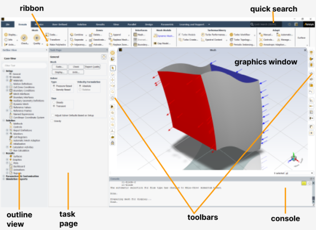
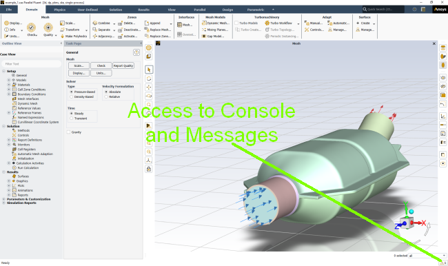
The graphical user interface (GUI) is made up of seven main components, which are described in detail in the subsequent sections: the ribbon, the tree, toolbars, task pages, a console, dialog boxes, and graphics windows. When you use the GUI, you will be interacting with one of these components at all times. The GUI will change depending on whether you are in meshing mode (as described in the Fluent Meshing section of the User’s Guide) or solution mode (as described in this guide, and as shown in Figure 1.1: The GUI Components). For details on how to switch between these modes, see Switching Between Meshing and Solution Modes in the Getting Started part of this manual.
Many of the GUI elements can be moved or tabbed together to suit your preferences. You can also modify attributes of the GUI to better match your platform environment. These are described in Customizing the Graphical User Interface and Setting User Preferences/Options.
For additional information, see the following sections:
The ribbon, located at the top of the Fluent GUI, is the primary method for
setting up and running your simulation. It facilitates access to the most commonly
used items, with tabs nominally arranged in a left to right workflow for a typical
simulation. Contents within each tab are grouped with related content and are
organized logically to accommodate varied projects and priorities. You have the
option to minimize the ribbon by clicking  , located to the right of the ribbon tabs.
Often, making a selection in the ribbon opens a dialog box. In some instances, a ribbon selection opens a task page.
The outline view tree, located on the left side of the Fluent GUI, is an interactive representation of your project. Its items are listed in an order that complements the typical problem setup you follow in the ribbon. Branches can be expanded and collapsed to suit your preferences.
You can select multiple related items by holding Shift or Ctrl and left-clicking. Right-clicking selected items in the tree provides a list of common commands. Typographical Conventions shows the convention used to describe this right-click action, when it is referred to in the documentation.
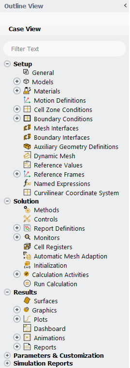
You can perform wildcard and regular expression searches in the tree using the filter text entry box at the top of the tree; see Filter Text Entry Boxes for additional information.
Double-clicking many of the branches under Setup, Solution, or Results displays the corresponding Task Page to the right of the tree. For additional information, see (Task Pages).
Copy and paste is available for copying items from the outline view to the clipboard so that you can paste them elsewhere in the same session or into another session without having to hold down the left-mouse-button like you do for a drag and drop operation. Copy and paste is available for:
You can use the drag and drop operation on the Outline View tree to varied effects, depending on what you are dragging and where you are dropping it.
Note that Fluent displays a plus ( ) icon for valid drop operations and a invalid (
 ) icon for operations or locations that are not allowed.
Tooltips indicate the type of operation that will be
performed.
) icon for operations or locations that are not allowed.
Tooltips indicate the type of operation that will be
performed.
Within the Same Session:
Open files by dropping them onto the open Fluent session.
The supported file types include:
Case and data (
*.cas.h5,*.cas,*.cas.gz,*.dat.h5,*.dat,*.dat.gz,*.msh.h5,*.msh,*.msh.gz)Journals (
*.jou,*.log)Profiles (
*.csv)PDFs (
*.pdf)
Cell Zones, Boundary Conditions, Mesh Interfaces
Copies the conditions of the dragged boundary onto the boundary where the dragged boundary is dropped.
Drop cell zones and boundary conditions on the graphics window to display them (additive). You can select a surface in the graphics window and hide it via the context menu option (accessed by right-clicking).
Report Definitions
Creates a copy of the dragged report definition when dropped on the Report Definitions branch.
When one report definition is dropped on another, the settings are copied from the first to the second.
Surfaces
When one or more surfaces are dropped on the parent branch, new copies of those surfaces are created with default names.
When one surface is dropped on another, the settings are copied from the first surface to the second.
Graphics
When individual graphics objects are dropped onto the parent branch (for example, the Mesh branch when dragging a mesh object), a new copy of that object is created with a default name.
When an object is dropped on another child object of the same type (for example, dropping a mesh object onto another mesh object), the properties of the dragged object are copied to the dropped object.
Drop objects on the graphics window to display them. This functions like the Add to right-click option. Note that once you have added multiple objects to the same window, you can right-click the graphics window and select Save as Scene to create a saved scene (Generating a Scene) that persists with the case file (assuming you save it).
Plots - XY and Cumulative
When individual plot objects are dropped onto the parent branch a new copy of that object is created with a default name.
When an object is dropped on another child object of the same type (for example, dropping an XY plot object onto another XY plot object), the properties of the dragged object are copied to the dropped object.
Drop plot objects on the graphics window to display them. This clears the previous display and only displays the most-recently dropped plot object.
Scene
When a scene object is dropped onto the parent branch a new copy of that scene is created with a default name.
When an scene object is dropped on another scene object, the properties of the dragged scene are copied to the dropped scene.
Drop scene objects on the graphics window to display them. This functions like the Add to right-click option.
Across Sessions:
Important:
The drag and drop of a single object will not create any more than one object in the new session, even if that object has dependencies that are not fulfilled in the new session. For example, if you drop example-mesh-1 on a new session, you will get a mesh-n (where "n" is the next increment in mesh object names) object. But if example-mesh-1 displays on example-plane-surface and that plane surface does not exist in the new session, the mesh-n object will be invalid, because the drop operation only created a new mesh object, not a new plane surface.
While running under Workbench, drag and drop operations between sessions are only supported without shared licensing (when Share a single license between applications when possible is disabled).
Drag and drop across sessions is only supported within the same release version of Fluent.
Cell Zones, Boundary Conditions, Mesh Interfaces
Copies the conditions of the dragged boundary onto the boundary where the dragged boundary is dropped.
Drop cell zones and boundary conditions on the graphics window to display them.
Report Definitions
Creates a copy of the dragged report definition when dropped on the Report Definitions branch. If a report definition already exists with the same name, then a new default name is used.
When a single report definition is dropped on another, the settings are copied from the first session to the report definition in the second session.
Solution Methods, Solution Controls, Initialization, Run Calculation
Copies the settings from the source session to the target session for any of these branches.
Animation Definitions
Dragging the top-level Animation Definitions branch creates animation definition objects in the target session with objects of the same as in the source session. Any objects with the same names already exist in the target session are flagged. If you proceed with the operation, then the settings of the target objects of the same name are updated to match those of the source session.
Dragging individual animation definitions onto the top-level branch results in the same behavior as when you are dragging the whole Animation Definitions branch.
Dragging an individual animation definition onto a single animation definition in the target session will copy the settings of the source to the target.
Surfaces
When one or more surfaces are dropped on the parent branch, new copies of those surfaces are created with default names, unless there are already surfaces with the same name in the target session. If you confirm to proceed with the drag and drop operation, the definitions of the conflicting surfaces will be updated to match that of the source surfaces.
When one surface is dropped on another, the settings are copied from the first surface to the second.
Graphics
When individual graphics objects are dropped onto the parent branch (for example, the Mesh branch when dragging a mesh object), a new copy of that object is created with a default name.
When an object is dropped on another child object of the same type (for example, dropping a mesh object onto another mesh object), the properties of the dragged object are copied to the dropped object.
Plots - XY and Cumulative
(XY Plots) When an individual plot object is dropped onto the parent branch a new copy of that object is created with a default name.
(Cumulative Plots) When one or more cumulative plots are dropped on the parent branch, new copies of those plots are created with default names, unless there are already plots with the same names in the target session. If you confirm to proceed with the drag and drop operation, the definitions of the conflicting plots will be updated to match that of the source plots.
When an object is dropped on another child object of the same type (for example, dropping a plot object onto another plot object), the properties of the dragged object are copied to the dropped object.
Scene
When scene objects are dropped onto the parent branch, new copies of those scene objects are created with default names.
When an scene object is dropped on another scene object, the properties of the dragged scene are copied to the dropped scene.
Copy and Paste
Copy and paste is available for copying items from the outline view to the clipboard so that you can paste them elsewhere in the same session or into another session without having to hold down the left-mouse-button like you do for a drag and drop operation. Copy and paste is available for:
Boundary conditions
Named expressions
Report definitions, files, and plots
Postprocessing objects (mesh, contours, and so on)
Note: While drag and drop and copy and paste do work for multiphase boundary conditions, they are not available for phase level boundary conditions.
Export To File and Import From File
Export To File... and Import From File... are available as right-click options for certain branches in the outline view, including:
Boundary conditions (except phase level boundary conditions)
Named expressions
Report definitions
Postprocessing objects
These options allow you to save the settings of a single sub-branch (for
example, a single boundary condition or named expression) or all of the items in
the higher-level branch (for example, all of the boundaries or all of the named
expressions) for later use. These exports are saved in
.tsv format.
Graphics windows display the program’s graphical output, and may be viewed within the Fluent application window or in separate windows. You can right-click the top of the graphics window to select whether you want new graphics windows to be tabbed or as additional sub-windows within the graphics window group space. By default, graphics windows viewed within the application window will be placed below the toolbar on the right, as shown in Figure 1.1: The GUI Components.
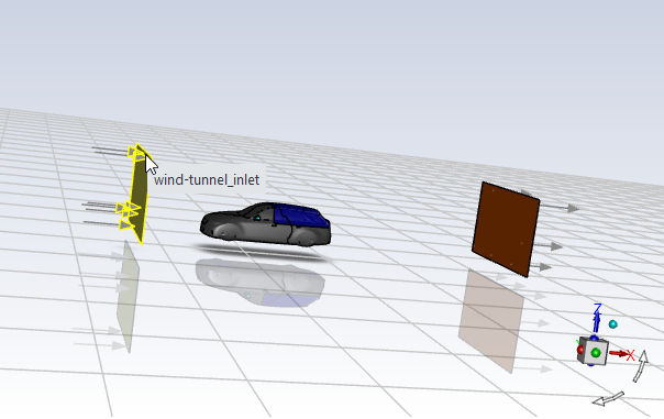
If you have Hover-Over Highlight enabled under Selections in the Appearance branch of Preferences (accessed by selecting Preferences... in the File ribbon tab), then as you move the cursor over your model (with the mesh displayed) you will notice that the edges of the face you are hovering over are highlighted and the name of that surface is displayed in a tooltip, as shown in Figure 1.4: Hover-Over Highlight. You can control the thickness of the highlighted or selected edges using the Edge Thickness field, and the overall appearance of highlighted/selected surface using the Front Edge Transparency field (both listed under Selections in Preferences).
Using context menus in the graphics window you can access and modify settings directly on the model. Figure 1.5: Graphics Window Context Menu: Single-Selection and Figure 1.6: Graphics Window Context Menu: Multiple-Selection demonstrate some of the options available via right-click. You can make multiple selections on the displayed graphics object by holding Ctrl. Quickly Coloring Surfaces by Field Variable Value contains more information on some of the right-click options.
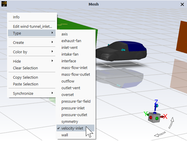
Figure 1.5: Graphics Window Context Menu: Single-Selection shows right-clicking the inlet (selection highlighted in green) and specifying it as a velocity-inlet.
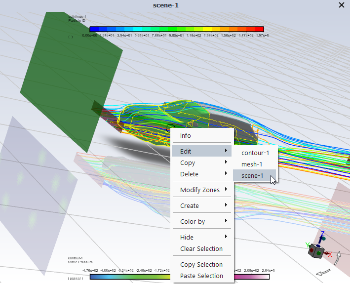
Figure 1.6: Graphics Window Context Menu: Multiple-Selection shows right-clicking the object when multiple surfaces are selected and a scene is displayed.
Note: There are a few situations where a right-click in the graphics window will not open a context menu:
Right-mouse-button click (RMB Click) is set as Probe and you right-click on the model when nothing is selected.
Right-mouse-button click (RMB Click) is set as Zoom or Fit to Window.
The graphics window is "reserved", that is, a window Fluent automatically generates while the solver is running (indicated by a gray Fluent icon
 ). The reserved windows include residuals (Printing and Plotting Residuals), report plots (Report Files and Report Plots), and animation
definitions (Creating an Animation Definition).
). The reserved windows include residuals (Printing and Plotting Residuals), report plots (Report Files and Report Plots), and animation
definitions (Creating an Animation Definition).
For additional information on mouse button settings, see Controlling the Mouse Button Functions.
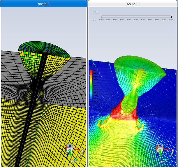
In Figure 1.7: Displaying Two Graphics Windows, two graphics windows are displayed by right-clicking the top of the graphics window and selecting SubWindow View, then creating two graphical displays and fitting them in the space accordingly.
In Figure 1.7: Displaying Two Graphics Windows, two graphics windows are displayed by right-clicking the top of the graphics window and selecting SubWindow View, then creating two graphical displays and fitting them in the space accordingly.
The Display Options dialog box (see Display Options Dialog Box) can be used to change the attributes of the graphics window or to open another graphics window.
Important: To cancel a display operation, press Ctrl+c while the data is being processed in preparation for graphical display. You cannot cancel the operation after the program begins to draw in the graphics window.
Important: It is possible that the graphics window may become [Out of Date] (which would be indicated at the top of the graphics window), if you make changes to items that are already displayed. To resolve this out of date state, right-click in the graphics window and click Refresh Display in the context menu that appears.
If a context menu does not appear on a right-click of the graphics window, ensure that the right-mouse button is set to an action other than Zoom, Probe, or Fit to Window. Confirm and/or change mouse mappings in the Navigation branch of Preferences (File > Preferences...).
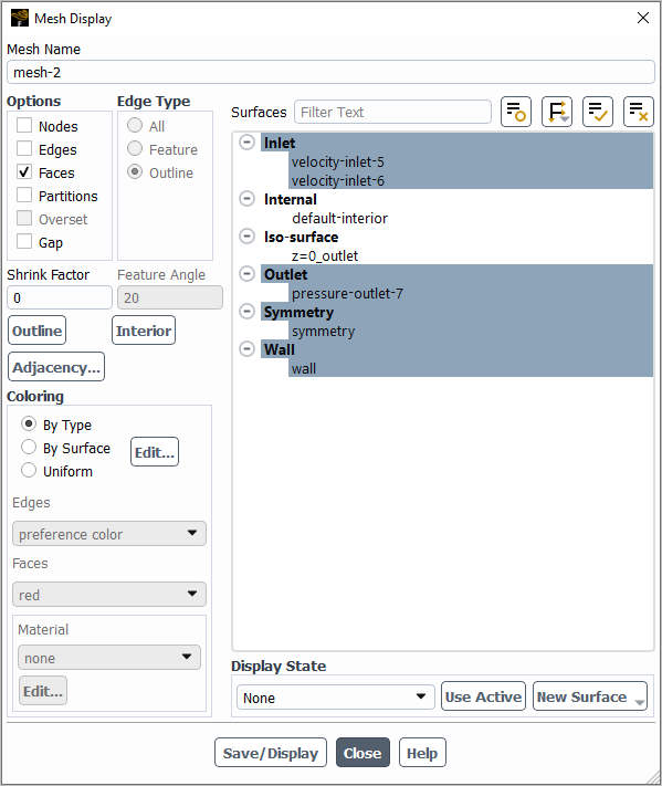
For the refresh of a mesh display, Fluent displays the surfaces
that are currently selected in the global Mesh Display
dialog box (accessed by clicking  in the toolbar). In some instances this may result in the
refreshed display not matching what was originally displayed.
in the toolbar). In some instances this may result in the
refreshed display not matching what was originally displayed.
Copy to Clipboard
Right-clicking the graphics window tab allows you to select Copy to Clipboard. This places a copy of the current picture displayed in the selected graphics window tab onto your clipboard. The size of your graphics window affects the size of the text fonts used in the picture.
The search bar (upper right of the Fluent window or via Ctrl + F) allows you to quickly locate the commands or controls that you are looking for. Clicking the search results is equivalent to clicking the same control in the ribbon. Hovering over a search result highlights the location of the control in the ribbon. Clicking a text command search result automatically enters the text of the command, but it does not execute the command; you still have to press Enter in the console to execute the text command.
The Fluent GUI includes toolbars located within the application window. These toolbars provide shortcuts to performing common tasks in Fluent. The toolbars include a standard toolbar and an objects toolbar.
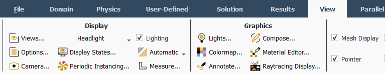
You can control which toolbars appear in the graphics window by enabling or disabling them in the Graphics Toolbars group box of the View ribbon tab (Figure 1.8: The View Ribbon Tab).
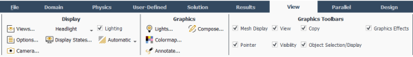
The standard toolbar (Figure 1.9: The Standard Toolbar) contains options for getting help, arranging the graphical user interface, and visiting the Ansys website.

The following is a brief description of each of the standard toolbar options:
Help
 allows you to access the Fluent User's Guide for help
topics, as well as additional learning resources. For more information,
see Using the Help System.
allows you to access the Fluent User's Guide for help
topics, as well as additional learning resources. For more information,
see Using the Help System.Arrange the workspace
 provides you with several application window layout
options. For example, you can choose to have the console docked in the
Messages dialog box with the warning and error
messages, allowing for a larger graphics window. These options also
allow you to return to a standard layout if you accidentally rearrange
(by dragging and dropping, or closing elements) the workspace in an
undesirable manner.
provides you with several application window layout
options. For example, you can choose to have the console docked in the
Messages dialog box with the warning and error
messages, allowing for a larger graphics window. These options also
allow you to return to a standard layout if you accidentally rearrange
(by dragging and dropping, or closing elements) the workspace in an
undesirable manner.Link to the Ansys Website
 opens a link to the Ansys home page in your
default browser.
opens a link to the Ansys home page in your
default browser.

The following tools are available in the graphics toolbar:
The mesh display configuration options (Figure 1.11: Mesh Display) contains predefined settings for how a mesh and objects are displayed.

The following is a brief description of the mesh display tools:
Mesh Display
opens the Mesh Display Dialog Box.Front Faces Transparent
 makes the front faces of the displayed object
transparent, allowing you to see inside.
makes the front faces of the displayed object
transparent, allowing you to see inside.
The pointer tools (Figure 1.12: The Pointer Tools) allow you to modify the way in which you view your model or select objects in the graphics window.

The following is a description of each of the pointer tools:
Box Select
 lets you select surfaces by box-selecting, that
is clicking and dragging the mouse from left-to-right or
right-to-left over your model. For more information, see Controlling the Mouse Button Functions.
lets you select surfaces by box-selecting, that
is clicking and dragging the mouse from left-to-right or
right-to-left over your model. For more information, see Controlling the Mouse Button Functions.Rotate View
 lets you rotate your model about a central
point in the graphics window. For more information, see Controlling the Mouse Button Functions.
lets you rotate your model about a central
point in the graphics window. For more information, see Controlling the Mouse Button Functions.Pan
 allows you to pan horizontally or vertically
across the view using the left mouse button. For more information,
see Controlling the Mouse Button Functions.
allows you to pan horizontally or vertically
across the view using the left mouse button. For more information,
see Controlling the Mouse Button Functions.Zoom In/Out
 allows you to zoom in to and out of the model
by holding the left mouse button down and moving the mouse down or
up. For more information, see Controlling the Mouse Button Functions. You can also roll the view by
holding the left mouse button down and moving the mouse left or
right.
allows you to zoom in to and out of the model
by holding the left mouse button down and moving the mouse down or
up. For more information, see Controlling the Mouse Button Functions. You can also roll the view by
holding the left mouse button down and moving the mouse left or
right.Important: If you want to zoom in or out while the solver is iterating, click
to assign Zoom In/Out
to the left-mouse-button prior to beginning the calculation.
Roll zoom, using the middle scroll wheel, does not
work while the solver is running.Zoom to Area
 allows you to focus on any part of your model.
After selecting this option, position the mouse pointer at a corner
of the area to be magnified, hold down the left mouse button and
drag open a box to the desired size, and then release the mouse
button. The enclosed area will then fill the graphics window. Note
that you must drag the mouse to the right in order to zoom in. To
zoom out, you must drag the mouse to the left. For more information,
see Controlling the Mouse Button Functions.
allows you to focus on any part of your model.
After selecting this option, position the mouse pointer at a corner
of the area to be magnified, hold down the left mouse button and
drag open a box to the desired size, and then release the mouse
button. The enclosed area will then fill the graphics window. Note
that you must drag the mouse to the right in order to zoom in. To
zoom out, you must drag the mouse to the left. For more information,
see Controlling the Mouse Button Functions.Probe - Print information about selected item
 allows you to select items from the graphics
windows and request information about displayed scenes. This behaves
as a probe button. When you hover-over postprocessing graphics
objects like contours, Fluent prints the name of the surface, the
name of the graphics object, and the value of the displayed
variable. For more information on clicking to probe, see Controlling the Mouse Button Functions.
allows you to select items from the graphics
windows and request information about displayed scenes. This behaves
as a probe button. When you hover-over postprocessing graphics
objects like contours, Fluent prints the name of the surface, the
name of the graphics object, and the value of the displayed
variable. For more information on clicking to probe, see Controlling the Mouse Button Functions.Note: (Parallel only) In some instances, the location selected using the mouse-probe in the graphics window may vary substantially from the location the code selects as the corresponding surface vertex. To make the mouse-probe and corresponding surface vertex match more closely, as they do when running with a single processor, disable the Remove Partition Lines option in the Graphics branch of Preferences (File > Preferences...).
Important: For hover-over probe to work, Hover-Over Probe Values must be enabled in Preferences (located in the Appearance branch under Selections).
Hover Probe Limitations
Not supported for global graphics objects (except for mesh) - these objects are hidden from the interface by default.
Pathline and Vector graphics objects must be re-displayed after enabling the Hover-Over Probe Values option in Preferences, for the hover probe functionality to work.
Vectors that are a part of a mirror plane or periodic repeat display are not highlighted when their value is shown.
Pathlines:
The probe value will appear sometimes even when the probe marker is not directly on the pathline, but near to it.
When included in a scene, probe values are not available for pathlines.
Probe is not showing the surface name.
Note: You can use Ctrl+Shift+C to copy a screenshot of the graphics window to the clipboard, which allows you to capture an image that includes the hover probe value.
The view tools (Figure 1.13: The View Tools) allow you to modify the way your model is displayed in the graphics window.

The following is a description of each of the view tools:
 shows the 3D object on your 2D screen
approximately how your eye would see it in real life. This button is
only available when running Fluent in 3D.
shows the 3D object on your 2D screen
approximately how your eye would see it in real life. This button is
only available when running Fluent in 3D. shows 3D objects to scale, ignoring perspective
view. When enabled, it makes it so the ruler is
accurate. This button is only available when running
Fluent in 3D.
shows 3D objects to scale, ignoring perspective
view. When enabled, it makes it so the ruler is
accurate. This button is only available when running
Fluent in 3D.Note: When Orthographic is selected for Graphics view in Preferences (Appearance branch), an additional Ruler option appears. Enabling Ruler makes it so that the ruler is displayed whenever the view is changed to orthographic. You can still disable the ruler by toggling the ruler button
 ).
).Fit to Window
 adjusts the overall size of your model to take
maximum advantage of the graphics window’s width and
height.
adjusts the overall size of your model to take
maximum advantage of the graphics window’s width and
height.Last View
 allows you to revert to the displayed objects
previous location and orientation in the graphics window.
allows you to revert to the displayed objects
previous location and orientation in the graphics window.Next View
 allows you to revert to the displayed objects
previous location and orientation in the graphics window.
allows you to revert to the displayed objects
previous location and orientation in the graphics window.Set view
 contains a drop-down of views, allowing you to
display the model from the direction of the vector equidistant to
all three axes, as well as in different axes orientations.
contains a drop-down of views, allowing you to
display the model from the direction of the vector equidistant to
all three axes, as well as in different axes orientations.Synchronize Views
 synchronizes the views of the displayed
graphics objects in all the open graphics windows to that of the
active graphics window. Graphics manipulations such as panning and
zooming performed in one window are simultaneously performed in the
other linked graphics windows.
synchronizes the views of the displayed
graphics objects in all the open graphics windows to that of the
active graphics window. Graphics manipulations such as panning and
zooming performed in one window are simultaneously performed in the
other linked graphics windows.Note: Any graphics windows opened after the is clicked will not by synchronized by default. To synchronize newly opened windows with the other windows that are already linked, right-click in the window and select Synchronize > Add this window from the context menu that appears.
The visibility tools (Figure 1.14: The Visibility Tools) allow you to modify the appearance of objects in the graphics window.

The following is a brief description of each of the visibility tools:
Axes Visibility
 turns the axes display on and off.
Ruler Visibility
turns the ruler on and off. When enabled, it
switches the view to orthographic (if it was
previously set to perspective).Titles Visibility
 turns the titles display on and off.
Boundary Markers
 enables/disables boundary markers at inlets and
outlets when the mesh is displayed.
enables/disables boundary markers at inlets and
outlets when the mesh is displayed.
The copy tools (Figure 1.15: The Copy Tools) allow you to copy an image of the graphics window to the clipboard and capture an image of the graphics window.
The following is a brief description of each of the copy tools:
Copy to Clipboard
 copies the current picture displayed in the
selected graphics window tab onto your clipboard. You can use
Ctrl+Shift+C
as a shortcut for this copy operation.
copies the current picture displayed in the
selected graphics window tab onto your clipboard. You can use
Ctrl+Shift+C
as a shortcut for this copy operation.Save Picture
 allows you to capture an image of the active
graphics window. For more information, see Saving Picture Files.
allows you to capture an image of the active
graphics window. For more information, see Saving Picture Files.
The object selection/display tools (Figure 1.16: The Object Selection/Display Tools) allow you to modify the selection and display of objects in the graphics window.

The following is a brief description of each of the object selection/display tools:
Show All
 redisplays all hidden surfaces.
Hide Selected Surfaces
 hides the selected surfaces from the
display.
hides the selected surfaces from the
display.Make Selected Surfaces Transparent
 makes any selected surfaces transparent. This
operation is additive, so if you select surfaces and click this
button, then select more surfaces and click it again, the second set
of surfaces will also be made transparent. Clicking this button when
no surfaces are selected removes all transparencies applied by this
tool. Clicking this button when the selected surface is already
transparent (from prior use of this button) removes the applied
transparency from the selected surface.
makes any selected surfaces transparent. This
operation is additive, so if you select surfaces and click this
button, then select more surfaces and click it again, the second set
of surfaces will also be made transparent. Clicking this button when
no surfaces are selected removes all transparencies applied by this
tool. Clicking this button when the selected surface is already
transparent (from prior use of this button) removes the applied
transparency from the selected surface.Note: Transparencies applied by this tool are temporary—they are not captured when you use the Save as Scene option available in the right-click context menu of the graphics window, nor are they saved in the case file.
Clear Selection
 deselects the currently-selected surfaces in
the graphics window. It will also remove any measurements that are
displayed.
deselects the currently-selected surfaces in
the graphics window. It will also remove any measurements that are
displayed.
The graphics effects tools (Figure 1.17: The Graphics Effects Tools) allow you to control which graphics effects are shown in the graphics window.

The following is a brief description of each of the graphics effects tools:
Reflections
 redisplays all hidden surfaces.
Shadows
 controls which shadowing effects are
shown:
controls which shadowing effects are
shown:Static Shadows
 is the shadow of the model on the
ground plane.
is the shadow of the model on the
ground plane.Dynamic Shadows
 is the shadow of the model on itself.
These shadows are updated as the model is rotated.
This graphics effect may result in reduced
graphics performance.
is the shadow of the model on itself.
These shadows are updated as the model is rotated.
This graphics effect may result in reduced
graphics performance.
Grid Plane
 shows/hides the ground plane grid that is
displayed beneath the model.
shows/hides the ground plane grid that is
displayed beneath the model.
The additional display options (Figure 1.18: Additional Display Options) lets you control which surfaces are selected in the graphics window.
The following is a description of the additional display option:
Filter Selected Surfaces
 lets you predefine which surfaces will be
selected with a "box select" action or filter the surfaces that are
already selected by a box select action. The
mouse-multi-select,
mouse-multi-select-add and
mouse-multi-select-toggle options for
mouse controls allow you to perform box selection in the
graphics window.
lets you predefine which surfaces will be
selected with a "box select" action or filter the surfaces that are
already selected by a box select action. The
mouse-multi-select,
mouse-multi-select-add and
mouse-multi-select-toggle options for
mouse controls allow you to perform box selection in the
graphics window.
Task pages appear on the right side of the tree when certain branches are double-clicked. They provide access to more advanced settings than are often available through a right-click of the same branch or sub-branches. The expected workflow is that you travel down the tree, using a right-click most branches and sub-branches to access the settings and controls required for to solve your problem.
Some of your setup will occur in dialog boxes, while others in task pages. For example, if you double-click General in the tree, the General Task Page is displayed. Global settings are made in this task page, which are saved to the case definition.
Each task page has a button. Clicking this button opens the related help topic in the Task Page Reference Guide. See Using the Help System for more information.
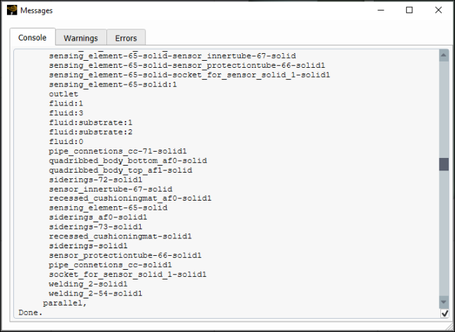
The console is typically located below the graphics window, as shown in Figure 1.1: The GUI Components. However, you can move the console to have
it in you preferred location, such as tabbed with the graphics window or docked as a
tab within the Messages dialog box (Figure 1.19: Messages Dialog Box with Tabs for Console, Warnings, and Errors). Dock the console by selecting the
Console>In Message Window option from the
"arrange the workspace" drop-down ( ) in the upper-right of the Fluent application
window.
Fluent communicates with you through the console. It is used to display various kinds of information (that is, messages relating to meshing or solution procedures, and so on). Console text is colored based on whether it is user-input, standard output, or a warning message. Fluent saves a certain amount of information that is written to the console into memory. You can review this information at any time by using the scroll bar on the right side of the console. You can enable/disable autoscrolling using the check box at the bottom right of the console to either have the cursor jump to the latest printed content or stay where it is. The size of the console can be adjusted by raising or lowering the bottom frame of the graphics window.
The console is similar in behavior to “xterm” or other Linux command shell tools, or to the MS-DOS Command Prompt window on Windows systems. It allows you to interact with the text user interface (TUI) menu. More information on the TUI can be found in Text User Interface (TUI).
The console accepts a “break” command (pressing Ctrl+c at the same time) to let you interrupt the program while it is working. It also lets you perform text copy and paste operations between the console and other X Window (or Windows) applications that support copy and paste. The following steps show you how to perform a copy and paste operation on a Windows system:
Move the pointer to the beginning of the text to be copied.
Press and hold down the left mouse button.
Move the pointer to the end of the text (text should be highlighted).
Release the left mouse button.
Press the Ctrl and
<Insert>keys at the same time.Move the pointer to the target window and click the left mouse button.
Press the Ctrl+v keys at the same time.
On a Linux system, you will follow the steps below to copy text to the clipboard:
Move the pointer to the beginning of the text to be copied.
Press and hold down the left mouse button.
Move the pointer to the end of the text (text should be highlighted).
Release the left mouse button.
Move the pointer to the target window.
Press the middle mouse button to “paste” the text.
Warning and Error Messages
In addition to being printed in the console, warning and error messages are also
available for easier review in separate Warning and
Error dialog boxes. These messaging dialog boxes can be
opened by clicking the warning ( ) and error (
 ) icons in the upper right of the console. When new messages are
printed in the console, the icons are highlighted (
) icons in the upper right of the console. When new messages are
printed in the console, the icons are highlighted ( ,
,  ), indicating that there are new messages for review. The
messages printed in the dialog box are hyperlinks to the location where they appear
in the Console. Note that clearing the messages from the
Warning and Error dialog boxes
does not remove them from the Console or transcript.
), indicating that there are new messages for review. The
messages printed in the dialog box are hyperlinks to the location where they appear
in the Console. Note that clearing the messages from the
Warning and Error dialog boxes
does not remove them from the Console or transcript.
When the console is docked with the warnings and errors messages in the Messages dialog box, the icon indicating a new warning or error is located at the bottom-right of the Fluent application window in the status bar. Messages such as when the system is ready after reading the mesh/case are printed to the status bar.
Note: The console has a 30,000 line retention limit. Once the number of lines passes 30,000, the auto-scroll checkbox (lower right of the Console) no longer has an effect.
There are two types of dialog boxes in Fluent. Some dialog boxes are used to perform simple input/output tasks, such as issuing warning and error messages, or asking a question requiring a yes or no answer. Other forms of dialog boxes allow you to perform more complicated input tasks.
A dialog box is a separate “temporary” window that appears when Fluent needs to communicate with you, or when various types of input controls are employed to set up your case. The types of controls you will see are described further in this section.
When you have finished entering data in a dialog box’s controls, you must apply the changes you have made, or cancel the changes, if desired. For this task, each dialog box falls into one of two behavioral categories, depending on how it was designed.
The first category of dialog boxes is used in situations where it is desirable to apply the changes and immediately close the dialog box. This type of dialog box includes an and a button that function as described below:
applies any changes you have made to the dialog box, then closes the dialog box.
closes the dialog box, ignoring any changes you have made.
An example of this type of dialog box is shown in the following figure:
The other category of dialog boxes is used in situations where it is desirable to keep the dialog box displayed on the screen after changes have been applied. This makes it easy to quickly go back to that dialog box and make more changes. Dialog boxes used for postprocessing and mesh adaption often fall into this category. This type of dialog box typically includes an button and a button as described below:
applies any changes you have made to the dialog box, but does not close the dialog box. The name of this button is often changed to something more descriptive. For example, many of the postprocessing dialog boxes use the name for this button, and the adaption dialog boxes use the name .
closes the dialog box.
An example of this type of dialog box is shown in the following figure:
All dialog boxes include the following button used to access Ansys Help:
displays information about the controls in the dialog box. The information appears on the Ansys help site.
Many dialog boxes also present additional buttons to accomplish specific tasks or open additional dialog boxes. You can find descriptions of the functions of these additional buttons in Ribbon Reference Guide or Task Page Reference Guide.
Note: Dialog boxes containing lists are expandable.
Each type of input control utilized by the dialog boxes is described below. Note that the examples shown here are for a Windows system; if you are working on a Linux system, your dialog box controls may look slightly different, but they will work exactly as described here.

Much like the tabs on a notebook divider, tabs in dialog boxes are used to mark the different sections into which a dialog box is divided. A dialog box that contains many controls may be divided into different sections to reduce the amount of screen space it occupies. You can access each section of the dialog box by “clicking” the left mouse button on the corresponding tab. A click is one press and release of the mouse button.

A button, also referred to as a push button, is used to perform a function indicated by the button label. To activate a button, place the pointer over the button and click the left mouse button.

A check box, also referred to as a check button, is used to enable / disable an item or action indicated by the check box label. Click the left mouse button on the check box to toggle the state.
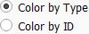
Radio buttons are a set of check boxes with the condition that only one can be set in the “on” position at a time. When you click the left mouse button on a radio button, it will be turned on, and all others will be turned off. Radio buttons appear either as diamonds (in Linux systems) or as circles (as shown above).
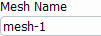
A text entry box lets you type text input. It will often have a label associated with it to indicate the purpose of the entry.
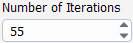
An integer number entry box is similar to a text entry except it only
allows integer numbers to be entered (for example, 10, -10, 50000 and 5E4).
You may find it easier to enter large integer numbers using scientific
notation. For example, you could enter 350000 or
3.5E5.
The integer number entry also has arrow buttons that allow you to easily increase or decrease its value. For most integer number entry controls, the value will be increased (or decreased) by one when you click an arrow button. You can increase the size of the increment by holding down a keyboard key while clicking the arrow button. The keys used are shown below:
| Key | Factor of Increase |
|---|---|
| Shift |
10
|
| Ctrl |
100
|

A real number entry box is similar to a text entry, except it only allows real numbers to be entered (for example, 10, -10.538, 50000.45 and 5.72E-4). In most cases, the label will show the units associated with the real number entry.

The filter text entry box allows you to search and organize a list using a
text string. The text string can include wildcards and regular expressions,
which allow you to perform pattern matching. For example, searching
*let* finds surfaces such as
inlets and outlets, including
those with longer names, such as "upper-inlet-5". If you have walls
separated by a number, you can search
example-wall-?-23, which would show
example-wall-1-23,
example-wall-2-23, and so on.
Filtering begins as soon as you enter text. Clicking Enter expands any sub-branches containing matches to the entered string.
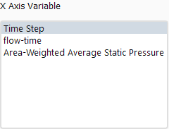
A single-selection list presents a list of items, with each item printed on a separate line. You can select an item by placing the pointer over the item line and clicking with the left mouse button. The selected item will become highlighted. Selecting another item will deselect the previously selected item in the list.
Many dialog boxes will also accept a double-click in order to invoke the dialog box action that is associated with the list selection (see information on the dialog box of interest for more details).
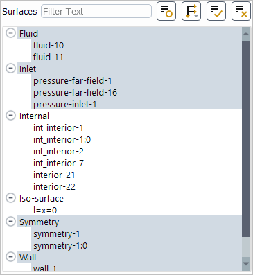
A multiple-selection list is similar to a single-selection list, except it allows for more than one selected item at a time. When you click the left mouse button on an item, its selection state will toggle. Clicking an unselected item will select it. Clicking a selected item will deselect it.
To select a range of items in a multiple-selection list, you can select the first desired item, and then select the last desired item while holding down the Shift key. The first and last items, and all the items between them, will be selected. You can also click and drag the left mouse button to select multiple items.
Note: As you hover over surface names in a Surfaces list, the corresponding surface edges will be highlighted in the graphics window (as long as you have the mesh outline displayed and Hover-Over Highlight enabled in the Appearance branch of Preferences). Refer to Figure 1.4: Hover-Over Highlight for an example of how the surfaces appear when highlighted.
There are several small buttons in the upper right corner of the multiple selection list to accelerate selecting or deselecting items from the selection list.
Click
 to display all of the items that are currently
selected.
to display all of the items that are currently
selected.Click
 or
or  to toggle to a tree view of the selection list,
and thereby group items by categories such as name or surface type.
You can select or deselect all the items in a particular group by
clicking the top-level branch. For example, if you have the surfaces
grouped by Surface Type, clicking
Inlet will select or deselect all inlets.
Note that once you switch to a tree view, the icon changes to
to toggle to a tree view of the selection list,
and thereby group items by categories such as name or surface type.
You can select or deselect all the items in a particular group by
clicking the top-level branch. For example, if you have the surfaces
grouped by Surface Type, clicking
Inlet will select or deselect all inlets.
Note that once you switch to a tree view, the icon changes to  or
or  , respectively.
Click
 to select all the items displayed in the
selection list.
to select all the items displayed in the
selection list.Click
 to deselect all the items displayed in the
selection list.
to deselect all the items displayed in the
selection list.
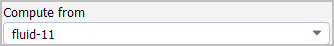
A drop-down list is a hidden single-selection list that shows only the current selection to save space.
When you want to change the selection, follow the steps below:
Click the arrow button to display the list.
Place the pointer over the new list item.
Click the left mouse button on the item to make the selection and close the list.
If you want to stop the selection operation while the list is displayed, you can move the pointer anywhere outside the list and click the left mouse button.
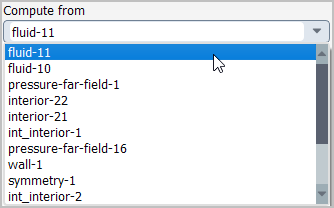
A scale is used to select a value from a predefined range by moving a slider. The number shows the current value. You can change the value by clicking the arrow buttons, or by following one of the procedures below:
Place the pointer over the slider.
Press and hold down the left mouse button.
Move the pointer along the slider bar to change the value.
Release the left mouse button.
or
Place the pointer over the slider and click the left mouse button.
Using the arrow keys on the keyboard, move the slider bar left or right to change the value.
The following sections describe the various types of dialog boxes.
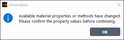
The Information dialog box is used to report some information that Fluent thinks you should know. After you have read the information, you can click the button to close the dialog box.
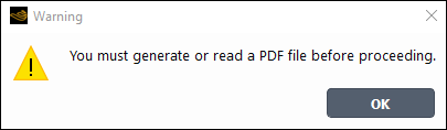
The Warning dialog box is used to warn you of a potential problem or deliver an important message. Your control of Fluent will be suspended until you acknowledge the warning by clicking the button.
Note: All warnings are available for review in the
Warning dialog box that you can access by
clicking the warning icon ( ) in the upper-right of the console.
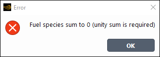
The Error dialog box is used to alert you of an error that has occurred. After you have read the error information, you can click the button to close the dialog box.
Note: All errors are available for review in the Error
dialog box that you can access by clicking the error icon ( ) in the upper-right of the console.
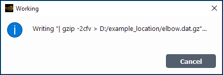
The Working dialog box is displayed when Fluent is busy performing a task. This is a special dialog box, because it requires no action by you. It is there to let you know that you must wait. When the program is finished, it will close the dialog box automatically. You can, however, abort the task that is being performed by clicking the button.
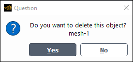
The Question dialog box is used to ask you a question. Sometimes the question will require a Yes or No answer, while other times it will require that you either allow an action to proceed () or Cancel the action. You can click the appropriate button to answer the question.
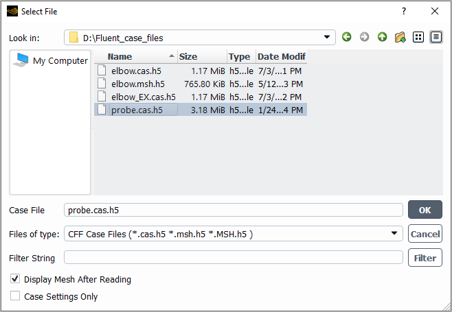
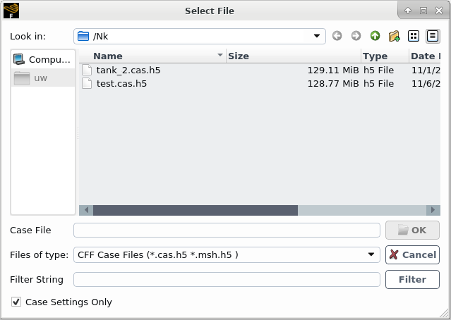
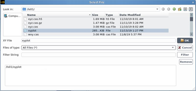
File selection is accomplished using the Select File dialog box (Figure 1.21: The Select File Dialog Box for Windows or Figure 1.22: The Select File Dialog Box for Linux Platforms).
For Linux systems, note that the appearance of the Select File dialog box will not always be the same.
The version shown in Figure 1.22: The Select File Dialog Box for Linux Platforms will appear in almost all cases, but it will be different if you are loading external data files for use in an XY plot (see Including External Data in the Solution XY Plot for more information). In such cases, the dialog box will look like Figure 1.23: Another Version of the Select File Dialog Box for Linux Platforms.
The steps for selecting a file are as follows:
Go to the appropriate directory. You can do this in two different ways:
Enter the path to the directory in the Look in: field.
Double-click a directory, and then a subdirectory, and so on, in the Name list until you reach the directory you want. You can also click once on a directory and then click the button, instead of double-clicking.
Note: If you are accessing a file using a Universal Naming Convention (UNC) path, you must ensure that you have permission to access to all of the folders in the path or you will not be able to open the file.
Specify the file name by selecting it in the Name list or entering it in the File text entry box. The name of this text entry box changes depending on the type of file you are selecting (Case File, Journal File, and so on).
Important: Note that if you are searching for an existing file with a nonstandard extension, you may need to modify the file filter by selecting a different type in the Files of type: drop-down list. For example, if you are reading a data file, only those files that have a
*.dat*extension will appear in the Name list.If you want all files in the directory to be listed in the Name list, select All Files (*) from the Files of type: drop-down list.
If you are reading a mesh or case file, use the Display Mesh After Reading option to specify whether you want Fluent to automatically display the mesh after the file is read. All of the boundary zones will be displayed, except for the interior zones of 3D geometries. The default status of this option (that is, enabled or disabled) is determined by your decision regarding the Display Mesh After Reading option in Fluent Launcher.
If you are reading a mesh or case file with a large cell count, enable the Case Settings Only option if you want to read the case settings only, without any of the data associated with the mesh. This allows you to review and/or modify the settings without having to wait for the reading of the mesh, on a machine that does not have the memory needed for the mesh (such as a personal computer or laptop). For further details, see Reading Settings Only for Mesh or Case Files with Large Cell Counts.
If you are reading multiple data files (for example, XY plots), the selected file will be added to the list of files shown at the bottom of the dialog box. Each file you select in the Name list is automatically added to the list of selected files. (If you accidentally select the wrong file, you can select it in the list and click .) Repeat until all of the desired files are in the list.
If you are writing a case, data, or radiation file, use the Write Binary Files check box to specify whether the file should be written as a text or binary file. You can read and edit a text file, but it will require more storage space than the same file in binary format. Binary files take up less space and can be read and written by Fluent more quickly. For further details, see Binary Files.
Click the button to read or write the specified file.
The "quick properties" editor allows you to specify certain key properties of selected boundaries directly in the graphics window without having to open the full version of relevant dialog box, as shown in Figure 1.24: Quick Editor for a Velocity Inlet.
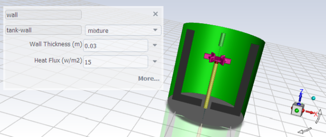
To access this functionality, enable Show quick property view in the Appearance branch of Preferences.
File → Preferences... → Appearance → Show quick property view
With the feature enabled, the quick property editor will appear as soon as you select a boundary. Inputs to the quick property editor are saved as soon as you leave the field. If you decide that you want to view the full version of the dialog box, you can click More... at the bottom right of the editor.
For multiphase models, You can edit the mixture as well as the other phases, by changing the selected phase in the drop-down list.
Note: Settings changes made using the "quick-edit" property editor are printed in the console and saved with the transcript (if one is being written) including the previous value(s) and new value(s).