


In addition to the many graphics tools already discussed, Ansys Fluent also provides tools that enable you to generate XY plots and histograms of solution, file, profile, and residual data. You can modify the colors, titles, legend, and axis and curve attributes to customize your plots. The following sections describe the XY and histogram plotting features in Ansys Fluent.
- 40.11.1. Plot Types
- 40.11.2. XY Plots of Solution Data
- 40.11.3. Creating an XY Plot From Multiple Data Sources (Including Files)
- 40.11.4. XY Plots of Profiles
- 40.11.5. XY Plots of Circumferential Averages
- 40.11.6. XY Plot File Format
- 40.11.7. Residual Plots
- 40.11.8. Histograms
- 40.11.9. Modifying Axis Attributes
- 40.11.10. Modifying Curve Attributes
Data can be plotted in XY (abscissa/ordinate) form or histogram form. Each form is described below.
An XY (abscissa/ordinate) plot is a line and/or symbol chart of data. Virtually any defined variable or function is accessible for this type of plot. Furthermore, you may read in an externally-generated data file in order to compare your results with experimental data. You can also use the XY-plot facility to plot out profile data, the residual histories of variables, or the time histories if you have a transient problem.
Ansys Fluent provides tools for controlling many aspects of the XY plot, including background color, legend, and axis and curve attributes. Figure 40.109: Sample XY Plot shows a sample XY plot.
To differentiate the data being displayed, you can customize the pattern, color and weight of the data lines and the shape, color, and size of the data markers.
If you want to move or resize the legend, double-click it, then you can move and resize it using the left-mouse-button.
A histogram plot is a bar chart of data. It is a representation of a frequency of distribution by means of rectangles of widths representing class intervals and with areas proportional to the corresponding frequencies. Figure 40.110: Sample Histogram shows a sample histogram.
See Histogram Reports for information about printing histogram reports. For more information on histogram plots, see Histograms.
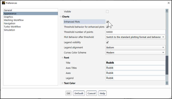
Enhanced plotting, enabled by default, allows you to zoom in/out on 2D plots, enable/disable curves, quickly query values at various points, and so on. The status of this plotting method is the controlled using the Enhanced Plots option in Preferences.
![]() File
→ Preferences...
File
→ Preferences...
Enhanced Plots provide the following interactions for 2D plots in the graphics window:
Enable/disable curves by clicking the associated colored square in the legend.
See values at any location along a plotted curve by hovering over the point of interest.
Note: The values shown on mouse-hover of Residual and Report Plot curves are not interpolated.
Zoom in/out on the plot using the mouse wheel or by using a box zoom with the left mouse button (drag from upper left to lower-right to zoom in and the opposite motion to zoom out).
Pan the plot using Ctrl + MMB (middle mouse button) + drag.
Fit the plot to the size of the graphics window by clicking the Fit to Window button (
 ) or by Ctrl +
A.
) or by Ctrl +
A.Edit the properties of a curve by double-clicking it in the plot window. Here you can edit properties like line thickness, marker style and so on. You can control the available colors using the Curves Color Scheme field in Preferences (Appearance branch).
Note: If you change the color scheme, the updated colors will only appear for new plots, so you will have to re-plot any existing plots to see the new color scheme applied.
Resize and scroll through the legend when the number of entries exceeds the size of the plot, allowing you to review all of the entries.
Edit axis properties by double-clicking the axis.
Control the color and fonts of the plot title, axis title, axes, and legend. If you want to move or resize the legend, double-click it, then you can move and resize it using the left-mouse-button.
You can control the default legend behavior, such as whether a legend is displayed and its location, using the Legend visibility and Legend Alignment fields in Preferences (Appearance branch).
Specify a threshold for the total number of plot points, after which, the plot can be reverted to the standard plot behavior to preserve performance. This is controlled by the Threshold behavior for enhanced plots, Threshold number of points, and Plot behavior after threshold fields in Preferences (Appearance branch).
Limitations
Annotations are not compatible with enhanced plots.
Solution animations of 2D enhanced plots are not compatible with the HSF image file format.
The Writing Systems available within the Fonts dialog box in Preferences are not supported with enhanced plots.
You can produce a very sophisticated XY plot by using data from several zones, surfaces, or files and modifying the axis and curve attributes. Using the capability for loading external data files, you can create plots that compare your Ansys Fluent results with data from other sources. To get further information about the solution, you can investigate the frequency of distribution of the data using a histogram (see Histograms).
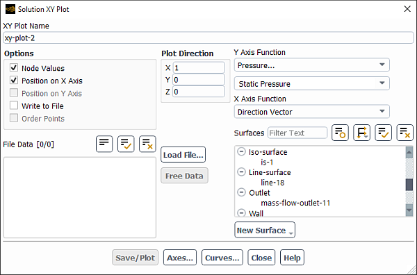
You can create an XY plot of solution data using the Solution XY Plot Dialog Box (Figure 40.112: The Solution XY Plot Dialog Box).
Named XY plot definitions can be saved for later use. See Creating and Using Contour Plot Definitions for additional information on graphics object definitions.
![]() Results → Plots
→ XY Plot
Results → Plots
→ XY Plot
![]() New...
New...
The basic steps for generating a solution XY plot are as follows:
Specify the variable(s) you are plotting:
To plot a variable on the y-axis as a function of position on the x-axis, enable the Position on X Axis option and choose the variable to be plotted on the y-axis in the Y Axis Function drop-down list. Select a category from the upper list and then choose the desired quantity in the lower list. For an explanation of the variables in the list, see Field Function Definitions.
To plot a variable on the x-axis as a function of position on the y-axis, enable the Position on Y Axis option and choose the variable to be plotted on the x-axis in the X Axis Function drop-down list.
To plot one variable as a function of another, turn off both the Position on X Axis and Position on Y Axis options and select the variables to be plotted in the X Axis Function and Y Axis Function drop-down lists.
Specify the plot direction:
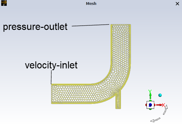
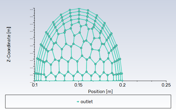
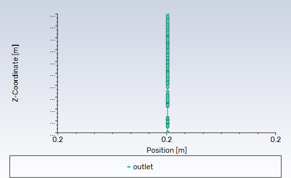
To plot a variable as a function of position along a specified direction vector, select Direction Vector in the X Axis Function or Y Axis Function drop-down list (whichever is the position axis), and specify the components of the direction vector for plotting under Plot Direction. The position axis of the plot is indicated by the selection of Position on X Axis or Position on Y Axis. The positions plotted will have coordinate values that correspond to the dot product of the data coordinate vector with the plot direction vector. For example, if you are plotting a variable at the pressure outlet of the geometry shown in Figure 40.113: Geometry Used for XY Plot, you would specify the Plot Direction vector (1,0,0) since you are interested in how the variable changes as a function of x. Figure 40.114: Data Plotted at Outlet Using a Plot Direction of (1,0,0) shows the resulting XY plot. (If you specified (0,1,0) as the plot direction, all variable values would be plotted at the same position (see Figure 40.115: Data Plotted at Outlet Using a Plot Direction of (0,1,0)), because the y value is the same at every point on the pressure outlet.)
It is also possible to plot a variable as a function of position along the length of a specified curvilinear surface. The curvilinear surface must be piecewise linear and it cannot contain more than one closed curve, such as a complete circle. To plot a variable in this way, select Curve Length in the X Axis Function or Y Axis Function drop-down list (whichever is the position axis). Then specify the plot direction along the surface: to plot the variable along the direction of increasing curve length, select Default under Plot Direction; to plot the variable in the direction of decreasing surface length, select Reverse. To check the direction in which the variable will be plotted along a surface, select the surface in the Surfaces list and click Show under Plot Direction. Ansys Fluent will display the selected surface in the graphics window, marking the start of the surface with a blue dot and the end of the surface with a red dot. Ansys Fluent will also display arrows on the surface showing the direction in which the variable will be plotted.
Note: When running the parallel version of Ansys Fluent, Curve Length is only supported when the curvilinear surface is contained within a single partition.
Choose the surface(s) on which to plot data in the Surfaces list. Note that if you are plotting a variable as a function of position along the length of a curvilinear surface, you can select only one surface in the Surfaces list.
Set any of the options described below, or modify the attributes of the axes or curves as described in Modifying Axis Attributes and Modifying Curve Attributes.
Click to generate the XY plot in the active graphics window.
If you want to modify XY plots with annotations (see Adding Text to the Graphics Window) you must first disable enhanced plotting (Enhanced Interactive Plots).
Note: Once created, you can re-display solution XY plots by right-clicking the desired plot in the Outline View tree (Results>Plots>XY Plot><plot-name>) and selecting Plot, Plot in (to specify which window), or Add to (to add this plot to another 2D plot). Note that if you are using the Add to option, it is your responsibility to make a meaningful plot by ensuring the plots have consistent units.
The options mentioned in Steps for Generating Solution XY Plots include the following.
You can include data from an external file in the solution XY plot to compare your results with experimental data.
You can also choose node or cell values to be plotted, and save the plot data to a file.
To add external data to your XY plot for comparison with your results, you must first ensure that any external data files are in the format described in XY Plot File Format. You can then load the file(s) by clicking on the Load File... button and specifying the file(s) to be read in The Select File Dialog Box. Once a file has been loaded, its title will appear in the File Data list. You can choose the data file(s) to be included in your plot from the titles in this list.
To remove a file from the File Data list, select it and then click .
In Ansys Fluent you can choose to display the computed cell-center values or values that have
been interpolated to the nodes, with boundary face values being displayed at
boundaries in either case, when available. By default, the Node
Values option is enabled and the interpolated values are
displayed. If you prefer to display cell-centered values, disable the
Node Values option. Node-averaged data curves may
be somewhat smoother than curves for cell values. If you want to
display cell-center values instead of boundary face values, then you
must set the plot/set-boundary-val-off to
yes, and disable Node
Values.
For face-only functions (for example, Wall Shear Stress), the cell values that are displayed for boundary zone surfaces will actually be the face values. These face values are more accurate, as face-only functions are computed on the faces and not on the cells. For these face-only functions, the cell values on postprocessing surfaces will display the values in the cell. For more information about cell values, see Cell Values.
If you are displaying the XY plot to show the effect of a porous medium or 2D fan boundary, to depict a shock wave, or to show any other discontinuities or jumps in the plotted variable, you should use cell values; if you use node values in such cases, the discontinuity will be smeared by the node averaging for graphics and will not be shown clearly in the plot.
Once you have generated an XY plot, you may want to save the plot data to a file. You can read this file into Ansys Fluent at a later time and plot it alone using the Plot Data Sources Dialog Box, as described in Creating an XY Plot From Multiple Data Sources (Including Files), or add it to a plot of solution data, as described above.
To save the plot data to a file, enable the Write to File option in the Solution XY Plot Dialog Box. The button will change to the Write... button. Clicking on the Write... button will invoke The Select File Dialog Box, in which you can specify a name and save a file containing the plot data. The format of this file is described in XY Plot File Format.
To sort the saved plot data in order of ascending x-axis value, enable the Order Points option in the Solution XY Plot Dialog Box before you click . This option is available only when the Write to File option is enabled.
You can produce XY plots using data contained in external files and combine them with data from in-session XY plots and report plots. The Plot Data Sources Dialog Box enables you to display data read from external files in an abscissa/ordinate plot form. The format of the plot file is described in XY Plot File Format.
You can create an XY plot combining data from multiple sources, including in-session report plots and data sourced from one or more external files, using the Plot Data Sources Dialog Box (Figure 40.116: The Plot Data Sources Dialog Box).
![]() Results → Plots
→ Data Sources
Results → Plots
→ Data Sources
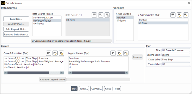
The steps for generating a file XY plot are as follows:
Select the files and/or plots that you want to display:
Click to select the file(s) you want to plot. Note that report files and
.xyfiles are supported (see XY Plot File Format for information on the.xyfile format).Click to select one or more XY Plot objects from the list of available objects.
Click to select on or more report plots from the list of available plots.
As soon as the files are loaded, the curves (plots) are all added to the Curve Information list.
For each data source, you can control which data set(s) are included from that source and what variables should be assigned to which axis.
Review the Curve Information list to ensure that the desired data sets are used and verify that variables are assigned to the axes you intend.
Selecting/de-selecting Y variables and Data Sets adds or removes them from the Curve Information list.
Click (to the right of Legend Names) to remove the selected curve(s) from the Curve Information list.
Modify legend names as needed. To modify a legend name:
Select a name in the Legend Names list.
Enter the new name in the text entry box to the right of the button.
Click .
You can control the appearance of the axes and curves by clicking or .
Provide names for the Title, Legend Label, X Axis Label and Y Axis Label in the Plots group box.
Click to generate an XY plot of the data listed in the Curve Information list.
(Optional) Click if you accidentally selected a plot that you did not intend or if you are done with a data set.
Note: Plots created using the Plot Data Sources dialog box will always be displayed in SI units.
Ansys Fluent enables two options for generating XY plots of data related to boundary profiles. Using the Plot Profile Data Dialog Box, you can plot the original data points from the profile file you have read into Ansys Fluent. Alternatively, you can plot the values assigned to the cell faces on the boundary after the profile file has been interpolated, by using the Plot Interpolated Data Dialog Box.
Important: Note that you must have valid data when trying to use the profile plotting options.
For more information about boundary profiles, see Profiles.
Once you have read a profile file, it is available for plotting by using the Plot Profile Data Dialog Box.
![]() Results →
Results → ![]() Plots →
Plots → ![]() Profile Data → Set Up...
Profile Data → Set Up...
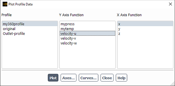
The procedure for generating an XY plot of the original profile data is as follows:
Select one of the profiles you have read from the Profile selection list.
Select a field of the profile from the Y Axis Function selection list.
Choose a variable against which you want to plot the field data, and select it from the X Axis Function selection list. The available variables will vary depending on the profile, and include x, y, z, r, and time.
Modify the attributes of the axes or curves as described in Modifying Axis Attributes and Modifying Curve Attributes.
Click to generate an XY plot of the profile field data.
To interpolate a profile you must first read a profile file for the case, and select a profile field in a boundary conditions dialog box (for example, the Velocity Inlet Dialog Box). After the flow solution has been initialized, the cell face values of the boundary zone can be plotted by using the Plot Interpolated Data Dialog Box.
![]() Results →
Results → ![]() Plots →
Plots → ![]() Interpolated Data → Set Up...
Interpolated Data → Set Up...
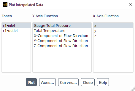
The procedure for generating an XY plot of the interpolated data is as follows:
Select a zone from the Zones selection list. Only the zones for which you have set a profile field as one or more of the parameters will be available in this list.
Select a profile-related parameter of the zone from the Y Axis Function selection list. The name of the parameter will be the same as that of the drop-down list in the boundary condition dialog box from which the profile field was selected.
Choose a variable against which you want to plot the field data, and select it from the X Axis Function selection list. The available variables are x, y, and (for 3D cases) z.
Modify the attributes of the axes or curves as described in Modifying Axis Attributes and Modifying Curve Attributes.
Click to generate an XY plot of the cell face values on the boundary.
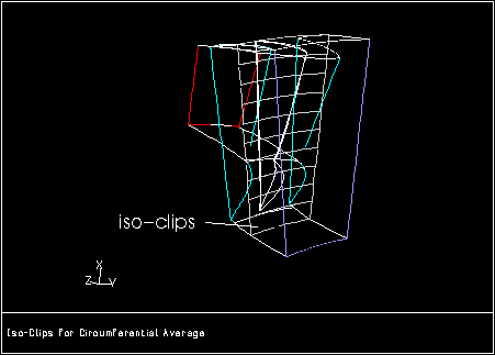
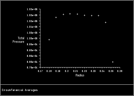
You can also generate a plot of circumferential averages in Ansys Fluent. This enables you to find the average value of a quantity at several different radial or axial positions in your model. Ansys Fluent computes the average of the quantity over a specified circumferential area using either area-weighted or mass-weighted averaging, and then plots the average against the radial or axial coordinate.
You can generate an XY plot of circumferential averages in the
radial direction using the circum-avg-radial text command:
plot → circum-avg-radial
or you can use the circum-avg-axial text command to generate an average in the axial direction:
plot → circum-avg-axial
The procedure for generating an XY plot of circumferential averages is as follows:
Specify the variable to be averaged by typing its name when Ansys Fluent prompts you for
averages of. You can press Enter to see a list of available variables.Choose the surface on which to plot data by typing its name when Ansys Fluent prompts you for
on surface.
Important:Use the Mesh Display Dialog Box to see a list of surfaces on which you can plot data. Pressing Enter will not show a list of available surfaces.
In 2D, use the interior volume to create the axial and radial bands and not an external zone surface. While this may have little impact on the results for area-weighted averaging, mass-weighted averaging would be 0 due to the absence of a flux on a constructed surface around the volume.
Specify the
number of bandsto be created. The default number of bands is 5.Ansys Fluent will create circumferential bands by isoclipping the specified surface into equal bands of radial or axial coordinate. An example of the iso-clips created is shown in Figure 40.119: Iso-Clips Created For Circumferential Averaging. The radial or axial coordinate is derived from the rotation axis of the Reference Zone specified in the Reference Values Task Page.
Specify whether Ansys Fluent uses area-weighted averaging (default) or mass-weighted averaging.
Ansys Fluent then computes the average of the variable for each band using the specified averaging method, as described in Computing Surface Integrals of the Theory Guide. Finally, it plots the average of the variable as a function of radial or axial coordinate. Figure 40.120: XY Plot of Circumferential Averages shows an example of an XY plot of circumferential averages using radial coordinates.
When the circumferential average plot is generated, Ansys Fluent also
creates a new surface called radial-bands or axial-bands, which contains the iso-clips
described above (see Figure 40.119: Iso-Clips Created For Circumferential Averaging).
You can use this surface to generate other XY plots. For more information
on the creation and manipulation of surfaces, see Creating Surfaces and Cell Registers for Displaying and Reporting Data.
If you want to customize the appearance of the axes or curves
in a circumferential average plot, you can save the plot data to a
file (using the plot-to-file text command,
as described in XY Plot File Format), read the file
into Ansys Fluent and plot it again (using the Plot Data Sources Dialog Box, as described in Creating an XY Plot From Multiple Data Sources (Including Files)), and then use the Axes Dialog Box and Curves Dialog Box (as described
in Modifying Axis Attributes and Modifying Curve Attributes) to modify the appearance of the
plot.
To save the plot data to a file, first use the plot-to-file text command to specify the name of the file.
plot → file-set → plot-to-file
Then generate the circumferential average XY plot as described above. Ansys Fluent will display the plot in the graphics window, and also save the plot data to the specified file.
The XY file format read or written by Ansys Fluent includes the following information:
The title of the plot
The label for the abscissa and the ordinate
Cortex variables and pairs of abscissa/ordinate data for each curve in the plot
The following sample file illustrates the XY file format:
(title "Velocity Magnitude")
(labels "Position" "Velocity Magnitude")

((xy/key/label "pressure-inlet-8")
  (xy/key/visible? #t)
  (xy/line/pattern "--")
  0.0000 230.097 0.
  0625 160.551
  0.1250 149.205
  ...
  0.5000 183.007
)
Similar to the case file format, parentheses bound the various
pieces of information in the formatted, ASCII file. The title (title " ") and labels (labels " ") must be first in the file, then each curve has information in the
form ((cxvar value) x y x y x y...), where
there may be zero or more Cortex variables defined for each curve.
You do not have to include Cortex variables to import your XY data. For example, you may want to import experimental data to compare with the Ansys Fluent solution. The following example would use the default Cortex variables in the code to define the data. After you import the file into Ansys Fluent, you could then use the Axes Dialog Box and the Curves Dialog Box to customize the XY plot, as described in Modifying Axis Attributes and Modifying Curve Attributes.
(title "Experiment, Run 11")
(labels "X, m" "Cp")
( 0 1.5
  1.5 1.3
  3.2 1.5
  5.1 1.2
)
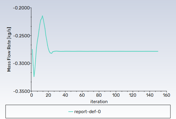
Residual history can be displayed using an XY plot. The abscissa of the plot corresponds to the number of iterations and the ordinate corresponds to the log-scaled residual values.
To plot the current residual history, click in the Residual Monitors Dialog Box.
![]() Solution → Monitors
→ Residuals
Solution → Monitors
→ Residuals
![]() Edit...
Edit...
For additional information about using the Residual Monitors Dialog Box to plot residuals, see Printing and Plotting Residuals.
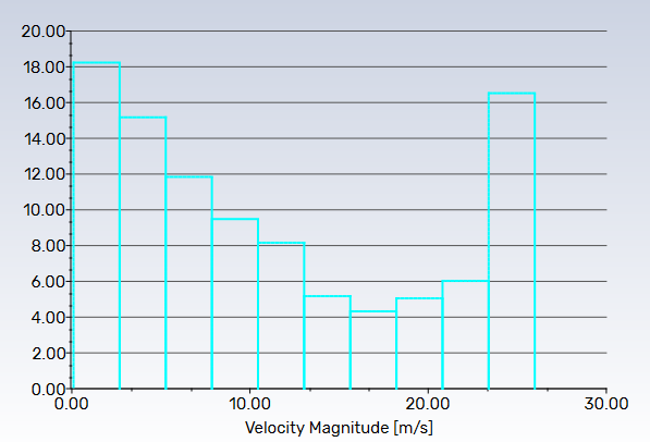
Histograms can be displayed in a graphics window using a bar chart (or printed in the console window, as described in Histogram Reports). The abscissa of the chart is the desired solution quantity and the ordinate is the percentage of the total number of cells.
You can create a histogram plot of solution data using the Histogram Dialog Box (Figure 40.121: The Histogram Dialog Box).
![]() Results → Plots → Histogram
Results → Plots → Histogram![]() Edit...
Edit...
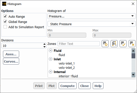
The steps for generating a histogram plot are as follows:
Choose the scalar quantity to be plotted in the Histogram of drop-down list. Select a category in the upper list and then select the desired quantity in the lower list. (See Field Function Definitions for an explanation of the variables in the list.)
Set the number of data intervals that will be plotted in the histogram in the Divisions field. By default there will be 10 intervals (“bars”) in the histogram plot to finer intervals, increase the number of Divisions. You may want to click to update the Min and Max fields when you are trying to decide how many divisions to plot.
Select the face or cell zone under Zones for which you want results plotted or printed. If all zones are selected, then the entire domain will be plotted. You can also plot histograms based on the selected Zone Types.
Set the option described below, if desired, or modify the attributes of the axes or curves as described in Modifying Axis Attributes and Modifying Curve Attributes.
Click to generate the histogram plot in the active graphics window.
Click to print out your histogram results on individual zones, or the entire domain. Similarly, you can click to calculate your histogram results on individual zones, or the entire domain.
In addition to the axis and curve attribute controls mentioned in the procedure above, the only other options for histogram plotting are the ability to specify a subrange of values to be plotted, and the ability to add histograms to your simulation reports.
By default, the range of values included in the histogram plot is automatically set to the range of values in the entire domain for the selected variable. If you want to focus in on a smaller range of values, you can restrict the range to be displayed.
To manually set the range of values, turn off the Auto Range option in the Histogram Dialog Box. The Min and Max fields will become editable, and you can enter the new range of values to be plotted. To show the default range at any time, click and the Min and Max fields will be updated.
You can also choose to base the minimum and maximum values on the range of values on the selected surfaces, rather than in the entire domain. To do this, turn off the Global Range option in the Histogram Dialog Box. The Min and Max values will be updated when you next click .
By default, histograms and their data are not automatically included in simulation reports. To include histograms in your simulation reports, select the Add to Simulation Report option. Once you have made any additional changes in the dialog box, you can click the Add to Report button.
For more information, see Using Simulation Reports.
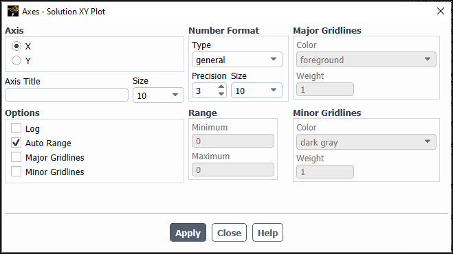
You can modify the appearance of the XY and parameters that control the labels, scale, range, numbers, and major and minor rules. For each type of plot (solution XY, file XY, profile, residual, histogram, and so on), you can set different axis parameters in the Axes Dialog Box (Figure 40.122: The Axes Dialog Box). Note that the title following Axes in the dialog box indicates which plot environment you are changing (for example, the Axes - Solution XY Plot dialog box controls parameters for solution XY plots).
To open the Axes Dialog Box for a particular plot type, click in the appropriate dialog box (for example, the Solution XY Plot, File XY Plot, Plot Profile Data, Plot Interpolated Data, or Residual Monitors dialog box).
The Axes Dialog Box enables you to independently control the characteristics of the ordinate (y-axis) and abscissa (x-axis) on an XY plot or parameters for one axis or the other, by following the procedure below:
Choose the axis for which you want to modify the attributes by selecting X or Y under Axis.
Set the desired parameters.
Click and then choose the other axis and repeat the steps, if desired.
The changes to the axis attributes will appear in the graphics window the next time you generate a plot.
If you want to modify the title for the axis, you can do so by editing the Axis Title text field in the Axes Dialog Box. The title font size is controlled by the Size drop-down list located next to the Axis Title field.
You can change the format of the labels that define the primary data divisions on the axes using the controls under the Number Format heading in the Axes Dialog Box.
To display the real value with an integral and fractional part (for example, 1.0000), select float in the Type drop-down list. You can set the number of digits in the fractional part by changing the value of Precision.
To display the real value with a mantissa and exponent (for example, 1.0e-02), select exponential in the Type drop-down list. You can define the number of digits in the fractional part of the mantissa in the Precision field.
To display the real value with either float or exponential form, depending on the size of the number and the defined Precision, choose general in the Type drop-down list.
Use the Size field to control the size of the font used in displaying the numbers on the axis.
By default, decimal scaling is used for both axes (except for
the  -axis in residual plots, which uses a log scale).
If you want to change to a logarithmic scale, enable the Log option in the Axes Dialog Box. To return
to a decimal scale, turn off the Log option.
Note that when you are using the logarithmic scale, the Range values are the exponents; to specify a logarithmic
range from 1 to 10000, for example, you will specify a minimum value
of 1 and a maximum value of 4.
-axis in residual plots, which uses a log scale).
If you want to change to a logarithmic scale, enable the Log option in the Axes Dialog Box. To return
to a decimal scale, turn off the Log option.
Note that when you are using the logarithmic scale, the Range values are the exponents; to specify a logarithmic
range from 1 to 10000, for example, you will specify a minimum value
of 1 and a maximum value of 4.
By default, the extents of the axis will range from the minimum
value plotted to the maximum value plotted. If you want to change
the range or extents of the axis, you can do so by turning off the Auto Range option in the Axes Dialog Box and
setting the new Minimum and Maximum values for the Range. This feature is useful
when you are generating a series of plots and you want the extents
of one or both of the axes to be the same, even if the range of plotted
values differs. For example, if you are generating plots of temperature
on several different wall zones, you might want the minimum and maximum
temperature on the  -axis to be the same in every plot so that you can
easily compare one plot with another. You would determine a temperature
range that includes the temperatures on all walls, and use that as
the range for the
-axis to be the same in every plot so that you can
easily compare one plot with another. You would determine a temperature
range that includes the temperatures on all walls, and use that as
the range for the  -axis in each plot.
Ansys Fluent enables you to display major and/or minor rules on the axes. Major and minor rules are the horizontal or vertical lines that mark, respectively, the primary and secondary data divisions and span the whole plot window to produce a “mesh.” To add major or minor rules to the plot, enable the Major Rules or Minor Rules option. You can then specify a color and weight for each type of rule. Under the Major Rules or Minor Rules heading, select the desired color for the lines in the Color drop-down list and specify the line thickness in the Weight field. A line of weight 1.0 is normally 1 pixel wide. A weight of 2.0 would make the line twice as thick (that is, 2 pixels wide).
The data curves in XY plots and histograms can be represented by any combination of lines and markers. You can modify the attributes of the curves, including the patterns, weights, and colors of the lines, and the symbols, sizes, and colors of the markers. For each type of plot (solution XY, file XY, profile, residual, and so on), you can set different curve parameters in the Curves Dialog Box (Figure 40.123: The Curves Dialog Box). Note that the title following Curves in the dialog box indicates which plot environment you are changing (for example, the Curves - Solution XY Plot dialog box controls curve parameters for solution XY plots).
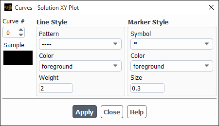
To open the Curves Dialog Box for a particular plot type, click in the appropriate dialog box (for example, Solution XY Plot, File XY Plot, Plot Profile Data, Plot Interpolated Data, or Residual Monitors dialog box).
The Curves Dialog Box enables you to independently control the characteristics of each data curve in an XY plot or parameters for a curve, you will follow the procedure below:
Specify the curve for which you want to modify the attributes by increasing or decreasing the Curve # counter. The curves are numbered sequentially, starting from 0. For example, if you were plotting flow-field values on two surfaces, the first surface would be curve 0, and the second, curve 1. If the plot contains only one curve, the Curve # is set to 0 and is not editable.
Set the desired line and/or marker parameters as described below.
Click and then choose another Curve # and repeat the steps, if desired.
Your changes to the curve attributes will appear in the graphics window the next time you generate a plot.
You can control the pattern, color, and weight of the line using the controls under the Line Style heading:
To set the line pattern for the curve, choose one of the items in the Pattern drop-down list. Except for center and phantom lines, the list displays examples of the pattern choices. A center line alternates a very long dash and a short dash and a phantom line alternates a very long dash and a double short dash. Note that selecting the second item in the drop-down list, represented by 4 short dashes, will result in a solid-line curve.
Important: If you do not want the data points to be connected by any type of line (that is, if you plan to use just markers), select the “blank” choice, which is the first item in the Pattern list.
To set the color of the line, pick one of the choices in the Color drop-down list.
To define the line thickness, set the value of Weight. A line weight of 1.0 is normally 1 pixel wide. Therefore, a weight of 2.0 would make the line twice as thick (that is, 2 pixels wide).
You can control the symbol, color, and size for the data marker using the controls under the Marker Style heading:
To set the symbol used to mark data, choose one of the items in the Symbol drop-down list. The list displays examples of the symbol choices. For example, in plotting pressure-coefficient data on the upper and lower surfaces of an airfoil, the symbol
/*\(filled-in upward-pointing triangle) could be used for the marker representing the upper surface data, and the symbol\*/(filled-in downward-pointing triangle) could be used for the marker representing the lower surface data.Important: If you do not want the data points to be represented by markers (that is, if you plan to use just a line connecting the data points), select the “blank” choice, which is the first item in the Style list.
To set the color of the marker, pick one of the choices in the Color drop-down list.
To define the size of the data marker, set the value of Size. A symbol of size 1.0 is 3.0% of the height of the display screen, except for the “.” symbol, which is always one pixel.
To see what a particular setting will look like in the plot, you can preview it in the Sample window of the Curves Dialog Box. A single marker and/or line will be shown with the specified style attributes.