


You view and save simulation statistics either after you have finished processing a simulation or have completed enough of the processing that the data you want to analyze is available.
You can use the data directly on the Properties and Curve tabs to view an individual statistic for a property; or you can graph an entire data set by creating plots and histograms, or by exporting the data you want to a CSV file to view from a spreadsheet program, such as Microsoft Excel.
What would you like to do?
See Also:
You choose to view an individual statistic when you want to know only a particular data point at a particular timestep in the simulation.
What would you like to do?
See Also:
The steps you take to view an individual statistic depend upon whether the property you are interested in has been calculated yet. Sometimes Rocky calculates other individual statistics with the statistic you have chosen if doing so will save on calculation time.
You will know whether a property has been calculated or not by what operational values (Min, Max, and so on) are displayed in the panel tab, as explained below and illustrated in Figure 5.79: Property column header options in the Data Editors panel:
If you see question marks <?> or <unknown> in the property row, the data has not yet been calculated.
If you see values <numbers> in the property row, the data has already been calculated.
If you see -1.#IND in the property row, the calculation is invalid for that particular timestep. This can happen if there is no particle in the simulation at the time selected, for example.
(See also Recognize Data Placeholders.)
For properties that are already calculated, viewing an individual statistic involves either hovering over the property and viewing the information in the tooltip, or customizing the column headers for the panel tab so that the values you want to view are visible in the UI.
For functions that have yet to be calculated, viewing an individual statistic involves first choosing to Compute Statistics, which is affected by how frequently you have chosen calculations to be updated. (See also Determine the Frequency of Calculations by Pinning/Unpinning Items.) The results of the calculation are dependent upon what kind of data item you chose, as described below:
For items on the Properties tab, choosing to Compute Statistics results in only the current timestep being calculated for the function chosen.
For items on the Curves tab, choosing to Compute Statistics results in all currently available timesteps being calculated for the property chosen. But unlike pinning an item, choosing to Compute Statistics will not continue to recalculate those values should settings change that affect them, nor if new timesteps are added to the simulation.
Use the image and table below to help you understand how you can view an individual statistic in the Rocky UI.
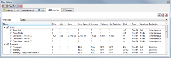
Table 1: Properties and Curves column header options
Header | Description |
|---|---|
Name | The name of the property or curve. |
Value | For Curves only, indicates the base value for the selected curve. |
Min | The lowest value of all the recorded data for the property or curve. |
Max | The highest value of all the recorded data for the property or curve. |
Sum | The final value when of all the recorded data for the property or curve are added together. |
Sum Squared | The final value when of all the recorded data for the property or curve are added together and squared. |
Average | The average value of all the recorded data for the property or curve. |
Variance | The variance between of all the recorded data for the property or curve. |
Std. Deviation | The standard deviation between of all the recorded data for the property or curve. |
Unit | The unit used by the value. |
Type | For Properties only, indicates the underlying data type storing the value. |
Location | For Properties only, indicates the specific part of the entity to which the property is applied. For example:
|
Evaluation | For Properties only, defines whether the property is "Instantaneous" or "Statistical". Specifically:
|
What would you like to do?
Learn more About the Property User Process
Learn more About Curves
See Also:
Use the Time toolbar to select the exact point in the simulation for which you want information. (See also About the Time Toolbar.)
From the Data panel, select the entity containing the property for which you want to view an individual statistic. This can include a conveyor or imported geometry component, Particles, 1-Way LBM, 1-Way Fluent, Solver, or any individual User Processes linked to these entities. (See also Use Properties and Curves.)
From the Data Editors panel, select either the Properties or Curves tab containing the property for which you want to view an individual statistic.
Do one or both of the following:
If the information has yet to be calculated (e.g., the values show question marks <?> or <unknown>), right click the property you want, and then click Compute Statistics. The values for the selected timestep and property are displayed on the tab.
If the information has already been calculated, display the information in one of the following ways:
In a row of the panel tab by right-clicking the header row for the property table, and then left-clicking the values you want shown/hidden from the menu displayed.
From a tooltip by hovering your mouse over the property.
See Also:
In Rocky, you create plots—such as Time Plots or Cross Plots—and histograms when you want to see a graphical comparison of various data sets in the UI.
After selecting your data and displaying it in the plot or histogram window of your choice, you can then modify your graph by changing the window and data properties of your choosing.
What would you like to do?
Learn more about Graphing (Plot or Histogram) a Data Set Within Rocky
Learn more about Changing the Appearance of a Graph (Plot or Histogram)
See Also:
In Rocky, there are five different types of graphs you can create with your simulation data, as described below:
Time Plot: Graphs data across a time period. Also enables you to inspect a particular point in a curve and see the results in table format.
Multi Time Plot: Like a Time Plot, graphs data across a time period but enables multiple plots to be compared in one window.
Histogram: Provides a graphical representation of the distribution of a data set. It represents in vertical bars the data set previously tabulated and divided into uniform bins. The base of each bar represents a class and the height of each bar represents the amount or frequency with which the value of the class occurred in the data set.
Space Plot: Graphs one-dimensional (line) data from the Properties tab.
Cross Plot: Displays in a dot-cloud format correlations between two entity properties (Curves or Properties) that share a common domain.
Creating one of these graphs produces a window within the Rocky workspace that you can then drag and drop a Property or a Curves data set into (see also Use Properties and Curves.). From there, you may use the options on the Window Editors panel to change the appearance of your graph, including settings like background color, font color/sizes, axis and legend information.
For Histograms only, you can also determine by which method you want the data weighted through the Configure Histogram dialog. This also enables you to change the number of bins, and whether the data is aggregated by percentage and/or by cumulative methods.
For Time Plots and Multi Time Plots only, you can also add an Annotation, which places a mark and caption in a location of your choice on the graph. (See also About Creating an Annotation on a Time Plot or Multi Time Plot.)
Once your graph contains the data you want and appears the way you prefer, you may then choose to save the graph as an image or export it to an external CSV file (see also About Exporting Data Out of Rocky.)
What would you like to do?
Learn more About Time Plots
Learn more About Multi Time Plots
Learn more About Histograms
Learn more About Space Plots
Learn more About Cross Plots
Learn more about Changing the Appearance of a Graph (Plot or Histogram)
See Also:
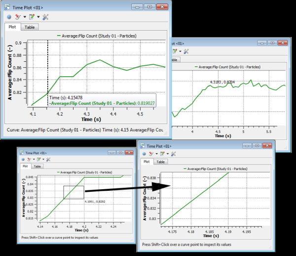
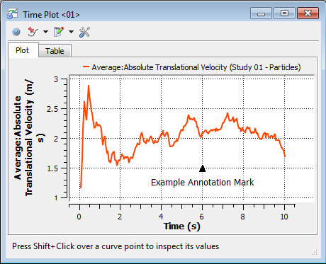
A Time Plot graphs data across a time period (Figure 5.80: Example Time Plot). Like any other Plot in Rocky, you can inspect a particular point in a curve or zoom-in on a particular area (Figure 5.81: Inspecting a Time Plot Curve with Shift+Click (top left), Ctrl+Click (top right), and Ctrl+Click+Drag (bottom)). Unlike Multi Time Plots, which accepts many sub-plots in one window, Time Plot windows accept only one plot at a time. However, Time Plots are the only graphs within Rocky with the ability to view and add custom formulas to the results in table format (Figure 5.82: Table tab results of the example Time Plot).
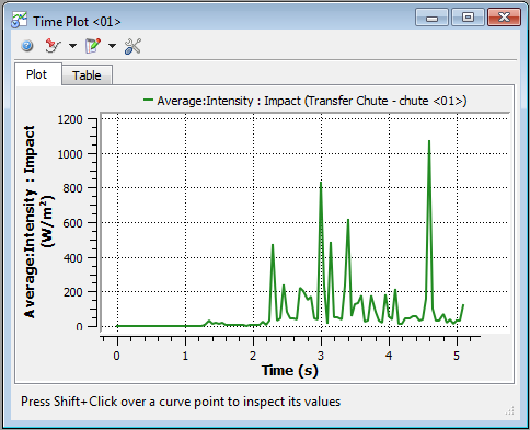
Figure 5.81: Inspecting a Time Plot Curve with Shift+Click (top left), Ctrl+Click (top right), and Ctrl+Click+Drag (bottom)
The Plot tab of a Time Plot window is where the graph itself is located. As with Multi Time Plots, you can add an Annotation or a Time Mark to a Time Plot. An Annotation places a mark and caption in a location of your choice on the graph (see also About Creating an Annotation on a Time Plot or Multi Time Plot) while a Time Mark enables you to identify with a vertical line the location of the Current Timestep.
Tip: To see walk-through examples of Time Plots being used to analyze simulation results, refer to the following Tutorials:
The Table tab for a Time Plot (Figure 5.82: Table tab results of the example Time Plot) enables you to view the data in tabular format and also add and edit custom formulas using variables and expressions (see also Defining Your Variables) that will themselves be calculated and added to the graph.
See the images and tables below to understand how you can use the options on the Table tab for a Time Plot window to change the data displayed in your graph.
Tip: To see walk-through examples of the Table tab being used to analyze simulation results, refer to the following Tutorials:
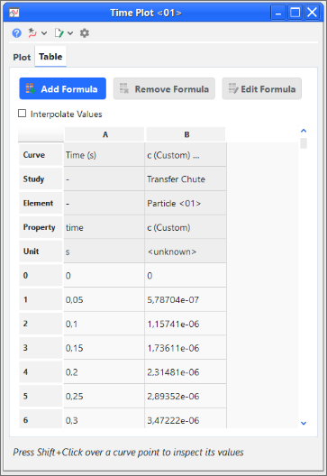
Table 1: Table tab options for a Time Plot window
Setting | Description | Range |
|---|---|---|
Interpolate Values | When enabled, this will create the non-existing values so that when there are multiple curves plotted, all curves have values in all exported timesteps. | Turns on or off |
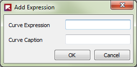
Table 2: Add Expression dialog options
Setting | Description | Range |
|---|---|---|
Curve Expression | The mathematical expression for the curve you want to add to the Time Plot. | |
Curve Caption | The name you want to give the new curve. This will be displayed in the Table as a new column and in the Time Plot legend. Note: Unlike curves you drag and drop into the Time Plot window, you cannot edit curves added from the Table tab in the Window Editors panel. Rather, you must only use the options in the Edit Expression dialog. | No limit |
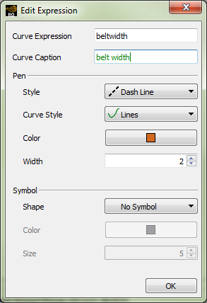
Table 3: Edit Expression dialog options
Setting | Description | Range |
|---|---|---|
Curve Expression | Enables you to change the mathematical expression for the curve you are editing. | |
Curve Caption | Enables you to change the name of the curve you are editing. This will be displayed in the Table as a column header and will also be listed in the Time Plot legend and axis titles. Note: Unlike curves you drag and drop into the Time Plot window, you cannot edit curves added from the Table tab in the Window Editors panel. Rather, you must only use the options in the Edit Expression dialog. | No limit |
Pen | ||
Style | Enables you to set what kind of line style you want represented on the plot for the custom curve. Tip: If you want the curve represented on the plot by symbols instead of lines, select No Line and then choose what you want under Symbol. | No Line; Solid Line; Dash Line; Dot Line; Dash Dot Line; Dash Dot Dot Line |
Curve Style | When you select a Style other than No Line, this enables you to set how the curve is represented in the plot. What you set here will be drawn in the Style indicated. | Lines; Sticks; Steps |
Color | When you select a Style other than No Line, this enables you to change the color of the plot line for the custom curve. | Options limited by the Select Color dialog |
Width | When you select a Style other than No Line, this enables you to change the width of the plot line for the custom curve. | Whole numbers greater than or equal to one |
Symbol | ||
Shape | Enables you to add to the plot a symbol marking the custom curve data point for each recorded Timestep. (For example, every 0.05 s.) Tip: If you want the curve represented on the plot by lines instead of symbols, select No Symbol and then choose what you want under Pen. | Ellipse; Rectangle; Diamond; Triangle; Down Triangle; No Symbol |
Color | Enables you to change the color of the symbol used to mark the data points of the custom curve. | Options limited by the Select Color dialog |
Size | Enables you to change the size of the symbol used to mark the data points of the custom curve. | Whole, positive values |
What would you like to do?
See Also:
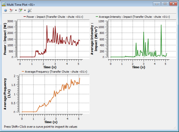
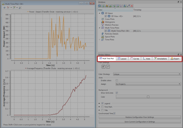
A Multi Time Plot is a type of graph that like a Time Plot, graphs data across a time period while also enabling you to inspect a particular point in a curve or zoom-in on a particular area (as shown below). But unlike a Time Plot, a Multi Time Plot enables multiple plots, called sub-plots, to be compared in one graphical window:
Figure 5.85: Inspecting a Multi-Time Plot Curve with Shift+Click (top left), Ctrl+Click (top right), and Ctrl+Click+Drag (bottom)
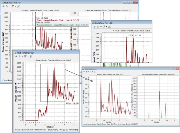
You add additional sub-plots to an existing Multi Time Plot window by selecting the property (Property or Curves) that you want and then holding the Ctrl key while you drop it in the window. This will create another plot within the same window. If you do not hold the Ctrl key before dropping the property, instead of being added as a separate sub-plot, the property will be added to the same sub-plot over which you released your mouse over. Tip:While dragging, use the tooltip and hover text to help you determine how and where to drop your data for different effects.
All sub-plots within the same window share the same display settings and can be treated as one image for export (see also Save an Image of the 3D View, Plot, or Histogram).
Like with Time Plots, you can also add an Annotation or a Time Mark to a Multi Time Plot. An Annotation places a mark and caption in a location of your choice on the graph (see also About Creating an Annotation on a Time Plot or Multi Time Plot) while a Time Mark enables you to identify with a vertical line the location of the Current Timestep.
In addition to the standard settings available to all graphs, you can also control how these sub-plots appear in the window by using the Layout tab on the Window Editors panel.
Tip: To see walk-through examples of simulations that make use of Multi Time Plots, refer to the following Tutorials:
What would you like to do?
See Also:
A Histogram is a type of graph that represents in vertical bars the data set previously tabulated and divided into uniform bins. The base of each bar represents a class and the height of each bar represents the amount or frequency with which the value of the class occurred in the data set:
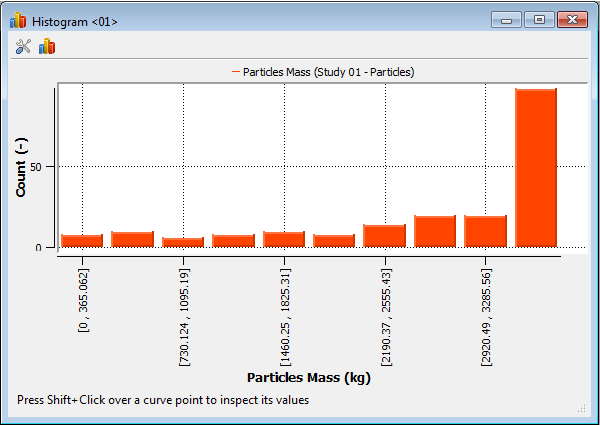
Histograms work by aggregating data into separate bins for analysis. One of the benefits of this type of graph is that you can weigh and compare different statistics for different results. For example, you can compare the results of one statistic weighted by another statistic at two different times in the simulation:
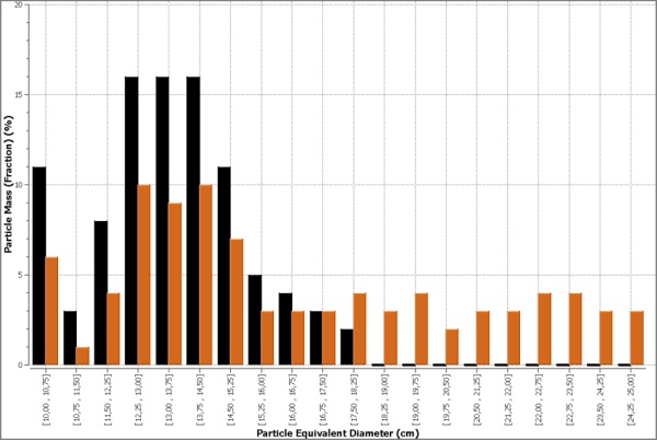
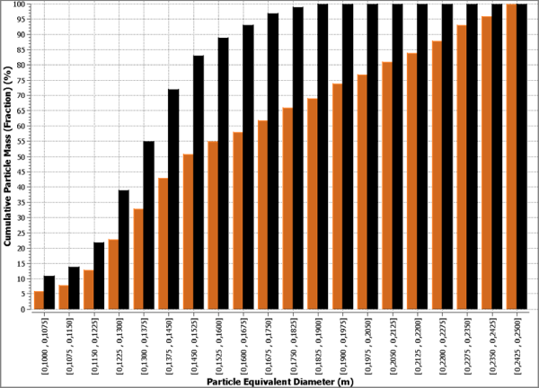
Histograms enable you to have even more control over your analysis by enabling you to plot your data in a percentage and/or cumulative manner:
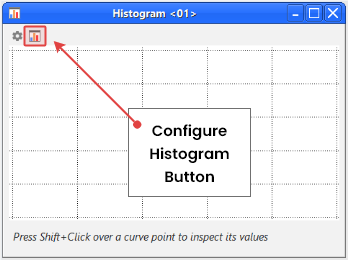
These settings are made through a separate Configure Histogram dialog that you access from the top left corner of the Histogram window:
Tip: To see walk-through examples of simulations making use of Histograms, refer to the following Tutorials:
See the image and table below to help you understand how to configure a Histogram.
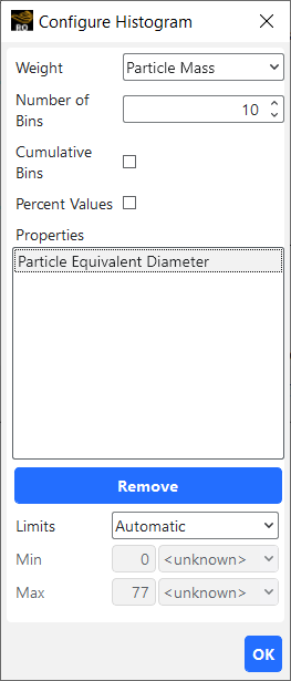
Table 1: Configure Histogram options
Setting | Description | Range |
|---|---|---|
Weight | The method by which you want the selected property(s) weighted for comparison. The weight you choose affects all properties for the selected Histogram. The weight options can include the following:
| Properties (for both geometries and particles); Count |
Number of Bins | Enables you to choose the number of bins or bars the data is aggregated into. | Whole numbers greater than 1 |
Cumulative Bins | When selected, plots in ascending order the relative frequency of each class (bin) added to all classes (bins) with lower values. A useful method for showing a range of values, this is a mapping that counts the cumulative number of observations in all of the classes (bins) up to the specified bin. | Turns on or off |
Percent Values | When selected, provides the weighted value by percentage. | Turns on or off |
Properties | Displays the name of the Property(s) and/or Curve(s) that you have added to the Histogram. (See also Graph Data within Rocky by Creating a Plot or Histogram). These are the items that will be affected by the Weight you select. | Automatic display |
Limits | Enables the values of the selected item in the Properties list to be changed. The options are as follows:
| Automatic; User Defined |
Min | When Limits is set to Automatic, this displays the minimum value for the selected property as calculated for the current Timestep. (See also About the Time Toolbar). When Limits is set to User Defined, this enables you to set a custom minimum value for the selected property that you want displayed in the Histogram. | No limit |
Max | When Limits is set to Automatic, this displays the maximum value for the selected property as calculated for the current Timestep. (See also About the Time Toolbar). When Limits is set to User Defined, this enables you to set a custom maximum value for the selected property that you want displayed in the Histogram. | No limit |
What would you like to do?
See Also:
Space Plots are graphs that plot one-dimensional information from the Properties tab (Figure 5.92: Example of a Particle Trajectory property being graphed in a Space Plot).
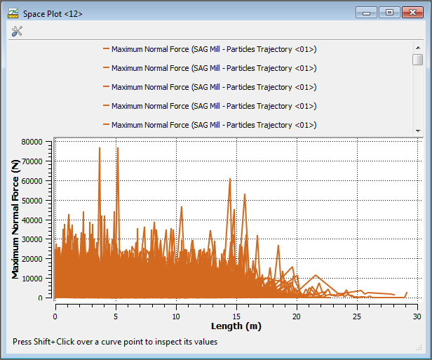
While most data in Rocky does not have the one-dimensional criteria required for this kind of graphing, Space Plots can still be useful in certain specific conditions such as the following:
Particle Trajectory Properties (see also About the Particles Trajectory User Process)
Cut Plane Properties (see also About the Plane User Process)
Worn Geometry Properties (see also View Surface Wear Modification on an Imported Geometry)
What would you like to do?
See Also:
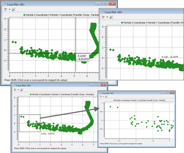
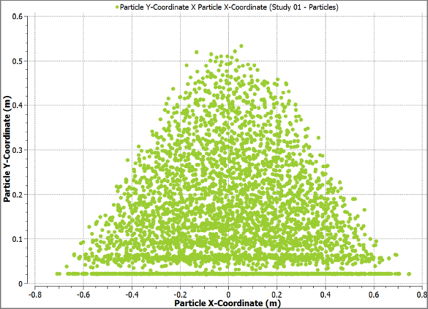
A Cross Plot is a type of graph that displays in a dot-cloud format correlations between two entity properties (Curves or Properties) that share a common domain (Figure 5.93: Example Cross Plot). Like other Plots, you can also inspect a particular point or zoom-in on a particular area (Figure 5.94: Inspecting a Cross Plot Dot-Cloud with Shift+Click (top left), Ctrl+Click (top right), and Ctrl+Click+Drag (bottom)).
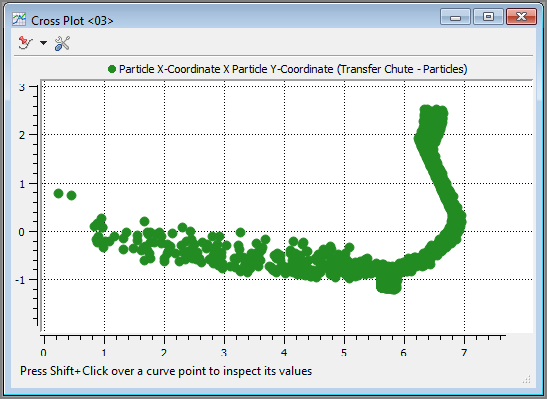
Figure 5.94: Inspecting a Cross Plot Dot-Cloud with Shift+Click (top left), Ctrl+Click (top right), and Ctrl+Click+Drag (bottom)
One example of how you can use a Cross Plot is to measure the angle of repose of your calibrated material to verify that the simulated particles match real-world results. After creating a sample pile of your particles (Figure 5.95: Simulated particle pile to be measured), you can then create a Cross Plot of the Particle Y-Coordinate position (image) crossed with the Particle X-Coordinate position (domain) (Figure 5.96: Cross Plot of the above particle pile showing the Particle X-Coordinate position crossed with the Particle Y-Coordinate position). Using this Cross Plot, you can then measure the angle of repose.
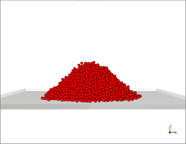
Figure 5.96: Cross Plot of the above particle pile showing the Particle X-Coordinate position crossed with the Particle Y-Coordinate position
The two restrictions for creating a Cross Plot are as follows:
The Curves to be crossed must share a common property. For example, given an entity (Particles) that has two Curves [(Pressure X Time) and (Temperature X Time)], there must be a property common to both Curves (Time) in order to generate the desired Cross Plot (Pressure X Temperature).
You may only cross Curves from the same entity. For example, you may not cross a Curve from one type of entity (Particles) with another Curve from a different entity (Feed Conveyor). The Curves must come from the same entity.
Like other graphs you create in Rocky, you can also use the Window Editors panel to change how the graph appears.
Tip: To see walk-through examples of using a Cross Plot, review the following Tutorials:
What would you like to do?
See Also:
Open the simulation containing the results you want to graph.
From the Windows menu, select the plot or histogram that you want. (See also About Graphing (Plot or Histogram) a Data Set Within Rocky) An empty window appears on the Workspace.
From the Data panel, select the entity containing the data that you want to graph (Particles, Solver, an individual geometry component, CFD Coupling component, or an individual User Process).
From the Data Editors panel, select either the Properties or Curves tab, locate and select the function(s) you want to graph, and then click and drag the function(s) to the empty plot or histogram window you created. (See also Use Properties and Curves). The data you selected appears in the window.
Tips:
Add additional data to your existing graph by repeating step 4.
Add additional sub-plots to a Multi Time Plot by repeating step 4 but before dropping the data in the window, press and hold the Crtl key. (See also About Multi Time Plots.)
Use the options on the Window Editors panel to change the display of your graph to your liking. (See also About Changing the Appearance of a Graph (Plot or Histogram.)
View data in tabular format, add and edit custom curves for a Time Plot through the Table tab. (See also Add and Edit Custom Table Formulas in a Time Plot.)
Shift-click a point along any curve to inspect the data, which will both provide a tooltip with information as well as posting it at the bottom of the window. You can also press and hold the Shift key while left-clicking and dragging your mouse along a curve to inspect multiple points.
For Plots only (not Histograms), Ctrl-click anywhere within the plot area to see data for that point. You can also press and hold the Ctrl key while left-clicking and dragging your mouse to select an area upon which to zoom-in; after releasing the mouse, the plot will be re-drawn to the area you selected.
Lock the Curve selection being displayed to any Plot and then use the Data panel to change the data being shown. (See also Lock a Curve Selection to a Plot to Quickly Change the Data Shown.)
See Also:
Once you create your plot or histogram and add data to it, you can then modify your graph by changing the window properties and/or the data properties as described below:
Visualization properties, like magnification, which are done through the mouse, keyboard, or toolbar.
Window display properties, which include settings like background color, font color/sizes, axes and legend information. These are things that affect the appearance of your graph and are accomplished using the Window Editors panel. For Time Plots or Multi Time Plots, this is also where you will add Annotations, which enables you to define a specific data mark and caption on your graph.
Data properties, which include what Properties or Curves you want to plot, and for Histograms, by what method you want the data weighted. These changes are made using Data and Data Editors panel, and for Histograms, the Configure Histogram dialog.
What would you like to do?
See Also:
Note: The movements described below do not apply to histogram windows.
Select the plot window you want to change.
Do one or more of the following:
Use the left or center wheel buttons on the mouse to pan or zoom respectively.
Press R on the keyboard or click the Fit button on the Camera visualization toolbar to automatically adjust the window view to the available data.
Tip: Additional keyboard shortcuts are listed in the Preferences dialog. (See also Keyboard Accessibility and Shortcuts).
See Also:
From the Window Editors panel, you can modify display settings for the selected plot or histogram window. Changes can include the background color, font color/sizes, and window axes displays. You can also synchronize the Timesteps displayed when two or more graphing windows are open.
What would you like to do?
See Also:
After you create your initial plot or histogram (see About Graphing (Plot or Histogram) a Data Set Within Rocky), you can modify the appearance of your graph by using the Window Editors panel (Figure 5.97: Window Editors panel tabs for a Multi Time Plot). There are some differences in settings between the various types of graphs, but the manner in which you modify the appearance of these graphical windows is very similar.
In this topic, we will cover all of the following tabs on the Window Editors panel:
The "Graph Type" tab
The Curves tab
The Axes tab
The Annotations tab (for Time Plots and Multi Time Plots)
The Layout tab (for Multi Time Plots)
The label on the first tab in the Window Editors panel changes to reflect the type of graph you have selected. On this tab, you may change settings that have to do with the appearance of the graph itself, include the font and background colors, and whether or not the current Timestep is reflected on your graph or not.
See the image and table below to help you understand how to modify the appearance of a graph by using the first tab on the Window Editors panel.
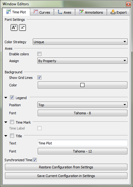
Table 1: Graph (plot and histogram), first tab settings in the Window Editors panel
Setting | Description | Range |
|---|---|---|
Font Settings | The following two buttons in this section apply to all axes, legend, and title text shown in the graph:
Notes:
| Increase font size; Reduce font size |
Color Strategy | Changes the coloring criteria of the curves, which affects the legend text and plot line of the properties (Property or Curves) being graphed. This option can be used to group curves with a similar representation by color based upon the following options:
| Entity Based; Property Based; Unique |
Axes Enable colors | Enabling this checkbox colors the Y axes according to the Color Strategy selected. Clearing this checkbox keeps all axes colored black. | Turns on or off |
Axes Assign | For plots with multiple Properties or Curves, this enables the Y axes to be shared according to the following options:
| By Quantity; By Property |
Background Show Grid Lines | Selecting this checkbox enables black gridlines to appear behind your graph. | Turns on or off |
Background Color | Enables you to choose the color that appears behind your graph. | Options limited by the Select Color dialog |
Legend | Enables the legend information, the content and color of which are determined by the Color Strategy setting, to be displayed on the graph window. | Turns on or off |
Legend Position | When Legend is enabled, determines where the Legend information appears on your graph. | Bottom; Left; Right; Top |
Legend Font | Enables you to change the type, style, size, and effects of the font used for displaying the Legend text. Note: The size you choose will still be affected by the Font Settings buttons. | Options limited by the Select Font dialog |
Time Mark | For Time and Multi Time Plots only, enables a dotted, vertical line to be displayed at the location of the current Timestep. | Turns on or off |
Time Label | When Time Mark is selected, enables you to add a label to the mark displaying the current output time value. Note: The value displayed reflects the units used for the Time (X) axis. | Turns on or off |
Title | Enables you to add a separate title to the top of the graph. | Turns on or off |
Title Text | When Title is selected, determines what text will be displayed in the title. | No limit |
Title Font | Enables you to change the type, style, size, and effects of the font used for displaying the Title text. Note: The size you choose will still be affected by the Font Settings buttons. | Options limited by the Select Font dialog |
Synchronized Time | When enabled and the plot window (or any other window with this checkbox enabled) is selected, the details shown in this (and any other Synchronized Time) window will be updated when the current Timestep is changed on the Time toolbar. (See also About the Time Toolbar.) When cleared and the window is selected, only this window will be updated when the current Timestep is changed on the Time toolbar. Tip: To keep the Timestep synchronized between multiple plot or other display windows, ensure each window has this option enabled. | Turns on or off |
Restore Configuration from Settings | Clicking this button replaces the values set on the tab with the ones that have been saved to the (internal) Rocky Settings folder. (See also Rocky File Types and Folders) | (Button selection) |
Save Current Configuration in Settings | Clicking this button overwrites the values that have been saved to the (internal) Rocky Settings folder with the ones currently set on the tab. (See also Rocky File Types and Folders) | (Button selection) |
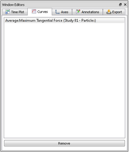
The Curves tab is where you can see what properties, from either the Property or Curves tab, you have added to the selected graph. From here, you can review and/or select and remove these properties to verify or change what data is displayed in your graph (as shown below).
Note: While you can remove properties from the Curves tab, you must still add them from the Data Editors panel. See also Graph Data within Rocky by Creating a Plot or Histogram.
The Axes tab enables you to change display settings related only to the various axes that make up your graph, including axis titles, value ranges, and scales.
See the image and table below to help you understand how to modify the display of your axes by using the Axes tab on the Window Editors panel.
Tip: You can also access these options by double-clicking an axis on your plot window.
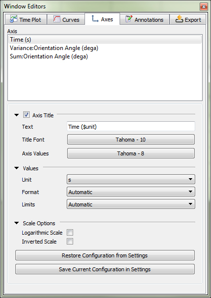
Table 2: Graph (plot and histogram), Axes tab settings in the Window Editors panel
Setting | Description | Range |
|---|---|---|
Axes | Lists each separate axis that has been added to the graph. | List generated automatically |
Axis Title | When enabled, adds a title labeling the selected axis. | Turns on or off |
Axis Title Text | When Axis Title is selected, enables you to modify the default text labeling the selected axis. | No limit |
Axis Title Font | Enables you to change the type, style, size, and effects of the font used for displaying the title Text for the selected axis. Note: The size you choose will still be affected by the Font Settings buttons located on the first tab of the Window Editors panel. | Options limited by the Select Font dialog |
Axis Title Axis Values | Enables you to change the type, style, size, and effects of the font used for displaying the value marks for the selected axis. Note: The size you choose will still be affected by the Font Settings buttons located on the first tab of the Window Editors panel. | Options limited by the Select Font dialog |
Values Unit | Enables you to change the units for which the values for the selected axis are displayed. | Automatically provided |
Values Format | Enables you to change the number of decimal places in which you want the axis values displayed. Specifically:
| Integer; Decimal 2 digits; Decimal 4 digits; Decimal 8 digits; Exponential 2 digits; Exponential 4 digits; Exponential 8 digits; Automatic |
Values Limits | Sets how the minimum and maximum values for the selected axis are determined. Specifically:
| Automatic; User Defined |
Values Min | When Limits is set to User Defined, this enables you to set a custom minimum value for the selected axis. | No limit |
Values Max | When Limits is set to User Defined, this enables you to set a custom maximum value for the selected axis. | No limit |
Values Step | When Limits is set to User Defined, this enables you to set the amount you want between each value mark on the selected axis. | No limit |
Scale Options Logarithmic Scale | When enabled, this converts the scale of the selected axis to logarithmic. When cleared, the scale is a standard linear one. | Turns on or off |
Scale Options Inverted Scale | When enabled, this swaps the minimum and maximum value placements on the selected axis. | Turns on or off |
Restore Configuration from Settings | Clicking this button replaces the values set on the tab with the ones that have been saved to the (internal) Rocky Settings folder. (See also Rocky File Types and Folders) | (Button selection) |
Save Current Configuration in Settings | Clicking this button overwrites the values that have been saved to the (internal) Rocky Settings folder with the ones currently set on the tab. (See also Rocky File Types and Folders) | (Button selection) |
The Annotations tab is where you edit the values and change the display settings for the Annotation marks that you have already added to either a Time Plot or a Multi Time Plot. (See also About Creating an Annotation on a Time Plot or Multi Time Plot.)
See the image and table below to help you understand how to edit your Annotations by using the Annotations tab on the Window Editors panel.
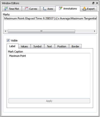
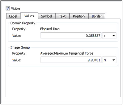
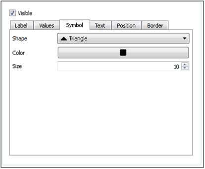
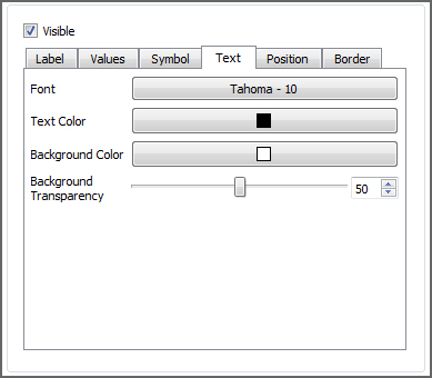

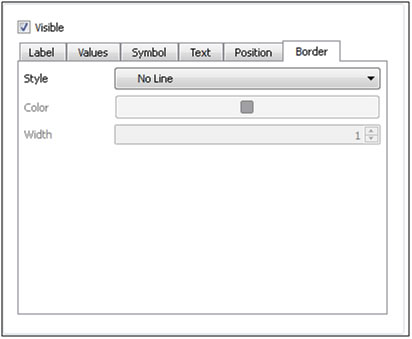
Table 3: Time Plot and Multi Time Plot, Annotations tab settings in the Window Editors panel
Setting | Description | Range |
|---|---|---|
Marks | Lists each separate Annotation that has been added to the graph. This is where you select which Annotation you want to modify. | List generated automatically |
Visible | When enabled, this shows the selected Annotation on the graph. When cleared, this hides the selected Annotation. Note: The only way to remove an Annotation from a graph is to clear the Visible checkbox. | Turns on or off |
Label | ||
Mark Caption | Enables you to modify what text is displayed on the graph for the selected Annotation. Tip: Use the Enter key to indicate where you want line breaks. | No limit |
Values | ||
Domain Property | Property | Displays the property you chose in the Create Annotation dialog for the Domain (X axis) value for the selected Annotation. Note: This setting is not editable. | Display only |
Domain Property | Value | Enables you to edit the value you entered for the Property domain. This will be X axis location of the selected Annotation mark. | No limit |
Image Group | Property | Displays the property you chose in the Create Annotation dialog for the Image (Y axis) value for the selected Annotation. Note: This setting is not editable. | Display only |
Image Group | Value | Enables you to edit the value you entered for the Property domain. This will be Y axis location of the selected Annotation mark. | No limit |
Symbol | ||
Shape | Enables you to change the shape of the symbol used to mark the selected Annotation. Besides the five shape symbols listed, you can also select No Symbol to have only the Annotation caption text be displayed on the graph. | Ellipse; Rectangle; Diamond; Triangle; Down Triangle; No Symbol |
Color | Enables you to change the color of the symbol used to mark the selected Annotation. | Options limited by the Select Color dialog |
Size | Enables you to change the size of the symbol used to mark the selected Annotation. | Whole, positive values |
Text | ||
Font | Enables you to change the type, style, size, and effects of the font used for displaying the Mark Caption text for the selected Annotation. Note: The size you choose will not be affected by the Font Settings buttons located on the first tab of the Window Editors panel. | Options limited by the Select Font dialog |
Text Color | Enables you to change the color of the font used for displaying the Mark Caption text for the selected Annotation. | Options limited by the Select color dialog |
Background Color | Enables you to change the color appearing behind the text for the selected Annotation. | Options limited by the Select color dialog |
Background Transparency | Enables you to change the transparency level of the Background Color selected. The higher the value, the more transparent the color. | 0-100 |
Position | ||
Orientation | Enables you to change the orientation of the text for the selected Annotation. | Horizontal; Vertical |
Corner | Enables you to set where in relation to the mark to place the text for the selected Annotation. | Top Left; Top; Top Right; Left; Center; Right; Bottom Left; Bottom; Bottom Right |
Spacing | Enables you to set how many pixels away from the mark to place the text for the selected Annotation. | Whole numbers greater than or equal to one |
Border | ||
Style | Enables you to set what kind of border you want surrounding the text for the selected Annotation. If you want no border, choose No Line. | No Line; Solid Line; Dash Line; Dot Line; Dash Dot Line; Dash Dot Dot Line |
Color | When you select a Style other than No Line, this enables you to change the color of the border. | Options limited by the Select Color dialog |
Width | When you select a Style other than No Line, this enables you to change the width of the border. | Whole numbers greater than or equal to one |
This tab appears only for Multi Time Plots and enables you to change how the various sub-plots are displayed, including the number of columns and the minimum sub-plot dimensions within the graph window.
See the image and table below to help you understand how to modify layout of your Multi Time Plots by using the layout tab on the Window Editors panel.
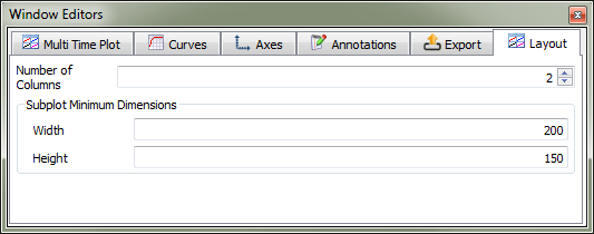
Table 4: Multi Time Plot, Layout tab settings in the Window Editors panel
Setting | Description | Range |
|---|---|---|
Number of Columns | Enables you to set how many columns into which you want the sub-plots of your selected Multi Time Plot arranged. | Whole numbers greater than or equal to one |
Subplot Minimum Dimensions Width | Enables you to define the minimum pixel width you want Rocky to maintain for each individual sub-plot in the selected Multi Time Plot. When making the window size smaller, the sub-plots will continue to be displayed in full until this setting is reached, at which point scroll bars will be added. | Whole values greater than or equal to 300 |
Subplot Minimum Dimensions Height | Enables you to define the minimum pixel height you want Rocky to maintain for each individual sub-plot in the selected Multi Time Plot. When making the window size smaller, the sub-plots will continue to be displayed in full until this setting is reached, at which point scroll bars will be added. | Whole values greater than or equal to 150 |
What would you like to do?
See Also:
An Annotation is a special mark that you can add to a Time Plot or a Multi Time Plot that shows a particular data point and caption that you define (as shown below). This is useful in cases where you want to highlight a particular event on the graph to help provide context. For example, you might add an Annotation at the moment when the particle flow reached steady state, when a hopper valve was opened, or when you have reached the maximum mass of particles inside a particular region.
You add the initial Annotation and define the text and values from a separate menu button on the graph itself (as shown below) but then can change the display options for it, including settings like font size and position, mark shape, and so on, on the Annotations tab of the Window Editors panel. (See also About Changing the Appearance of a Graph (Plot or Histogram)).
See the images and table below to understand how to create an Annotation for a Time Plot or Multi Time Plot.
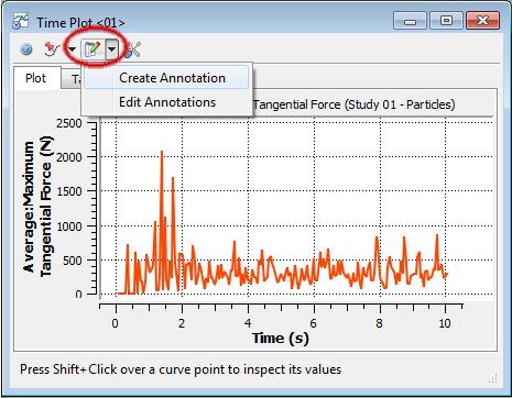
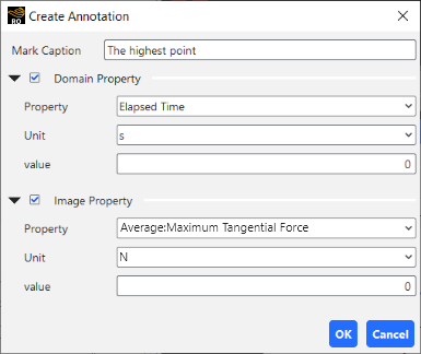
Table 1: Create Annotation dialog options
Setting | Description | Range |
|---|---|---|
Mark Caption | Enables you to enter what text is displayed on the graph for the new Annotation. Note: You can add line breaks in the Annotations tab on the Window Editors panel. | No limit |
Domain Property | Settings defined by the Property or Curve graphed for the domain (X) axis. For Time Plots and Multi Time Plots, the domain is always Time. Note: This setting does not affect how the Annotation is created. Even if cleared, Domain Property values will still be used in the Annotation definition. | Turns on or off |
Domain Property Property | The Property or Curve graphed for the domain (X) axis to which you want the Annotation applied. For Time Plots and Multi Time Plots, the only choice is Elapsed Time. | Elapsed Time |
Domain Property Unit | Enables you to set the units for which the value of the Property is defined. | Automatically provided |
Domain Property value | Enables you to set where along the domain (X) axis to place the Annotation marker. | No limit |
Image Property | Settings defined by the Properties or Curves graphed for the image (Y) axis. Note: This setting does not affect how the Annotation is created. Even if cleared, Image Property values will still be used in the Annotation definition. | Turns on or off |
Image Property Property | The Property or Curve graphed for the image (Y) axis to which you want the Annotation applied. | Automatically provided |
Image Property Unit | Enables you to set the units for which the value of the Property is defined. | Automatically provided |
Image Property value | Enables you to set where along the image (Y) axis to place the Annotation marker. | No limit |
What would you like to do?
See Also:
Ensure the Window Editors panel is visible. (From the View menu, click Window Editors.)
From the Workspace, select the plot or histogram window that you want to change. (See also Graph Data within Rocky by Creating a Plot or Histogram.)
From the Window Editors panel, select the options you want on the "Graph Type", Curves, Axes, and Annotations tabs. (See also About Changing the Appearance of a Graph (Plot or Histogram).) Any changes you make are automatically updated in the selected window.
Tips:
You can also open the Window Editors panel for a window by right-clicking an empty space within the plot or histogram window (for example, the background behind a curve), and then clicking Settings.
To change how data is weighted in a Histogram, use the Configure Histogram dialog. (See also Configure how Data is Displayed in a Histogram).
If changes to your graph take too long to update, you can either minimize the window or create a new workspace for the window. This will save changes to the graph without causing the updates to affect your other work in Rocky.
To reuse in future projects the settings you made on either the "Graph Type" or Axes tabs, click the Save Current Configuration in Settings button on the tab containing the values you want to retain.
To apply settings you have already saved (either by previously using the Save Current Configuration in Settings button or by saving selections within the Preferences dialog) to either the "Graph Type" or Axes tabs, click the Restore Configuration from Settings button on the tab containing the values you want to replace.
See Also:
From the Workspace, select the Time Plot or Multi Time Plot window to which you want to add an Annotation. (See also Graph Data within Rocky by Creating a Plot or Histogram.) Important Ensure you have already added the properties (Properties and/or Curves) that you want to the graph.
From the top left corner of the window, click the arrow next to the Select the types of annotations to display in the plot. button, and then click Create Annotation.
From the Create Annotation dialog, do all of the following:
In the Mark Caption field, enter the Annotation text you want to display on the graph.
Under Domain Property, ensure the Unit is as you want and then enter the domain axis location of the mark in the value field.
Under Image Property, select what you want from the Property list, verify the Unit setting, and then enter the image axis location of the mark in the value field.
Click OK. The Annotation text and mark you defined appears in the graph.
Tip: To change the appearance, values, and other settings of this newly added Annotation, use the Window Editors panel. (See also About Changing the Appearance of a Graph (Plot or Histogram).)
See Also:
From the Workspace, select the histogram window that you want to configure. (See also Graph Data within Rocky by Creating a Plot or Histogram.)
In the upper-left corner of the window, click the Configure histogram button.
In the Configure Histogram dialog, do any or all of the following:
Select the options you want for Weight. Important If you have chosen to display a Property in your Histogram, ensure you choose a weight that is applicable to the Property you chose. (See also About Histograms.)
Select the options you want for Number of Bins, Cumulative Bins, and Percent Values.
To change the value limits, select the Property or Curve from the Properties list, select User Defined from the Limits list, and then change the Min and/or Max values as you want.
Click OK to close the dialog. Note: The Histogram window is automatically updated with your changes as you make them.
Tips:
To change how your graph appears, use the Window Editors panel. (See also Use the Window Editors Panel to Change the Appearance of a Graph (Plot or Histogram)).
If changes to your graph take too long to update, you can either minimize the window or create a new workspace for the window. This will save changes to the graph without causing the updates to affect your other work in Rocky.
See Also:
From the Workspace, select the Time Plot window to which you want to add or edit a custom Formula (see also Graph Data within Rocky by Creating a Plot or Histogram, and then select the Table tab.
Do one of the following:
To add a custom curve to the Time Plot, click the Add Formula button, enter what you want on the Add Expression dialog, and then click OK. A new column with the curve data you defined appears in the table and a new curve appears in the plot.
To edit a custom curve that you have already added, select the column header of the custom curve you want to change, click the Edit Formula button, enter what you want on the Edit Expression dialog, and then click OK. The curve data is updated both in the table column and on the plot itself.
To remove a custom curve that you have already added, select the column header of the custom curve you want to remove, and then click the Remove Formula button. The curve data is removed from both the table and the plot.
Select what you want for the Interpolate Values checkbox.
See Also:
The Coloring tab, located on the Data Editors panel for all simulation entities and User Processes, enables you to change the colors and data attributes of the entities being displayed in a plot or histogram window.
What would you like to do?
See Also:
Using the options on the Coloring tab is one way you can change what is displayed in a Plot or Histogram window.
When a Plot or Histogram window is selected, the Coloring tab for the simulation entity you have selected in the Data panel shows the data sets that are already calculated and ready to display in the window (as shown below).
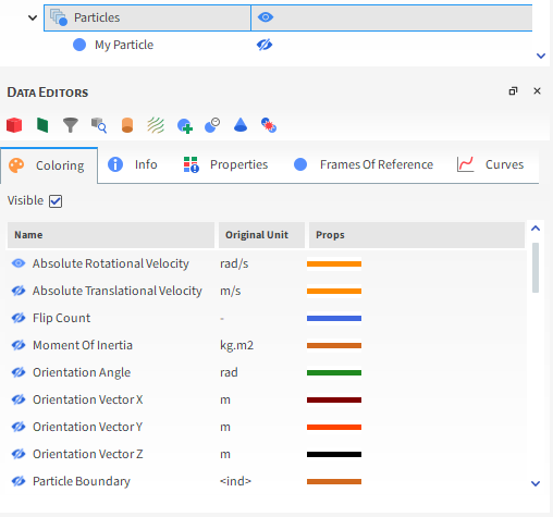
The active data sets being shown in the selected window are indicated with an "open" eye icon. (See also Show/Hide Components by Using Eye Icons and Checkboxes). You can add or remove data shown in the selected plot or histogram by "opening" or "closing" these eye icons accordingly.
In addition, you can use the Props column to change the color and display of the lines, dots, or dashes representing the data in the selected window. (See also Double-Click a Plot Line, Bar, or Point to Change Its Appearance).
What would you like to do?
See Also:
From the Workspace or Windows panel, select the Plot or Histogram window that you want to change. (See also Graph Data within Rocky by Creating a Plot or Histogram.)
From the Data panel, select the simulation entity that contains the properties you want to display or change within the selected window.
From the Data Editors panel, select the Coloring tab, and then do one or both of the following:
Use the eye icons to change what data sets are shown. (See also Show/Hide Components by Using Eye Icons and Checkboxes.)
Double-click a data set row to change the color or display of the data line, dashes, or dots shown in the selected window. (See also Double-Click a Plot Line, Bar, or Point to Change Its Appearance.) The visualization settings you change are automatically updated in the selected window.
See Also:
There are four main ways you can export data and images out of Rocky:
By saving a snapshot of the selected Rocky window
By exporting Plot or Histogram data to a separate CSV file you can review outside of Rocky
By copying an image or data set to the clipboard
By collecting and then exporting boundary forces for FEM analysis
Besides data and images, you may also export individual particle shapes and geometry components out of Rocky as well. You can also use Ansys Workbench to link data from a Rocky project directly to other Ansys tools, such as Mechanical or Fluent.
What would you like to do?
See Also:
There are four main ways you can export data out of Rocky:
by saving a snapshot of the selected Rocky window
by exporting Plot or Histogram data to a separate CSV file you can review outside of Rocky
by copying information, including the snapshot or data values within the window you've selected, to paste into another program
by having Rocky collect forces data for the simulation geometries and then exporting that data to a CSV file you can use in a separate FEA program. (See also About Collecting and then Exporting Geometry Forces Data for Later FEM Analysis.)
Notes:
You may also export individual particle shapes and geometry components out of Rocky as well. These are covered in separate topics. (See also Export a Particle Shape to an STL File and Export a Geometry Component to an STL File.)
You may also use Ansys Workbench to exchange Rocky data with other Ansys tools. (See also About Rocky and Ansys Workbench Integration.)
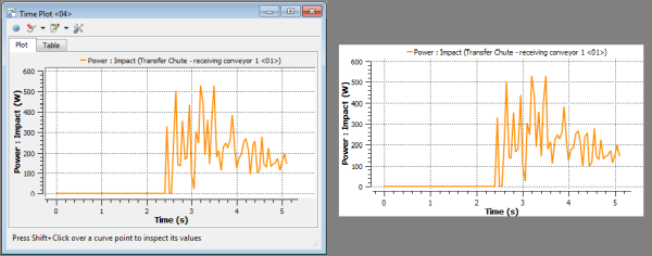
Taking an snapshot of the 3D View, Motion Preview, Particles Details, or graph (plot or histogram) saves an image of only the display area within the selected window. The other window items surrounding the display area, including buttons and on-screen instructions are not included in the final image (as shown below).
Figure 5.112: A Time Plot window in Rocky (left); the saved snapshot image of the same window (right)
There are several ways to save an image in Rocky, which produce slightly different outcomes as described below:
Save a Snapshot of the Rocky Window, which is accessible through the Export tab on the Window Editors panel and allows you to accomplish tasks like changing the dimensions of the image prior to saving it (Plots and Histograms only) or setting the magnification of the image (3D View, Motion Preview, and Particles Details windows only). Note: For Plots and Histograms, you can access this same information by right-clicking within the window area, pointing to Export and then selecting Image.
Save an Image of the Rocky Window, which is accessible through the Windows menu and uses only the current dimensions of the window when saving the image.
See the images and tables below to understand more about how to use the Window Editors panel to save a snapshot.
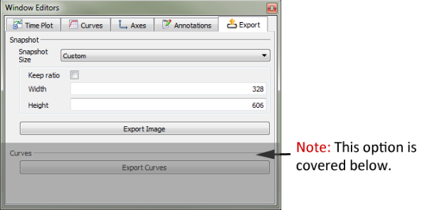
Figure 5.114: Export settings in the Window Editors panel (3D Views, Motion Preview, and Particles Details windows only)

Table 1: Export Image settings for Plots and Histograms in the Window Editors panel
Setting | Description | Range |
|---|---|---|
Snapshot Size | Enables you to choose the width and height of the image to be saved. Specifically:
| Window Size; Custom |
Keep ratio | When Snapshot Size is set to Custom, this enables you to keep the aspect ratio of your image relative to the window size. When enabled, you can change only the Width value and Rocky will calculate the Height value accordingly. When cleared, you can change both the Width and Height values. | Turns on or off |
Width | When Snapshot Size is set to Window Size, this displays the width of the selected window in pixels. When Snapshot Size is set to Custom, this enables you to set a custom width value. | Positive values |
Height | When Snapshot Size is set to Window Size, this displays the height of the selected window in pixels. When Snapshot Size is set to Custom, this enables you to set a custom height value. | Positive values |
Table 2: Export Image settings for 3D View, Motion Preview, and Particles Details windows in the Window Editors panel
Setting | Description | Range |
|---|---|---|
Magnification | Enables you to increase the level of magnification for the image you are exporting. For example, a value of 1 saves the image at the same level of magnification as the selected window. A value of 2 saves the image at double the magnification, a value three at triple the magnification, and so on. | Whole numbers 1 or greater |
To review your data in a CSV file outside of Rocky, you must first create a plot or histogram of the data you want to export. (See also Graphing (Plot or Histogram) a Data Set Within Rocky.)
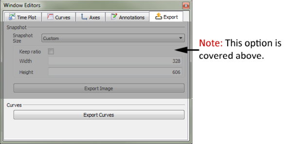
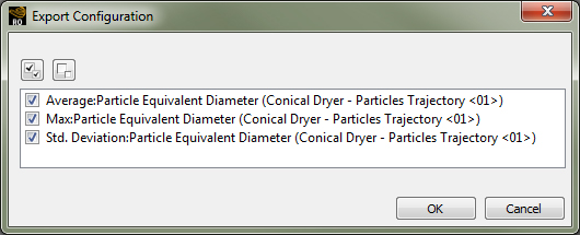
After you choose to Export Curves on the Export tab of the Window Editors panel (Figure 5.115: Time Plot, Export Curves settings in the Window Editors panel), you can select which curves you want to include in the CSV file on the Export Configuration dialog (Figure 5.116: Export Configuration dialog).
Note: You can access this same information by right-clicking within the window area, pointing to Export and then selecting Curves.
If you don't want to save a copy of your image or data, you can also choose to place a temporary copy on the clipboard and then paste it into another program later. You may accomplish this from the Edit | Copy menu, or from the right-click menu within the window area you want to copy.
Choosing Image copies the image using the current dimensions of the window to the clipboard, which can then be pasted into an image editor or other software. This is available for all Rocky windows.
Choosing Values copies the underlying data used to create the curves in a plot or histogram window to the clipboard, which can then be pasted into a spreadsheet or other software.
What would you like to do?
See Also:
If you are interested in analyzing how the particle loading will affect your structure, then you can have Rocky record those loads and export them for use in a third-party FEA tool, such as Ansys Mechanical. To do so, ensure you have enabled the collection of Forces for FEM Analysis for Boundary Collisions Statistics before processing your simulation (see also About Collision Statistics for Boundaries). (Note: If you are doing this integration through Workbench, this checkbox will be automatically enabled for you.) After processing, you are then able to export the recorded data into a .csv file. This file can be used in a separate FEA tool—such as Ansys Mechanical—for analysis.
FEM loads can be exported for one or more geometry components in your simulation, and for a single Timestep or a Timestep range that you define. One CSV file is created for each of the selected Timesteps and includes the recorded loads acting on all selected geometries as a result of particle interaction.
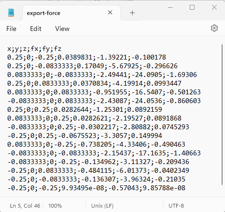
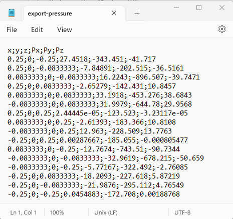
The CSV files that you export will show the values for the selected load type in each coordinate. The image below illustrates how the data is arranged: the first , the second and the third columns refer to the X, Y and Z coordinates from the geometries you selected, respectively. The fourth , fifth and sixth columns refer to the FEM loads components in directions X, Y and Z respectively, at each coordinate.
Tip: You can also use Ansys Workbench to share the data Rocky collects directly with Ansys Mechanical using a Static Structural Model, or a Transient Structural Model. (See also About Rocky and Ansys Workbench Integration.)
Use the image and table below to understand how to export geometry loads into a CSV file.
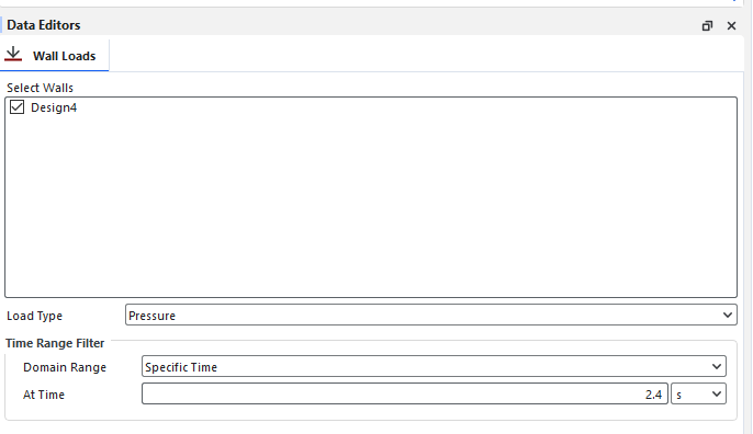
Table 1: Export Loads dialog settings
Setting | Description | Range |
|---|---|---|
Select Walls | Enables you to choose which geometry data will be included in the export. | Turns on or off |
| Load Type | Enables you to choose what you want to include in the export, between pressure and force. |
Pressure; Force. |
Domain Range | Defines what timesteps of the simulation are included in the export. The options are as follows:
| Application Time Filter; All; Last Output; Time Range; Specify Time; After Time; Time Range Relative to Simulation End. |
Initial | When Time Range or After Time is chosen for Domain Range, this is the starting time to begin the Timestep selection. | Any value between 0 and the final simulation time. |
Final | When Time Range is chosen for Domain Range, this is the ending time to stop the Timestep selection. | Any value between the Initial time and the final simulation time. |
At Time | When Specific Time is chosen for Domain Range, this is the exact moment in which the Timestep will be selected. | Any value between 0 and the final simulation time. |
Range from end | When Time Range Relative to Simulation End is chosen for Domain Range, this is the period of time before the final simulation time in which timesteps will be included in the selection. For example, when you want to include only the last X seconds of the simulation. | Any value between 0 and the final simulation time. |
What would you like to do?
See Also:
In the Workspace, select the 3D View, Motion Preview, Particles Details, Plot, or Histogram window for which you want to save a snapshot.
From the Window Editors panel, select the Export tab, and then under Snapshot, enter what you want.
Click Export Image. The Snapshot dialog appears.
From the Snapshot dialog, enter a folder location, File Name and Save as Type information, and then click Save. The image is saved to the location you chose and Rocky asks you whether you want to open the snapshot.
Tip: For Plots and Histograms only, you can also access this same information by right-clicking within the window area, pointing to Export and then selecting Image.
See Also:
From the Windows panel, select the plot or histogram containing the data that you want to export. Tip:Use the View menu to show any panels that might not currently be visible in the UI.
From the Window Editors panel, select the Export tab and then under Curves, click Export Curves.
From the Export Configuration dialog, ensure under Export that the check box for the data set(s) you want are selected, and then click OK.
From the Export Curve(s) dialog, choose a location and enter a file name for the CSV file, and then click Save.
Tips:
You can perform this same process by right-clicking within the window area, pointing to Export and then selecting Curves.
You can copy the data to the clipboard instead of saving it by right-clicking within the window area, point to Copy and then selecting Curves.
See Also:
In the Workspace, select the 3D View, Motion Preview, Particles Details, Plot, or Histogram window for which you want to copy an image or data.
From the Edit menu, point to Copy and then do one of the following:
To copy a snapshot of the window to the clipboard, click Image.
To copy the underlying data to the clipboard, click Values.
The copied information is now available for you to paste into another program, such as a spreadsheet or image editor.
See Also:
Set up your simulation as you normally would.(See also Setting Up a Simulation.) Tip:You can also use Ansys Workbench to share the data Rocky collects directly with Ansys Mechanical using a Static Structural Model, or a Transient Structural Model. (See also About Rocky and Ansys Workbench Integration.)
Before processing your simulation, ensure that you have enabled the Forces for FEM Analysis Boundary Collision Statistics option. (See also About Collision Statistics for Boundaries.) Note: If you are setting up your simulation within Workbench, this option will be enabled for you.
Process your simulation. (See also Processing a Simulation.)
When processing is complete, do all of the following:
From the Data panel under Geometries, right-click one of the boundaries for which you want to export forces, point to Export, and then click Geometry Loads.
From the Export Loads dialog, select the geometries for which you want to export forces data, and then under Time Range Filter, define which Timestep or range you want included in the export. (See also About Collecting and then Exporting Geometry Forces Data for Later FEM Analysis.)
Click OK.
From the Select file to export dialog, choose a location and name for the .csv file, and then click Save. One .csv file is saved for each Timestep output in the range that you selected. These .csv files can then be used in your FEA program to analyze geometry forces.
See Also: