


A 3D View is a window in the Rocky Workspace that enables you to visualize the various components that make up your simulation.
After you set up your 3D View windows, you can choose to reuse the zoom, rotation, and pan settings in another window by saving and applying a Custom Camera Preset. You can also reuse your 3D View window settings within another project by exporting the project context, or use the 3D View window as a basis for creating an animation of your simulation.
What would you like to do?
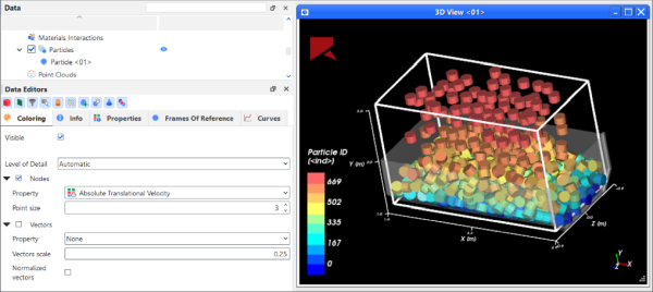
A 3D View window is where in Rocky you will do most of your simulation visualization. Prior to processing, it is where you can preview your geometry, point cloud, and inlet placements. After processing, it is where you will see the particle flow and how it interacts with the geometries and other components in your design (as shown below).
Tips:
To preview your geometry motions prior to processing your simulation, use a Motion Preview window instead. (See also Preview a Motion in 3D.)
To preview a particle shape, or view on a representative particle shape collision statistics that you have collected during processing, use a Particles Details window instead. (See also Preview a Particle Shape in 3D.)
As with other windows in Rocky, there are various ways you can change what appears in a 3D View window, including fonts, overlays, background colors, and grid lines. After you set up your 3D View window, you can choose to reuse the zoom, rotation, and pan settings in another window by saving and applying a Custom Camera Preset. You can also reuse your window settings within another project by exporting the project context. And, you can use a 3D View window as a basis for creating an animation that you can use to share your simulation results outside of Rocky.
What do you want to do?
Ensure that the components you want to show in the 3D View window have been added to the simulation. (See also Set Simulation Parameters.)
From the Window menu, click 3D View. A new 3D View window appears in the Workspace.
Tip: You can also create a new 3D View by clicking and dragging the component(s) you want to visualize from the Data panel to an empty location within the Workspace.
See Also:
There are several ways you can change what you see in the 3D View window once you have created it, as explained below.
Zoom, pan, tilt, and fit the image by using your mouse, keyboard, an/or the Camera Visualization toolbar
Change the colors and data attributes of the image, including the faces, edges, nodes, or vectors being displayed by using the Coloring tab on the Data Editors panel (or the Coloring Service toolbar)
Show/hide the simulation entity you want displayed by using eye icons on the Data panel
Change the attributes of the 3D Window itself, such as background colors, grid lines, and legend and caption details by using the Window Editors panel
What would you like to do?
Learn more about Using the Mouse, Keyboard, or Toolbar to Change a the View
Learn more about Using the Window Editors Panel to Change a 3D View
Learn more about Using the Coloring Tab to Change a 3D View
Learn more About Using the Coloring Service Toolbar to Change a 3D View
See Also:
Using the mouse and/or keyboard, or the Camera Visualization toolbar, there are several ways you can magnify (zoom), rotate (tilt), pan, and fit the data you see in the 3D View, Motion Preview, or Particles Details window window.
What would you like to do?
There are several ways you can use the mouse and keyboard to change what you see in the 3D View, Motion Preview, or Particles Details window. Note: Some—but not all—of these methods work for Plots as well.
Tip: To see more keyboard shortcuts used in Rocky, refer to the Keyboard Accessibility and Shortcuts topic.
See the images and tables below for details.
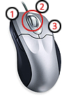
Table 1: Mouse and keyboard functions
Note: The below interactions assume that the Change vizu interactor configuration button is set to Default. (See also About Using the Camera Visualization Toolbar.)
Function | Mouse Interactions |
|---|---|
Zoom or magnify | To zoom in, position the mouse cursor over the view or plot and then move the scroll wheel (2) away from you. To zoom out, move the scroll wheel towards you. |
Pan | To pan, position the mouse cursor over the view or plot, and then click and hold the right mouse button (3) or center wheel buttons (2) while moving the mouse. |
Tilt or rotate | For views only, to tilt or rotate, position the mouse cursor over the image and then click and hold the left mouse button (1) while moving the mouse. |
Change the location of the center point of rotation | For views only, to change the location of the point used for tilting or rotating, press the Ctrl key, and then with the left mouse button, click the new geometry location you want. The view will re-center to that new location and any rotations will happen around that new point. |
Fit the view | To have Rocky automatically fit the data to the view or plot window, press the R key. Tip:Additional view-related keyboard combinations are listed on the Shortcuts section of the Preferences panel. (See also Set Global Preferences.) |
Inspect an individual triangle or block | For 3D Views of Geometries and Eulerian Statistics, you may double-left-click the triangle or block you want to inspect and a new Inspector User Process will be automatically created for the entity you chose. If there is already an Inspector User Process for that entity, Rocky will help you choose to update the cell location of the existing User Process, or create a new one. Note: Double-left-clicking a cell in a 3D View window does not currently work for Particles, 1-Way LBM, or 1-Way Fluent. (See also About the Cell Inspector.) |
Move overlay or legend displays | For views only, position the mouse cursor over the middle of the overlay or legend you want to move, click and hold the left mouse button (1), drag the item to the new location, and then release the mouse. (See also About Using the Window Editors panel to Change a 3D View.) |
Resize overlay or legend displays | For views only, position the mouse over the border of the overlay or legend you want to resize, click and hold the left mouse button (1), drag the border to the new location, and then release the mouse. (See also About Using the Window Editors panel to Change a 3D View.) |
What would you like to do?
See Also:
The Camera visualization toolbar (shown below) has several buttons that are useful for visualizing the objects in your 3D View, Motion Preview, or Particles Details windows—and even some Plot windows—including camera preset views, spin, and projection abilities.
Use the images and table below to help you understand how to use this toolbar for adjusting what you see in your views.

Table 1: Camera Visualization toolbar button descriptions
Button | Description |
|---|---|
| For all windows, clicking the Fit button automatically adjusts the zoom and pan of the selected view or plot window to show any data or entities that are marked as visible. (See also Show/Hide Components by Using Eye icons and Checkboxes). For view windows only, clicking the down arrow to the right of the Fit button displays several Camera Presets that you can use to quickly snap-to a particular view. Specifically:
|
| For 3D View windows only, these buttons enable you to undo or redo any camera-related modifications you made to any open 3D View window. The changes include ones made with the mouse and keyboard (see also About Using the Mouse and Keyboard to Change the View), or through the Camera Presets options on the Fit button menu. |
| For view windows only, when the Camera spin button is enabled (pressed in), it allows all views to spin in the speed and direction you indicate by left-clicking and dragging (slowly or quickly) then releasing the mouse on the view. Tip:Left-click the view again to stop the spinning. When the Camera spin button is disabled, left-clicking and dragging the mouse rotates the view but will not spin it upon release of the mouse. |
| For view windows only, when the Change projection:Default/Orthogonal button is set to Default, a perspective projection is provided of all open views, showing distant objects foreshortened to provide additional realism. |
| For view windows only, when the Change projection:Default/Orthogonal button is set to Orthogonal, a parallel projection is provided of all open views, showing to-scale objects that ignore perspective. |
| For view windows only, changes how the mouse buttons and center wheel affects items being shown in all open view windows. Specifically, when set to:
(See also About Using the Mouse and Keyboard to Change the View). |


What would you like to do?
See Also:
Select the 3D View, Motion Preview, or Particles Details window you want to change.
Do one or more of the following:
Use the left, right, or center wheel buttons on the mouse to rotate, pan, or zoom respectively.
Ctrl + left-click a geometry or particle shape location to change the center point of rotation.
Press R to automatically fit the window view to the available data.
Change to another camera preset by pressing x, X, y, Y, z, and Z respectively. Note: This is the same as using the options on the Fit menu, which is located on the Camera Visualization toolbar. (See also About Using the Camera Visualization Toolbar.)
Double-left-click a geometry triangle or Eulerian Statistics block to inspect that individual cell.
Tip: Additional keyboard shortcuts are listed in the Preferences dialog. (See also Keyboard Accessibility and Shortcuts).
See Also:
From the Window Editors panel, you can modify display settings for all the 3D View windows in your project, or just the selected 3D View window. Changes can include the background color, font color/sizes, text and/or image overlays, and window axes displays. You can also synchronize the Timesteps displayed when two or more 3D View windows are open.
What would you like to do?
See Also:
From the Window Editors panel, you can modify display settings for all the 3D View windows in your project. These include settings such as Property legend display options, window axes display options, and Particle rendering scale.
Tip: You can also use Rocky Preferences to change the background color and fonts for all the 3D View windows in your project. (See the "Preferences for Windows Properties" section in the About Setting Global Preferences topic.)
You can also duplicate the 3D window to facilitate the viewing and editing of different parts of your project. To do this, simply right-click on the tab of the 3D window you want to duplicate and click in Duplicate.
The options on the Properties tab enable you to set the colored legend display options for each of the various Properties that are listed. The image below illustrates the options that can be changed.
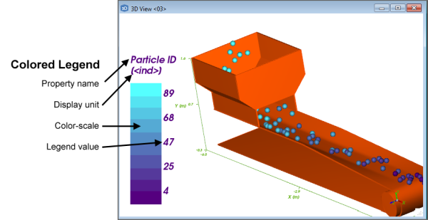
These include the colors making up the banding, the number of value ticks, and the legend units displayed—all of which apply to all 3D Views in your project, and will also be replicated on the Colorings tab of the associated Color Scale. (See also About Color Scales.)
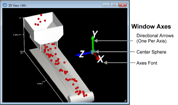
The options on the Axes tab enable you to change the display of the set of colored axes on each of your 3D View windows. The settings include changing individual axis arrow colors, and making changes to the axes set as a whole, including font colors and sizes, as well as the size and placement of the axes set itself:
Important The settings you make on the Axes tab for any of the three window types in Rocky—including the 3D View, Motion Preview, and Particles Details windows—will apply to the other two window types respectively. In addition, any changes you make to an Axes tab will also be replicated in future Rocky projects. (See also About Using the Window Editors Panel to Change the Window Axes Displays.)
The Rendering Scale option on the Particles tab enables you to make particles appear slightly larger or smaller in 3D View windows than calculated.
Important: This rendering affects only the visualization of the particles and has no effect upon the results nor the analyses.
Increasing the scale can be used in cases where the particles in the simulation are so small that you want to exaggerate the size to better show the shape. Decreasing the scale can be a useful in cases where particles appear to "bleed" through the boundary, as illustrated in below.
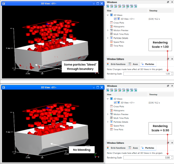
This kind of visual overlap between the particles and the geometry can occur, for example, when the geometries are imported as a surface. Because a surface boundary has no thickness, the particles can sometimes appear to come through it.
In the example shown above, the Rendering Scale is changed from the default of 1.00 to the new value of 0.90, which reduces the rendering of the particles by 10%. In this case, this is enough of a reduction to prevent the Particles from appearing to go through the boundary.
See the images and table below to understand more about how you can use the Window Editors panel to change all 3D View windows in your project.
Figure 5.51: Grid-functions options on the Window Editors panel when the main 3D View entity is selected
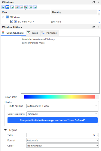
Table 1: Properties options on the Window Editors panel
Setting | Description | Range |
|---|---|---|
Properties | List of Rocky Properties that can be displayed in 3D Views. | Automatically provided |
Color-scale | Displays the current color banding configuration for the legend associated with the selected Property. Clicking the ... button will enable you to edit the options. (See Figure 5.52: Color-scale dialog and Table 2 below.) | Display only |
Limits | ||
Limits options | Determines how the minimum and maximum values for the legend associated with the selected Property are assigned. Specifically:
Tip: You may also have Rocky help you calculate the limits by specifying a time range based upon an applicable process(es). To do so, click the Compute limits in time range and set as "User Defined" button. (See also Figure 5.53: Calculate limits for time range dialog and Table 3 below.) | Automatic PER view; Automatic ALL views; User Defined |
Limits | When Limit options is set to User Defined, this enables you to enter the minimum and maximum values you want to define the legend's limits. | Any value |
Color-scale unit | Determines the units that will be displayed in the legend. Note: If the Color-scale unit differs from the unit you selected in the Limits drop-down list, your limit values will be translated into this preferred unit on the actual legend display. | Options limited by list box |
Legend | ||
Ticks | Defines the number of divisions whose respective values will be displayed next to the legend. Note: Ticks represent only the numerical divisions of the legend. To change the color divisions, use the Banded option on the Color-scale dialog. (See Table 2 below.) | 1 > 65 |
Format | Enables you to change how the values next to each tick are formatted. Specifically:
| Integer; Decimal 2 digits; Decimal 4 digits; Decimal 8 digits; Exponential 2 digits; Exponential 4 digits; Exponential 8 digits; Automatic |
Color | Defines how font color of the values listed next to the legend is determined. Specifically:
| From window; Custom |
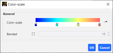
Table 2: Color-scale dialog options
Setting | Description | Range |
|---|---|---|
Color-scale | Determines the gradient distribution of color along the selected scale. From here, you can move the color sliders to adjust the gradient, double-click color slider handles to change the color, double-click the slider bar itself to add another color slider, or click the ... button to select from several additional presets, which you can also modify. | Limited by the UI |
Banded | When selected, the legend will divide the color scale into the number of solid bands you indicate. When cleared, the legend will display the color scale in a smooth, unbanded gradient. Note: Banded applies only to the color divisions of a legend. To change the numerical divisions, change the Ticks value instead. (See Table 1 above.) | Turns on or off; Positive whole numbers 2 or greater |
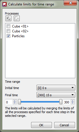
Table 3: Calculate limits for time range dialog options
Setting | Description | Range |
|---|---|---|
Processes | Lists the applicable entities or User Processes upon which you can base your time range. You must select at least one process to calculate limits using a time range. | Limited by the UI |
Time range | ||
Initial time | The timestep with which to begin the time range. This can be set by selecting the timestep you want from the drop-down list, by entering the corresponding output number for the timestep, or by using the slider. | Limited by the UI |
Final time | The timestep with which to end the time range. This can be set by selecting the timestep you want from the drop-down list, by entering the corresponding output number for the timestep, or by using the slider. | Limited by the UI |
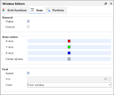
Table 4: Axes options on the Window Editors panel
Setting | Description | Range |
|---|---|---|
General | ||
Visible | When enabled, shows a set of colored axes on all 3D View windows in your project. | Turns on or off |
Interact | When enabled (and the Visible option is enabled as well), this allows you to move and change the size of the set of colored axes on all 3D View windows in your project. | Turns on or off |
Axes colors | ||
X-Axis | Enables you to set the color of the axis arrow that represents the X coordinate direction. | Limited by the options available in the Select Color dialog. |
Y-Axis | Enables you to set the color of the axis arrow that represents the Y coordinate direction. | Limited by the options available in the Select Color dialog. |
Z-Axis | Enables you to set the color of the axis arrow that represents the Z coordinate direction. | Limited by the options available in the Select Color dialog. |
Center sphere | Enables you to set the color of the sphere at the center of the axes. | Limited by the options available in the Select Color dialog. |
Font | ||
Scaled | When enabled, the size of the text used on the axes set will be determined in relation to the height and width of the 3D View window itself; the axes text will grow or shrink in scale with the size of the window. When cleared, the font size can be set through the Size text box. | Turns on or off |
Size | The value entered here determines the size of the axes text in relation to the computer screen. With this option, the text (and its sizing box) stays the same size no matter the height and width of the 3D View window that contains it. | Whole positive values |
Color | Defines how the font color of the axes text is determined. Specifically:
| From window; Custom |
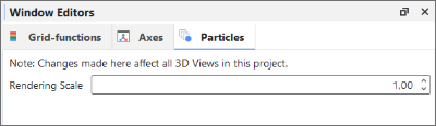
Table 5: Particles options on the Window Editors panel
Setting | Description | Range |
|---|---|---|
Rendering Scale | Defines how Particles shown in 3D View windows will be rendered. Specifically:
Important: This setting affects the visualization of the Particles only and has no effect on the underlying calculations nor simulation results. Note: This text field does not support parametric variables. (See also Change Window Display Options for All 3D Views in the Project.) | Values 0.01 or greater. Tip: Values closer to 1.00 are recommended. |
What would you like to do?
See Also:
Ensure that both the Windows and Window Editors panels are visible. (From the View menu, click Windows. From the View menu, click Window Editors.)
From the Windows panel, select the top most 3D Views entity.
From the Window Editors panel, change the options you want.
See Also:
When you use the Window Editors panel to change the selected 3D View, you have the ability to change how items in the window appear on the screen. These items include background color, font color/sizes, and text and/or image overlays (as shown below). You can also change how multiple windows of the same type respond to changes in Timesteps.
Tips:
You can also use Rocky Preferences to change the background color and fonts for all the 3D View windows in your project, not just the selected one. (See the "Preferences for Windows Properties" section in the About Setting Global Preferences topic.)
You can also change the Property legend display options, window axes display options, and Particle rendering scale for all the 3D View windows in your project. (See also About Using the Window Editors Panel to Change All 3D Views in the Project.)
In this section, we will cover only the items on the 3D View tab and the Overlay tab. See below for other resources:
The Coloring tab in the Window Editors panel for 3D View windows is almost identical to the one provided for default conveyors or imported geometry components on the Coloring tab of the Data Editors panel. See About Using the Coloring Tab to Change a View to understand more about that tab.
The Export tab will be covered in the About Exporting Data and Images Out of Rocky topic.
You use the 3D View tab on the Window Editors panel to change how the window appears and how the data displayed within it is updated. These options include changing display items like the background color; labels, lines, and axes colors; color scale label sizes; and window height and width. In addition, you can choose to show or hide the Bounding box, which displays measurements illustrating the simulation boundaries; use Auto update to enable or prevent the view from being updated when data affecting it is changed; or choose to have multiple views updated with the same Timestep by using Synchronized Time.
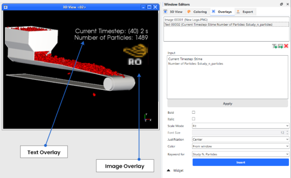
You use the Overlays tab on the Window Editors panel to add text or image overlays. Text overlays can include your own custom text or can include Keywords that will show data, including Property information and Input/Output variables, directly on your window view. Image overlays can include company or association logos, photos of real-world equipment, or any applicable image that compliments your simulation. Adding these kinds of overlays are especially useful for generating videos and images from your simulation.
See the images and table below to understand more about how you can use the Window Editors panel to change a 3D View window.
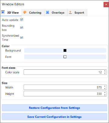
Table 1: 3D View tab options on the Window Editors panel
Setting | Description | Range |
|---|---|---|
Auto update | When enabled, any change made to the display settings of the selected window or to the items affecting the data or settings calculated and displayed within the window, including the Timestep or Properties displayed, will be updated in the window automatically. Because automatically updating the view with each separate change can be computationally intensive, you can clear this option to have all calculated items and more computationally intensive display options remain unchanged in the window until you enable Auto update again. Tip: You will know when the calculations in a window are not being updated when you see a thick red border around the window. | Turns on or off |
Bounding box | When enabled, displays measurements illustrating the simulation boundaries in the selected window. | Turns on or off |
Synchronized Time | When enabled and the window (or any other window with this checkbox enabled) is selected, the details shown in this (and any other Synchronized Time) window will be updated when the current Timestep is changed on the Time toolbar. (See also Use the Timestep Toolbar).When cleared and the window is selected, only this window will be updated when the current Timestep is changed on the Time toolbar. Tip: To keep the Timestep synchronized between multiple windows, ensure each window has this option enabled. | Turns on or off |
Color Background | Enables you to change the color that appears behind the geometries and particles in the window. | Options limited by the choices in the Select Color dialog |
Color Font | Enables you to change the color of the labels, borders, and axes lines displayed in the window. Note: These color options can be overridden for text overlays by using the Color option on the Overlays tab. (See Table 2 below.) | Options limited by the choices in the Select Color dialog |
Font sizes Color scale | Enables you to change the size of the text used on color scales for Properties, which, unlike the other lines or labels displayed on the window, is not affected by the window size or the level of zoom you have applied. | Whole values from 1 to 100 |
Size Width | Enables you to numerically change how wide the window is. Useful in cases where you need exact dimensions for generating animations, or ensuring image consistency. | Whole positive values between 123 and 5000. |
Size Height | Enables you to numerically change how tall the window is. Useful in cases where you need exact dimensions for generating animations, or ensuring image consistency. | Whole positive values between 0 (zero) and 5000. |
Restore Configuration from Settings | Clicking this button replaces the values set on the tab with the ones that have been saved to the (internal) Rocky Settings folder. (See also Rocky File Types and Folders). | (Button selection) |
Save Current Configuration in Settings | Clicking this button overwrites the values that have been saved to the (internal) Rocky Settings folder with the ones currently set on the tab. (See also Rocky File Types and Folders). | (Button selection) |
Table 2: Overlay tab options on the Window Editors panel for Text and Image Overlays
Setting | Description | Range |
|---|---|---|
Text Overlays Only | ||
Input | This box displays the text, phrase, or keyword that you want overlaid onto the selected window. It can be static text that you type in, can be dynamic text by using the Keyword for list, or can be a combination of both. | No limit |
Bold | Enables the selected text overlay to appear bold in the window. | Turns on or off |
Italic | Enables the selected text overlay to appear italic in the window. | Turns on or off |
Scale Mode | Determines how the text in the selected overlay scales in relation to its Font Size, the sizing box that surrounds it, and size of the window itself. Specifically:
| Font Size; Fit; Scaled Font Size |
Font Size | When Font Size or Scaled Font Size are chosen for Scale Mode, this sets the size of the text in the selected overlay. | Whole positive values |
Justification | Aligns the selected text horizontally in the overlay box. Tip: This feature is really only useful when you several lines of text. Use hard returns (press the Enter key) to force text to the next line. | Left Center Right |
Color | Enables you to indicate from what location the font color overlay text will be taken. Specifically:
| From window Custom |
Keyword for | Enables you to enter Rocky-specific placeholder values for data and settings that pertain to your simulation. As your simulation processes or as you change your timestep, and assuming you have selected Auto update on the (Window Type) tab (see Table 1 above), these values will be updated automatically in the text overlay. In addition to the items explained below, if you have defined any Input or Output Variables (see also About Defining and Using Input Variables and About Defining Output Variables), these will be listed here as well. See below for more information on keywords. For more information on Properties, see About Properties .
Tip: If you find that it takes too long to update the text displayed when changing Timesteps or other data, consider clearing the Auto update checkbox on the (Window Type) tab until your changes are complete. (See Table 1 above.) | Property maximum value (Geometries); Property maximum value (Particles); Property minimum value (Geometries); Property minimum value (Particles) Property name (Geometries); Property name (Geometries); Property name (Particles); Property unit (Geometries); Property unit (Particles); Simulation time; Simulation time index; Simulation time value; Study Customer Name; Study Description; Study N. Particles; Study Name |
Image Overlays Only | ||
Filename | This is the location and file name of the image you want overlaid onto the selected window. | .bmp .jpg .png .pnp |
Widget (both Text and Image Overlays) | ||
Visible | When enabled, shows the selected overlay in the window. When cleared, it hides the overlay. | Turns on or off |
Interact | When enabled, allows you to move and resize the selected overlay. When cleared, it locks the size and position. | Turns on or off |
Keep aspect ratio | When enabled, locks the aspect ratio of the sizing box surrounding the overlay so that when you resize it, the shape of the box is maintained. When cleared, you may change the shape of the sizing box surrounding the overlay. Note: The shape of the sizing box has no real effect upon the display of the overlay. No matter the shape, Rocky will automatically maximize the size of the content to fill it. | Turns on or off |
Position | X | For the selected overlay, this defines the X-position of the sizing box's lower left corner normalized in relation to the window size. A value of zero (0) is equal to the left window border and a value of 1 is equal to the right window border. | 0-1 |
Position | Y | For the selected overlay, this defines the Y-position of the sizing box's lower left corner normalized in relation to the window size. A value of zero (0) is equal to the lower window border and a value of 1 is equal to the upper window border. | 0-1 |
Position | Width | For the selected overlay, this defines the width of the sizing box normalized in relation to the window size. A value of 1 is equal to the full width of the window. | 0-1 |
Position | Height | For the selected overlay, this defines the height of the sizing box normalized in relation to the window size. A value of 1 is equal to the full height of the window. | 0-1 |
Opacity | Enables you to adjust the transparency of the overlay. The higher the value, the more opaque the overlay appears. The lower the value, the more transparent. | 0.0 - 1.0 (Values limited by UI) |
Border Size | Enables you to increase the thickness of the sizing box that surrounds the overlay. | Whole positive values including 0 (zero) |
Border Color | Enables you to change the color of the sizing box that surrounds the overlay. | Options limited by the choices in the Select Color dialog. |
What would you like to do?
See Also:
Ensure the Window Editors panel is visible. (From the View menu, click Window Editors.)
From the Workspace, select the 3D View window that you want to change. (See also View Geometries, Particles, Points, and Fluids in 3D.)
From the Window Editors panel, select the 3D View tab and then change the options you want.
Tips:
You can also open the Window Editors panel for a window by right-clicking an empty space within the 3D View window (for example, the background behind the geometries), and then clicking Settings.
You can also use Rocky Preferences to change the background color and fonts for all the 3D View windows in your project, not just selected one. (See the "Preferences for Windows Properties" section in the About Setting Global Preferences topic.)
To reuse in future projects the settings you made to this tab, click the Save Current Configuration in Settings button.
To apply settings you have already saved (either by previously using the Save Current Configuration in Settings button or by saving selections within the Preferences dialog) to this tab, click the Restore Configuration from Settings button.
See Also:
Ensure the Window Editors panel is visible. (From the View menu, click Window Editors.)
From the Workspace, select the 3D View window that you want to change. (See also View Geometries, Particles, Points, and Fluids in 3D.)
From the Window Editors panel, select the Overlays tab and then do one of the following:
To add a new text overlay, click the Add text overlay button. A new Text entry appears in the Overlays list at the top of the panel.
To edit an existing text overlay, select the name of the text you want to change from the list at the top of the panel.
Do any or all of the following:
To enter your own text, under Input, place your cursor directly into the Text entry and then remove and add text as you like using your keyboard.
To have Rocky automatically display simulation-related text, including simulation time or property name, in the Input box, place your cursor where you want the text to be inserted, choose what you want from the Keyword for list, and then click Insert. The placeholder text appears in the Input box. Tip:To see the text replaced with real values on the 3D View, click Apply.
To change how the text is displayed in the window, edit the Bold, Italic, Scale Mode, Font Size, Justification, and Color options as you want. (See also About Using the Window Editors panel to Change the Selected 3D View.)
To move the text, do one of the following:
Use your mouse to click the center of the text box and then drag it to a new location on the window.
Under Widget, use the Position options for X and Y.
To change the size and shape of the text box, do one of the following:
Click the text box border in the 3D View window, and then drag the border to resize or reshape the text box.
Under Widget, use the Position options for Width and Height. Note: While the Keep aspect ratio (under Widget) setting will allow you to change the shape of the sizing box that surrounds the text, it will not affect the size of the text itself. No matter the shape of the sizing box, Rocky will maximize the text size to fill it.
To hide the text from the 3D View window, under Widget, clear the Visible checkbox.
To lock the size and position of the text box, under Widget, clear the Interact checkbox.
To change how transparent the text is, under Widget, edit the Opacity value. Tip:Click away from the Opacity box to have your changes applied to the 3D View.
To change the appearance of the box surrounding the text, choose what you want under Widget for Border Size and Border Color.
To remove all the text in the selected overlay, click the Remove overlay button.
See Also:
Ensure the Window Editors panel is visible. (From the View menu, click Window Editors.)
From the Workspace, select the 3D View window that you want to change. (See also View Geometries, Particles, Points, and Fluids in 3D.)
From the Window Editors panel, select the Overlays tab and then do one of the following:
To add a new image, do all of the following:
Click the Add image overlay button. A new Image entry appears in the Overlays list.
Under Input click the … button next to Filename.
From the Load File dialog, navigate to and select the image file you want, and then click Open.
The location of the file you selected is displayed in the Filename box and the Image entry is appended with the file name. The image you selected appears in the selected window.
To edit an existing image, under Input, select the entry representing the image that you want to change.
Do any or all of the following:
To move the image, use your mouse to click the center of the image and drag it to a new location on the window.
To change the size of the image, click the image border in the window, and then drag to resize as desired.
Note: While the Keep aspect ratio (under Widget) setting will allow you to change the shape of the sizing box that surrounds the image, it will not affect the size of the image itself. No matter the shape of the sizing box, Rocky will maximize the image size to fill it.
To hide the image from the window, under Widget, clear the Visible checkbox.
To lock the size and position of the image, under Widget, clear the Interact checkbox.
To change how transparent the image is, under Widget, edit the Opacity value. Tip: Click away from the Opacity box to have your changes applied to the window.
To change the appearance of the box bordering the image, choose what you want under Widget for Border Size and Border Color.
To remove the image from the selected window, click the Remove overlay button.
See Also:
From the Window Editors panel, you can modify the axes display settings for all 3D View, Motion Preview, and Particles Details windows in your project. The settings you make on the Axes tab for any of the three window types will apply to the other two window types respectively. And any changes you make will also be replicated in future Rocky projects.
Important: The axes settings described here apply only to the set of axes representing the window itself. Other axes in Rocky, including the set of axes representing a motion frame and the set of axes representing an inlet, are not affected by these settings.
The options on the Axes tab enable you to change the display of the colored axes set on each of your Rocky windows. The settings include changing the individual arrow colors, axes fonts, and the size and placement of the axes set itself:
See the images and table below to understand more about how you can use the Window Editors panel to change all Axes settings for the windows in your project.
Table 1: Axes options on the Window Editors panel
Setting | Description | Range |
|---|---|---|
General | ||
Visible | When enabled, shows a set of colored axes on all windows in your project. | Turns on or off |
Interact | When enabled (and the Visible option is enabled as well), this allows you to move and change the size of the colored axes set on all windows in your project. | Turns on or off |
Axes colors | ||
X-Axis | Enables you to set the color of the axis arrow that represents the X coordinate direction. | Limited by the options available in the Select Color dialog. |
Y-Axis | Enables you to set the color of the axis arrow that represents the Y coordinate direction. | Limited by the options available in the Select Color dialog. |
Z-Axis | Enables you to set the color of the axis arrow that represents the Z coordinate direction. | Limited by the options available in the Select Color dialog. |
Center sphere | Enables you to set the color of the sphere at the center of the axes. | Limited by the options available in the Select Color dialog. |
Font | ||
Scaled | When enabled, the size of the text used on the set of axes will be determined in relation to the height and width of the window itself; the axes text will grow or shrink in scale with the size of the window. When cleared, the font size can be set through the Size text box. | Turns on or off |
Size | The value entered here determines the size of the axes text in relation to the computer screen. With this option, the text (and its sizing box) stays the same size no matter the height and width of the window that contains it. | Whole positive values |
Color | Defines how the font color of the axes text is determined. Specifically:
| From window; Custom |
What would you like to do?
See Also:
Ensure that both the Windows and Window Editors panels are visible. (From the View menu, click Windows. From the View menu, click Window Editors.)
From the Windows panel, select the top-most item for any of the three window categories. This includes the 3D View, Motion Preview, and Particles Details entities.
From the Window Editors panel, on the Axes tab, change the options you want. The changes you make are replicated to all windows in the project and will also be retained for future projects.
Important: The axes settings described here apply only to the set of axes representing the window itself. Other axes in Rocky, including the set of axes representing a motion frame and the set of axes representing an inlet, are not affected by these settings.
See Also:
The Coloring tab, located on the Data Editors panel for all simulation entities and User Processes, enables you to change the colors and data attributes of the entities being displayed in a 3D View window. Faces, edges, nodes, and vectors can be shown or hidden; displayed in solid colors; or colored by a Property property of your choice.
In addition, the Coloring tab also enables you to modify the limits, units, and legend options for the color scales used in your view windows.
For quicker access in 3D View windows only, some of these same options are also available on the Coloring Service toolbar.
What would you like to do?
See Also:
Using the options on the Coloring tab is one way you can change what is displayed in a 3D View window for the simulation entity that you want to change. Visualization options for the Faces, Edges, and Nodes can be modified with the Coloring tab for any of the following entities:
Inlets
Non-Particle-Specific User Processes, which includes a Cube, Cylinder, Polyhedron, Plane, Property, or Cell Inspector User Process
Any other User Process created from any of the above entities
For Color scales, there is also a Coloring tab but the options presented are quite different than the ones explained below. For more information, see also About Color Scales.
Example effects you can achieve with this method include smoothing out the Faces visualization of an Eulerian Statistics property by enabling Show on Nodes:
Figure 5.63: A Cube User Process with Eulerian Statistics applied displays Number of Particles with Show on Nodes disabled (left) and enabled (right)
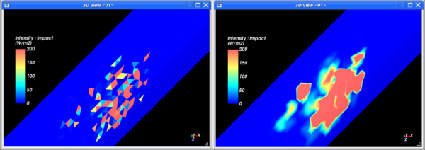
For default conveyors and imported geometry components, you can also color Edges by a property (Figure 5.64: A custom conveyor showing Solid Color Faces with Edges showing Intensity : Impact); enlarge the point size of Nodes (Figure 5.65: A custom conveyor showing 70% Transparent Solid Color Faces with increased Point Size Nodes showing Intensity : Impact); and smooth out the Faces visualization of a property by enabling Show on Nodes (Figure 5.66: A custom conveyor with Faces showing Intensity : Impact with Show on Nodes disabled (left) and enabled (right)).
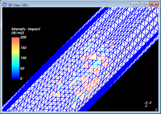
Figure 5.65: A custom conveyor showing 70% Transparent Solid Color Faces with increased Point Size Nodes showing Intensity : Impact
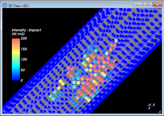
Figure 5.66: A custom conveyor with Faces showing Intensity : Impact with Show on Nodes disabled (left) and enabled (right)
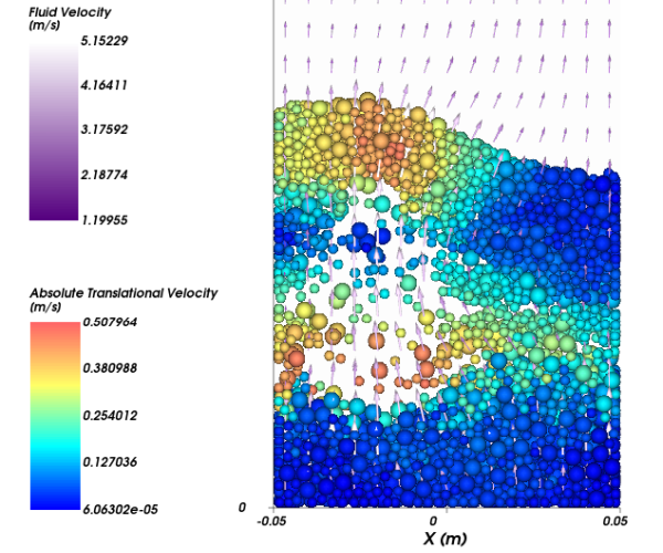
For CFD Coupling, you can also visualize the flow of fluids by viewing them as Nodes or Vectors. In 2-Way Fluent, for example, the fluid behavior is transient so as the simulation progresses, you can better see how the fluid flow interacts with the particle flow and vice versa:
Figure 5.67: Example of a 2-Way Fluent simulation showing transient fluid flow vectors (in purple), and transient particle nodes (all colors)
See the image and table below to help you understand how to use the Coloring tab to change a 3D View for selected entity.

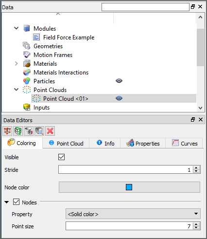
Table 1: Coloring tab parameter options (all entities except Color scales)
Setting | Description | Range | Applicable Entities |
|---|---|---|---|
Visible | When enabled, shows the selected entity in the active view window. Note: This is the same as using the Data panel eye icon. (See also Show/Hide Components by Using Eye icons and Checkboxes.) | Turns on or off | All entities |
Stride | One out of this number of data points will be shown when displaying Nodes or Vectors. The lower the number, the more data points will be displayed. Choosing a higher number can help speed up displays with very large amounts of data. Example: Choosing a Stride of 5 means that 1 point out of every 5 will be shown in the 3D View. | Whole numbers 1 or greater | Particles (Vectors only); Point Clouds; Contacts; 1-Way Fluent; 2-Way Fluent |
Transparency | Enables boundaries to be drawn transparently in the selected view window. A value of 0 (zero) makes the faces completely solid or opaque. A value of 100 makes the faces completely transparent or hidden. | Turns on or off; 0-100 | Default Conveyors; Imported Geometry Components; Eulerian Statistics |
Color | When Faces, Edges, and/or Nodes are selected and the Property is <Solid Color>, this enables the selected display type to be colored in the one solid color chosen. Note: For Faces, Transparency options affect how opaque this color appears in the view. | Options limited by the Select Color dialog | All entities |
Faces | Enables the entire surface of the entity to be visible and affected by the various Faces coloring options. | Turns on or off | Default Conveyors; Imported Geometry Components; 1-Way LBM; Eulerian Statistics |
Scope | When Faces is enabled, this changes how the blocks or cells are drawn in the view. Specifically:
| Full; Boundary | 1-Way LBM; Eulerian Statistics |
Structured Partitions | When Faces is enabled, this determines what side(s) of each block is visible. Specifically:
| All; Custom | Eulerian Statistics |
Structured Custom Partitions | When Faces is enabled and Custom is chosen from the Structured Partitions list, this enables you to select one or more sides that you want visible on each block. | Top; Bottom; North; South; East; West; | Eulerian Statistics |
Property | Three separate lists under Faces, Edges, and Nodes respectively provide properties and other color options that apply to the display type within which the list is contained. Specifically:
| <Solid color>; List of properties automatically generated from the Properties tab | All entities |
Show on Node? | When Faces is enabled and a property is selected from the Property list under Faces, this enables the visualization of the selected property to be evenly interpolated across the entity for a smoother visualization. | Turns on or off | Default Conveyors; Imported Geometry Components; 1-Way LBM; Eulerian Statistics |
Edges | Enables only the edges bordering the components making up the entity boundaries visible and affected by the various Edges coloring options. | Turns on or off | Default Conveyors; Imported Geometry Components; Particle Trajectories; 1-Way LBM; Eulerian Statistics; Contacts |
Width | When Edges is selected, this changes the thickness of the lines used to draw the borders. Entering 1 will provide the narrowest line. | Positive values | Default Conveyors; Imported Geometry Components; Particle Trajectories; 1-Way LBM; Eulerian Statistics; Contacts |
Nodes | Enables the points marking the intersections of the entity's individual components to be visualized as dots and affected by the various Nodes coloring options. | Turns on or off | All entities |
Level of Detail | Determines how the Particle visualization will be rendered. The more detailed the rendering, the more time it will take to visualize. Specifically:
| Rich; Automatic; Simple | Particles |
Point Size | When Nodes is selected, this changes the size of the dots used to draw the nodes. Entering 1 will provide the smallest dot. | Positive values | All entities |
Vectors | Enables the entity's data to be visualized as vectors and be affected by the various Vectors coloring options. | Turns on or off | Particles; Particle Trajectories; 1-Way LBM; 1-Way Fluent; 2-Way Fluent; Contacts |
Vectors Scale | When Vectors is selected and a property chosen from the Property list under Vectors (not None), this changes the scale of the vectors drawn. The lower the number, the smaller the vectors will be displayed. Unless Normalized Vectors is enabled, the relative size of the vectors is based upon the property being displayed. | Positive values | Particles; Particle Trajectories; 1-Way LBM; 1-Way Fluent; 2-Way Fluent; Contacts |
Normalized Vectors | When Vectors is selected, this enables the vectors to be drawn all the same size according to the Vectors Scale value. | Turns on or off | Particles; Particle Trajectories; 1-Way LBM; 1-Way Fluent; 2-Way Fluent; Contacts |
What would you like to do?
See Also:
The Coloring Service toolbar (shown below) is the method by which you can quickly change visualization options for a 3D View that affects all geometries at once, or all particles at once—all from one central location.

The toolbar presents some of the same options as on the Coloring tab for individual geometry components or Particles (see also About Using the Coloring Tab to Change a 3D View). These settings include what Property to display in the 3D View, as well as color and display options for Faces, Edges, and Nodes.
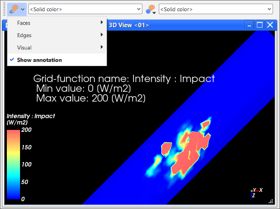
For geometries, you can also use the Show Annotation option to add a quick text overlay with default values:
See the images and table below to help you understand how to use the Coloring Services toolbar to change a 3D View.
Table 1: Coloring Service toolbar button descriptions
Button / Menu Option | Description |
|---|---|
| Presents a menu of options, including Faces, Edges, and Visual, as well as Annotation display options. Options selected here affect all geometries within the project. |
| Presents a menu of options, including Visible, Color, and Visual display options. Options selected here affect all Particles within the project. |
| Two separate lists—one affecting all geometries and one affecting all Particles in the project— provide properties and other color options for the respective entity. Specifically:
|
Faces | Settings for this display type apply to the entire surface of the entity. |
Edges | Settings for this display type apply only to the edges bordering the components making up the entity boundaries. |
Visible | When enabled, shows the selected display type or entity in the active 3D View window. Note: This is the same as using the Data panel eye icon. (See also Show/Hide Components by Using Eye icons and Checkboxes). |
Color | When the Property is <Solid Color>, this enables the selected display type or entity to be colored in the one solid color chosen. Note: For Faces, Transparency options affect how opaque this color appears in the 3D View. |
Visual | Specifies the level of detail in which the entity is rendered. Specifically:
|
Show annotation | For geometries only, creates a new text overlay showing the Property name, and both the minimum and maximum values (Figure 5.71: Show Annotations provides a default text overlay for geometries). These default values can be changed by editing the overlay. (See also Add or Edit a Text Overlay for a 3D View Window). |
What would you like to do?
See Also:
Every time you choose to show a *Property* in a 3D View or Particles Details window, a new colored legend is added to help you understand the data values shown:
For each colored legend created, a new entry is added under Color Scales in the Data panel. By selecting the entry representing it under Color Scales, you can change the appearance of a colored legend—including the colors making up the banding, the number of value ticks, and the units displayed for the legend values—by modifying the options on the Coloring tab (Figure 5.73: Coloring tab options for Color Scale entry in the Data Editors panel).
The options you change apply to all 3D View and Particles Details windows you add to your project.
Use the images and tables below to help you understand how to modify your 3D View and Particles Details Legends using Color Scales.
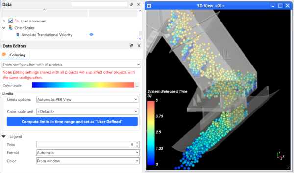
Table 1: Coloring tab options for Color Scale entries in the Data Editors panel
Setting | Description | Range |
|---|---|---|
Share configuration with all projects | When Share configuration with all projects is selected, any changes you make to the Color-scale or its Limits will be applied to all Rocky projects that both uses the selected Color Scale and also has the Share configuration with other projects setting selected. | Share configuration with all projects; Save changes only for current project |
Save changes only for current project | When Save changes only for current project is selected, any changes you make to the Color-scale or its Limits will apply only to the current project whenever the selected Color Scale is used. | Share configuration with all projects; Save changes only for current project |
Color-scale | Displays the current color banding configuration for the selected legend. Clicking the ... button will enable you to edit the options. (See Figure 5.74: Color-scale dialogand Table 2 below.) | Display only |
Limits | ||
Limits options | Determines how the minimum and maximum values for the selected legend are assigned. Specifically:
Tip: You may also have Rocky help you calculate the limits by specifying a time range based upon an applicable process(es). To do so, click the Compute limits in time range and set as "User Defined" button. (See also Figure 5.75: Calculate limits for time range dialog and Table 3 below.) | Automatic PER view; Automatic ALL views; User Defined |
Limits | When Limit options is set to User Defined, this enables you to enter the minimum and maximum values you want to define the legend's limits. | Any value |
Color-scale unit | Determines the units that will be displayed in the legend. Note: If the Color-scale unit differs from the unit you selected in the Limits drop-down list, your limit values will be translated into this preferred unit on the actual legend display. | Options limited by list box |
Legend | ||
Ticks | Defines the number of divisions whose respective values will be displayed next to the legend. Note: Ticks represent only the numerical divisions of the legend. To change the color divisions, use the Banded option on the Color-scale dialog. (See Table 2 below.) | 1 > 65 |
Format | Enables you to change how the values next to each tick are formatted. Specifically:
| Integer; Decimal 2 digits; Decimal 4 digits; Decimal 8 digits; Exponential 2 digits; Exponential 4 digits; Exponential 8 digits; Automatic |
Color | Defines how font color of the values listed next to the legend is determined. Specifically:
| From window; Custom |
Table 2: Color-scale dialog options
Setting | Description | Range |
|---|---|---|
Color-scale | Determines the gradient distribution of color along the selected scale. From here, you can move the color sliders to adjust the gradient, double-click color slider handles to change the color, double-click the slider bar itself to add another color slider, or click the ... button to select from several additional presets, which you can also modify. | Limited by the UI |
Banded | When selected, the legend will divide the color scale into the number of solid bands you indicate. When cleared, the legend will display the color scale in a smooth, unbanded gradient. Note: Banded applies only to the color divisions of a legend. To change the numerical divisions, change the Ticks value instead. (See Table 1 above.) | Turns on or off; Positive whole numbers 2 or greater |
Table 3: Calculate limits for time range dialog options
Setting | Description | Range |
|---|---|---|
Processes | Lists the applicable entities and User Processes upon which you can base your time range. You must select at least one process to calculate limits using a time range. | Limited by the UI |
Time range | ||
Initial time | The timestep with which to begin the time range. This can be set by selecting the timestep you want from the drop-down list, by entering the corresponding output number for the timestep, or by using the slider. | Limited by the UI |
Final time | The timestep with which to end the time range. This can be set by selecting the timestep you want from the drop-down list, by entering the corresponding output number for the timestep, or by using the slider. | Limited by the UI |
What would you like to do?
See Also:
From the Workspace, select the 3D View window that contains the simulation entity for which you want to change the visualization.
From the Data panel, select the entity that you want to change. This can include any of the of the following items:
Default Conveyors or Imported Geometry Components
Inlets
Particles
Point Clouds
Contacts
1-Way LBM
1-Way Fluent
2-Way Fluent
Particles Trajectories User Process
Eulerian Statistics User Process
Non-Particle-Specific User Processes, which includes a Cube, Cylinder, Polyhedron, Plane, Property, or Cell Inspector User Process
Color Scales
Tip: You can also apply settings to multiple, common items at once by multi-selecting items in the Data panel. Only those settings common to the items you have chosen will be shown in the Data Editors panel.
From the Data Editors panel, select the Coloring tab, and then change the settings you want. The visualization settings you change are automatically updated in the selected view window.
See Also:
From the Workspace, select a 3D View or Particles Details window containing the legend you want to change.
From the Data panel, under Color Scales, select the entry representing the legend you want to change. Tip:The entry(s) applicable to the selected window will have an open eye icon displayed to the right of the label.
From the Data Editors panel, on the Coloring tab, modify the settings you want. The changes you make are reflected in all 3D View and Particles Details windows that make use of that legend.
See Also:
Select the 3D View that you want to change.
From the Coloring Service toolbar, do one or both of the following:
Change the display options for all geometries in the project by making selections from the Coloring setting
 menu button and corresponding Property
  list.
list.Change the display options for all Particles in the project by making selections from the Coloring setting
 menu button and corresponding Property list.
See Also:
The options on the Custom Presets toolbar (shown below) enable you to save the camera visualization settings—which include rotation (tilt), magnification (zoom), and location (pan)—you have made for the selected 3D View, Motion Preview, or Particles Details window. By saving these settings as camera presets, you can always return a view to the preset you prefer or can replicate views for other view windows within your current project.

What would you like to do?
See Also:
The Custom Presets toolbar (Figure 5.76: Custom Presets toolbar) enables you to save camera presets for your 3D View, Motion Preview, and Particles Details windows.
A preset saves the rotation (tilt), magnification (zoom), and location (pan) settings you have made for the view window you select. These kinds of camera settings can be changed in the following two ways:
By saving these settings as camera presets, you can always return the position of a view to the preset you prefer or you can replicate views for other view windows within your current project. Custom presets can also help you save time when setting up views for your simulation animations. (See also About Creating and Saving an Animation.)
A preset does not save the window display settings (such as the background color or font sizes) nor the object display settings (such as the transparency, Faces, or Edges treatments) that you have set for the window. Rather, it saves only the relative position of the object being displayed within the window.
In addition, presets are not constrained to the type of object being shown in the window, nor even the type of window itself.
For example, you can save a preset that you made of a particle shape within a Particles Details window and apply that preset to a geometry in a Motion Preview window. However, because the view of the particle shape was likely much more magnified due to the smaller size of the particle, the same view applied to the Motion Frame is likely to be too magnified to fully contain the geometries within the view.
Therefore, when saving and applying custom presets across different kinds of view windows, you may need to "Fit" the view after applying the preset. Tip: Press the R key on your keyboard to Fit the active components into view.
See the images and table below to help you understand how to use the Custom Presets toolbar to save, apply, and modify camera presets for your view windows.
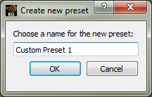
Table 1: Custom Presets toolbar button descriptions
Button | Description |
|---|---|
| Enables you to add a new custom preset to the list. Clicking this button opens the Create new preset dialog (shown above). |
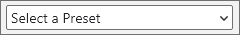
| Presents a list of presets you have saved. Selecting an item from this list will apply the saved settings to the selected view window. |
| Enables you to update the currently selected preset with whatever camera changes that you made to the view. This, in effect, saves over the current preset with the new camera settings. |
| Enables you to remove the selected preset from the list. |


What would you like to do?
See Also:
Select the 3D View, Motion Preview, or Particles Details window displaying the camera visualization settings you want to save. (See also Change a 3D View Window, Change a Motion Preview Window, or Change a Particles Details Window.)
From the Custom Presets toolbar, click the Add preset button.
From the Create new preset dialog, enter a name for the preset, and then click OK. The new preset is added to the Custom Cameras list.
See Also:
Select the 3D View, Motion Preview, or Particles Details window to which you want to apply an existing Custom Camera Preset. (See also Save Custom Camera Settings for a View.)
From the Custom Presets toolbar, select the name of the preset you want from the Custom Cameras drop-down list. The selected view window is updated to reflect the visualization and camera settings saved in the preset you selected.
Tips:
If applying a preset to a window type other than the one for which the preset was originally saved, you may need to "Fit" the view after applying the preset to best see the changes. (Press the R key on your keyboard to Fit the active components into view.)
If the preset you want is already active in the Custom Cameras list, select first another item in the list (for example, the default Select a Preset option), and then select the preset you want.
See Also:
From the Workspace, select a 3D View, Motion Preview, or Particles Details window.
From the Custom Presets toolbar, select the name of the preset you want to modify or remove from the list. The selected view window is updated to reflect the visualization and camera settings saved in the preset you selected.
Do one of the following:
To modify the settings, make the camera visualization changes you want to the selected view window, and then from the Custom Presets toolbar, click the Update selected preset button. The camera visualization settings for the preset you selected will be saved over with the new changes.
To remove the preset, click the Remove selected preset button. The selected preset is removed from the list.
See Also: