


You use the Details pane to specify the attributes of an object selected in the Outline. The pane provides categorized groups of properties for the selected object. You define the various properties in different ways. Some require you to make a selection in the Geometry window, others require a value, and so on. This is the primary entry point to properly define the environmental conditions of your simulation.
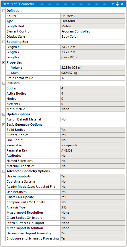
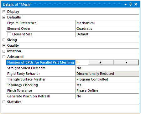
Here is an example of the Details pane for the Geometry object.
For more information, see the topic below:
| Features |
| Pausing Updates |
| Header |
| Categories |
| Undefined or Invalid Fields |
| Decision-Based |
| Text Entry |
| Numeric Values |
| Ranges |
| Increments |
| Scoping |
| Parameters |
| Options |
Features
The Details view enables you to enter information that is specific to each section of the Outline. It automatically displays details for branches such as Geometry, Model, Connections, etc. Features of the Details pane include:
Collapsible bold headings.
Dynamic cell background color change.
Row selection/activation.
Auto-sizing/scrolling.
Sliders for range selection.
Combo boxes for boolean or list selection.
Buttons to display dialog box (browse, color picker, etc.).
Apply / Cancel buttons for geometry selection.
Obsolete items are highlighted in red.
Pausing Updates
Certain actions instruct the application to update the content of the Details view pane. Depending upon the action, this can take an undesirable amount of time. The Options dialog preference Pause View Update enables you to halt Details view updates. This may be desirable until you have completed all desired actions when configuring an analysis. The options of this preference are and (default).
When active, the title of the pane displays the message “Details view Update Paused.” You must change the setting in the Options dialog to deactivate the setting. The setting for this preference carries over to future Mechanical session if not changed.
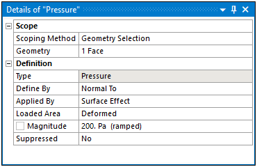
Header
The heading of the pane identifies the name of the selected object (contained in parenthesis), such as the "Pressure" load shown here. For certain objects, the heading may also display the type of object currently selected in addition to the object name.
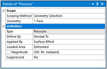
Categories
The category label in the pane organizes associated properties. The Definition category, a common object category, is highlighted in the following example. Double-click a category's name to expand or collapse the category.
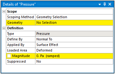
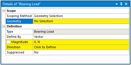
Undefined or Invalid Fields
Fields whose value is undefined or invalid are highlighted in yellow:
Decision-Based
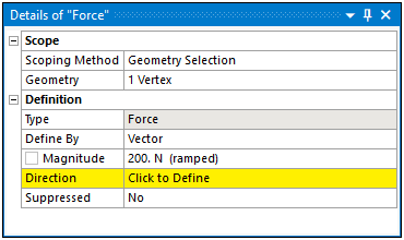
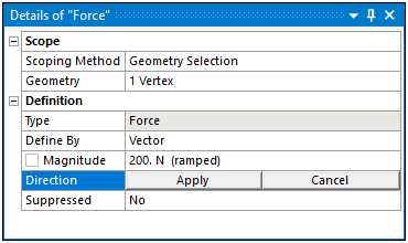
Some properties require a selection in order to specify an attribute, such as the Direction property shown here. This property requires additional specification actions that you then “Apply.”
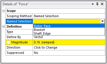
The properties associated with decision-based fields often provide a drop-down list of options, such as the list of Named Selections shown here.
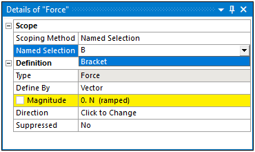
You can search these option-based fields. For example and as illustrated below, an "B" was entered in the field and the application filtered all of the options that included that letter. This search feature is not case sensitive. And, you can change disable this capability (turned on by default) under the UI Controls category of the Miscellaneous Options.
Note: The left column always adjusts to fit the widest visible label. This provides maximum space for editable fields in the right column. You can adjust the width of the columns by dragging the separator between them.
Text Entry
Text entry fields may be qualified as strings, numbers, or integers. Units are automatically removed and replaced to facilitate editing:
Inappropriate characters are discarded (for example, typing a Z in an integer field). A numeric field cannot be entered if it contains an invalid value. It is returned to its previous value.
Some languages use "separators" within numerical values whose meanings may vary across different languages. For example, in English the comma separator [,] indicates "thousand" ("2,300" implies "two thousand three hundred"), but in German the comma separator indicates "decimal" ("2,300" implies "two and three tenths", equivalent to "2.300" in English). To avoid misinterpretation of numerical values you enter that include separators, you are asked to confirm such entries before they are accepted.
For example, in English, if you enter "2,300", you receive a message stating the following:
"Entered value is 2,300. Do you want to accept the correction proposed below?
2300
To accept the correction, click .
To close this message and correct the number yourself, click .
Note: If an invalid entry is detected, an attempt is made to interpret the entry as numerical and you receive the message mentioned above if an alternate value is found. If an invalid value is entered, for example "a1.3.4", and no numerical alternative is found, the entry is rejected and the previous value is re-displayed.
Numeric Values
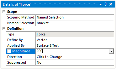
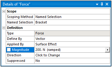
You can enter numeric expressions in the form of a constant value or expression, tabular data, or a function. See Specifying Boundary Condition Magnitude for further information.
Ranges
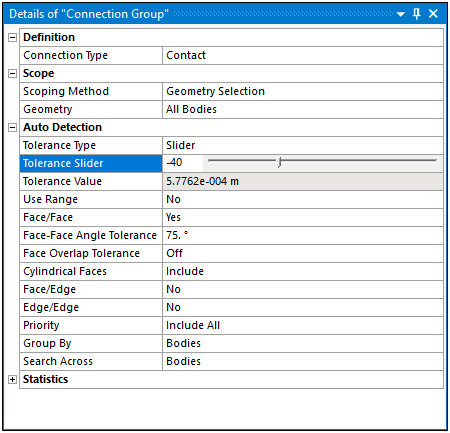
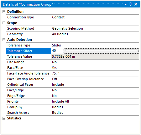
If a numeric field has a range, a slider appears to the right of the current value. If the value changes, the slider moves. And when the slider moves, the value updates.
Increments
If a numeric field has an increment, a horizontal up/down control appears to the right of the current value. The arrow buttons enable you to increase/decrease the property's value.
Scoping
The Scoping Method and its associated properties, usually Geometry and Named Selection, may have selection requirements. For example, the application only supports face scoping for a Bearing Load. If you try to scope the load to any other geometric entity, or a Named Selection that is not face-based, the application presents an invalid state.
Parameters
Variables that you can parameterize display in the interface with a check box. Clicking the box activates the property as a parameter. For more information, see Parameterizing a Variable.
Options
Option fields allow you to select one item from a short list. Options work the same way as Decision-Based, but don't affect subsequent fields. Options are also used for boolean choices (true/false, yes/no, enabled/disabled, fixed/free, etc.) Double-clicking an option automatically selects the next item down the list.
Selecting an option followed by an ellipsis causes an immediate action.