


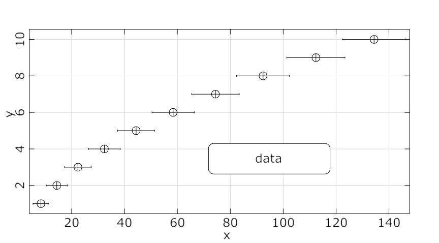
This plot assembles data in lists or a list of lists in Python, and then displays them as chart.
The available Python example script is add_custom_data_plot.py.
The following Python code snippet are excerpts from this script.
Create Visual
Creates a custom data plot using data with data_id, although data is not required.
custom_data = Visuals.CustomData(Id("Custom Data"), data_id)
Add to Postprocessing
Adds custom data plot in postprocessing to control_container, using the specified relative positioning.
    control_container.add_control (
        custom_data,
        True,
        RELATIVE_POSITIONING,
        1./3., 0, 1./3., 1./3.,
        "Data mining"
    )
Select Type
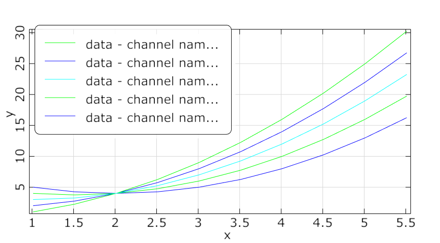
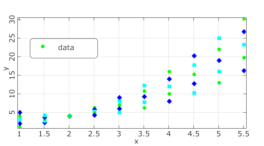
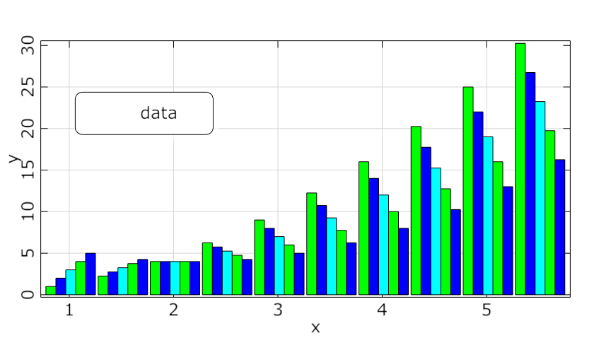
Selects the plot type.
plot_type = Visuals.CustomData_Type.Lines
Add Data
To add some data to the plot:
custom_data.add_data("layer", PyOSDesignEntry(ListList2VariantSignal(mat, vec)),StyleList(),WStrList(), False, plot_type )
Parameters are:
Layer_name
Data: Converted from Python list or listlist to PyOSDesignEntry
Styles
Channelnames
Show channelnames in legend
True: Results in Layername - channel y_data1
False: results in ydata1
plot_type
Preferences
The following preference settings are available:
Appearance
Font size
Line width
Symbol size
Enable axes
Enable lines
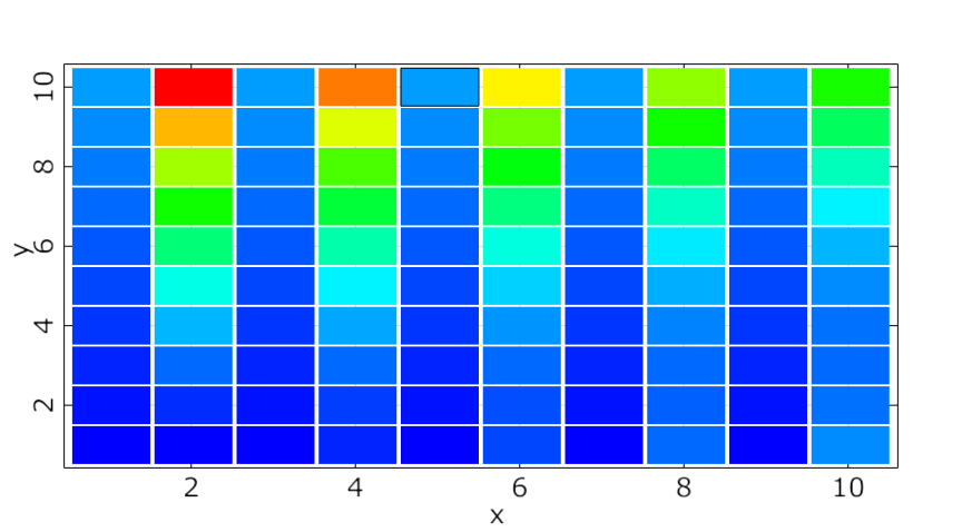
Enable surfaces
Axis Formats
Axis Ranges
Labels
Legend
Log Axes
Palette
Rotation
Window appearance
For more details, see Plot Preference Settings.