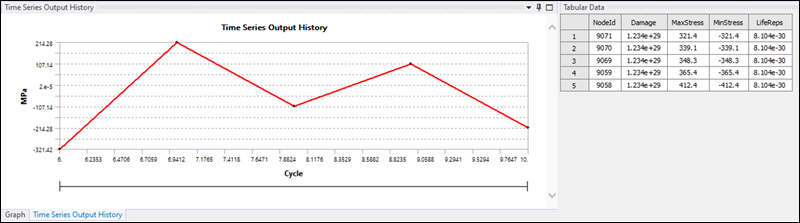
Tabular Data
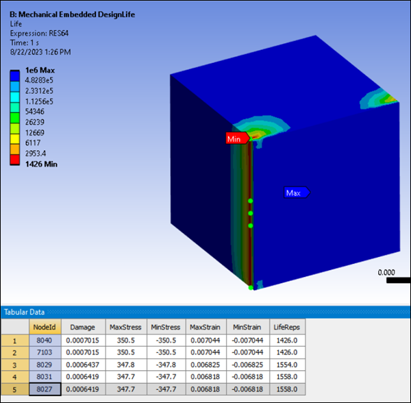
When you select a result that has been previously evaluated, the Most Damaged tabular data is displayed (see Figure 1.6: Most Damaged tabular data).
This tabular data displays the most damaged Node or Element IDs, displaying all results returned by the Ansys nCode DesignLife solver for the corresponding node or element.
By default, the five most damaged Node or Element IDs are filtered. If you require a different number of IDs to be filtered, modify the Most Damaged Ids to Display parameter.
If you select a NodeId or ElementId in the tabular data, the corresponding node or element will be selected and highlighted in green in the graphics panel.
For analysis, the Shell Layer, Seam Weld Location and Seam Weld Type results are also displayed.
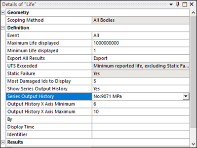
Series Output History
You can choose to display the Series Output History for each of the Most Damaged Ids displayed.
The Show Series Output History option in the Definition section for a Life Loading Event is set to by default. Set this to to display the Series Output History.
When setting the Show Series Output History to . The DesignLife add-on gathers the list of requested Most Damaged Ids and sends the list of elements or nodes to extract for each of them, using the in the case of the Time domain and the in the case of the Frequency domain.
The Series Output History is supported for both and domain and for , , , , , and analysis types.
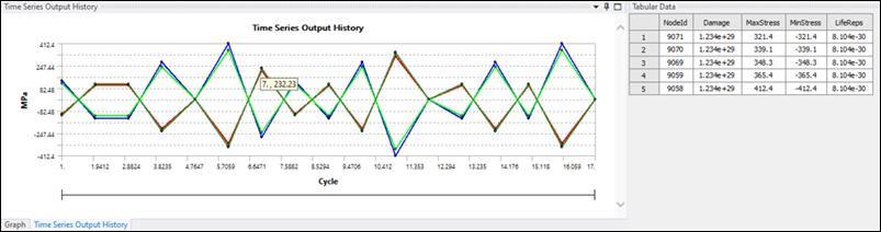
For the Time Domain case (see Figure 1.7: Series Output History: Time domain case), for each node or element, a graph for the combination of loading events is created as the Event processing setting for the frequency domain is set to . In this case, the x-axis corresponds to the number of cycles.
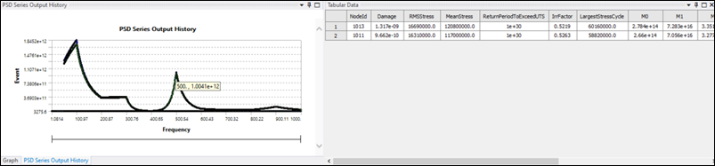
For the Frequency Domain case (see Figure 1.8: Series Output History: Frequency domain case), for each node or element, a graph for each loading event is created as the Event processing setting for frequency domain is set to independent . In this case, the x-axis corresponds to the frequency range.
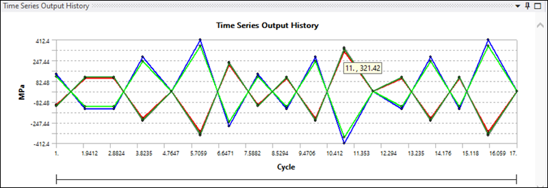
Displaying a Single Time Series Output
By default, for a Series Output History, all the output .csv files generated by nCode are plotted. However, single graphs can be plotted by selecting the required entry from the Series Output History drop-down menu (see Figure 1.9: Selecting a specific Time Series Output). Graphs for the corresponding node and loading event can be displayed independently.
Extracting Peak Information
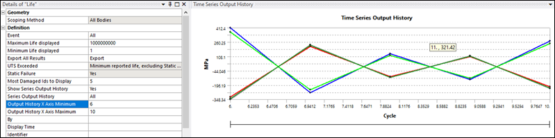
To be able to extract the peak information from a particular graph, you can hover over the specific graph point and a label with the corresponding x and y-information is displayed.
You can filter the x-axis minimum and maximum ranges to visualize the area of interest by setting the Output History X Axis Minimum and Output History X Axis Maximum values (see below).