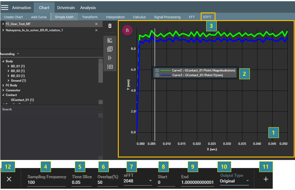
You can transform data in the time domain to the frequency domain by using the Short Time Fourier Transformation method (STFT) in the chart view. A color map or waterfall plot is supported through this operation. At least one graph must be selected for the operations as in the following steps.
Figure 4.36: Steps for the STFT operation
| Step | Description |
| 1 | Select the chart view. |
| 2 | Select the target graphs for the operation. |
| 3 | Select from the menu bar. |
| 4 | Set the Sampling Frequency, which is the maximum frequency of the y-axis in the color map |
| 5 | Set the Time Slice, which is the resolution of the x-axis in the color map. |
| 6 | Set the Overlap which is the percentage of the duplicated time interval for performing the STFT. |
| 7 | Set the number of data points (nFFT) for performing the STFT. |
| 8 | Set the Start time of data for STFT. |
| 9 | Set the End time of data for STFT. |
| 10 |
Under Output Type, set the scale method for resultant data. |
| 11 | Click the  button to create the graph. button to create the graph. |
| 12 | Click the  button to close the operation. button to close the operation. |

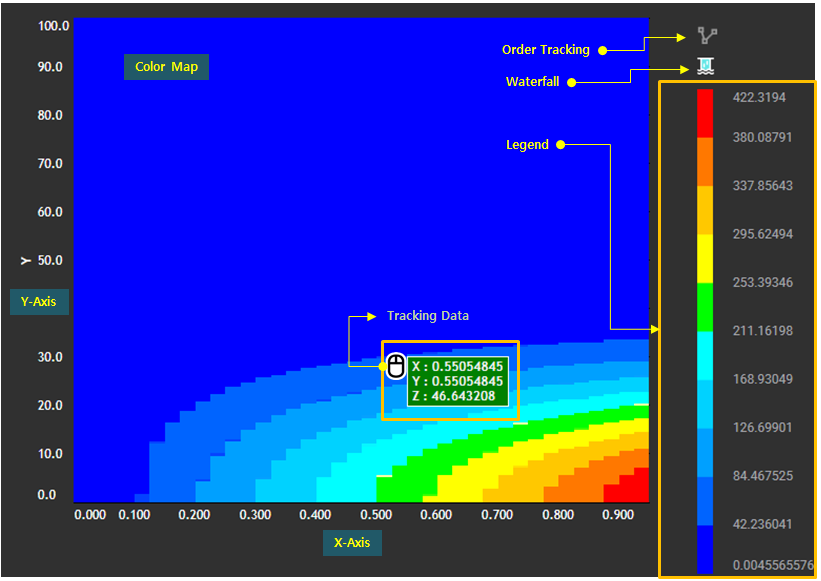
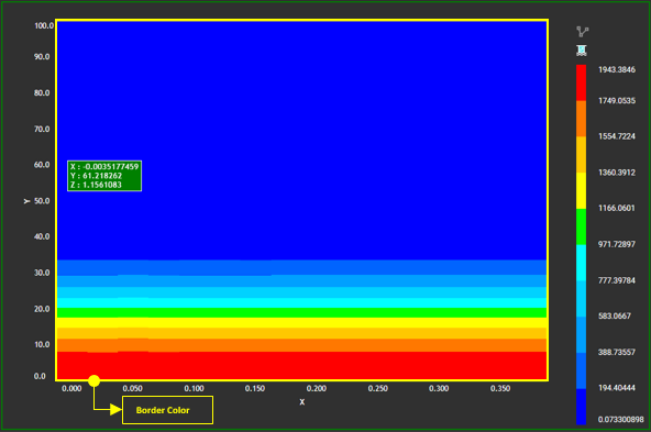
When a STFT is performed, the color map is displayed in a new chart as shown in the figure below. The color, x-axis, and y-axis of the color map correspond to the vibration amplitude, time, and frequency, respectively. Thus, you can analyze which frequency excited when and how much through the color map.
Figure 4.38: Color Map Configuration
| Contents | Description |
| Order Tracking | Used to perform the order tracking. See the definition for Order Tracking. |
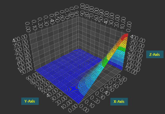
| Waterfall |
Used to display the waterfall plot by clicking the button. The x-axis, y-axis, and z-axis correspond to the time, frequency, and amplitude.
|
| Legend | Used to display the legend, which divides the minimum and maximum values of the resultant amplitude of the STFT into several sections, and shows the value and color corresponding to each section. |
| Tracking Data | Used to show the values of x-axis, y-axis, and color. |
| X-axis | Used to show the range of x-axis, which corresponds to time. |
| Y-axis | Used to show the range of y-axis, which corresponds to frequency. |
| Color | Used to show the magnitude of the target curve by STFT. |
Various properties of the Color Map are supported to change the chart view such as color, visibility, and font as shown in the figure and table below.
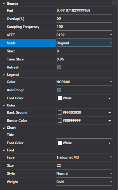
Figure 4.41: Color Map Properties
| Category | Content | Description |
| Source | End | Used to set the end value. |
| Overlap(%) | Used to set the percentage crossover region between intervals. | |
| Sampling Frequency | Used to set the sampling frequency. | |
| nFFT | Used to set the number of points for performing the Fast Fourier Transform. | |
| Scale | Used to set the scale. | |
| Start | Used to set the start value. | |
| Time Slice | Used to set the interval for dividing the region. | |
| Refresh | Used to update data by refreshing results. | |
| Legend | Color | Used to define the color scheme, which determines the colors corresponding to values (see Color Scheme). |
| AutoRange | Used to define how to determine the range of the contour. When this option is selected, the maximum and minimum values of the range are set automatically. Otherwise, you can enter the values directly. | |
| Font Color | Used to define the font color for the contour legend (see Contour Legend). | |
| Color | Back Ground | Used to set the background color of the chart view. |
| Boder Color |
Used to set the border color of the chart view.
| |
| Chart | Title | Used to define the title of the chart view. See Configuration of Chart View for more information. |
| Font Color | Used to set the font color of the title. | |
| Font | Face | Used to select the font face of the chart view title. |
| Size | Used to define the size of the chart view title. | |
| Style | Used to define the style of chart view title. , , and are available. | |
| Weight | Used to define the font thickness of the chart view title. |
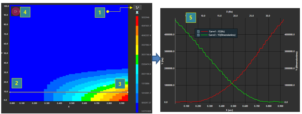
Order tracking is a very useful tool to analyze the N order vibration of rotation and amplitude of specific frequencies in the time domain. Order tracking can be performed using the following steps.
Figure 4.42: Steps for Order Tracking
| Step | Description |
| 1 | Click the button on the Color Map. |
| 2 | Develop the tracking curve by picking points on the Color Map. |
| 3 | Press ESC to finish developing the tracking curve. |
| 4 | Click the Export button  to create the order tracking graph in a
new chart view. to create the order tracking graph in a
new chart view. |
| 5 | Analyze the order tracking graph. The first graph is the vibration amplitude, and the second graph is the frequency along the tracking curve. |