


The following sections demonstrate how to use post tools to complete specific tasks.
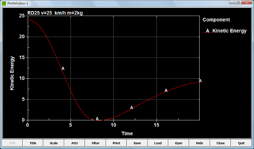
A sample to show how to use ASCII interface to plot xy data in ascii.
Step 1:
Select an ASCII file type in "Ascii type list". Click "Load" button to load this kind of ASCII file.
Step 2:
Select an id in "Id selection list" and a component in "Component selection list".
Step 3:
Choose the way of plotting xy data with "Popup" or "Main" radio button.
Step 4:
Click "Plot" button to plot items from ASCII file in current XY-plot window.
Click "Padd" button to add items from ASCII file to current XY-plot window.
Click "New" button to plot items from ASCII file in a new XY-plot window.
Step 5:
Step 6:
To operate xy data results in main window. See New XYPlot Frame interface in details.
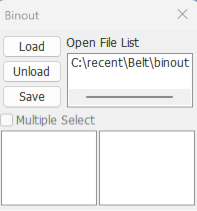
A sample to show how to use Binout interface to plot xy data in binout files.
Step 1:
Click "Load" to open a BINOUT file. Then the file name will be shown in the file list like this,
Step 2:
Click the item of file list. Then the main branches will be shown in the left-bottom list like this,
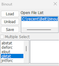
Step 3:
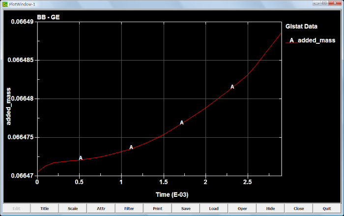
Take "glstat" for an example, click "glstat" in the main branch list. Then the glstat sub branch interface will be shown, like this,
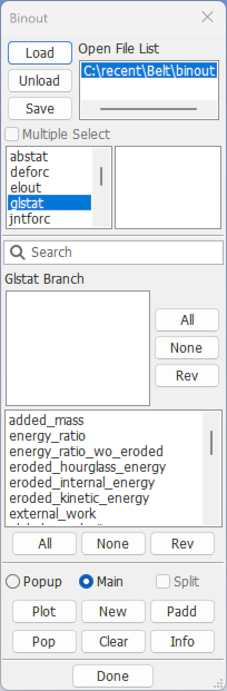
Step 4:
Choose the way of plotting xy data with "Popup" or "Main" radio button.
Step 5:
Click "Plot" to plot selected component in current XY-Plot window.
Click "New" to plot selected component in a new XY-Plot window.
Click "Padd" to add selected component to current XY-Plot window.
Step 6:
Step 7:
To operate xy data results in main window. See New XYPlot Frame interface in details.
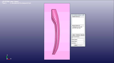
To show an example, how to use the "Chain Multipe Models".
Step 1:
The first step is to load each run through the File menu (File → Open → Binary Plot). The number of models loaded will be shown in the model selection list.
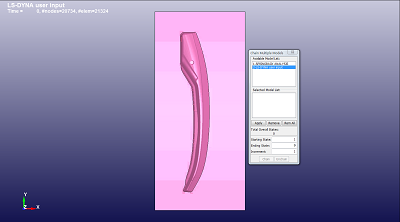
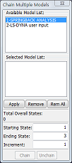
Step 2:
By selecting a model from the list and pressing the Apply button, a sequence list can be built in the list below.
The starting state, ending state, and increment for each model are determined by LS-PrePost automatically ( or they can be modified by the user for each model ).
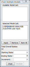
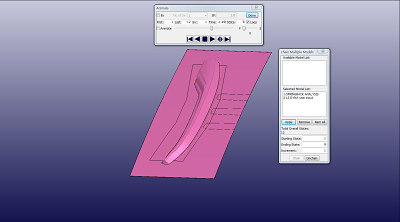
Step 3:
Finally, after composing a sequence, the Chain button can be pressed. This will chain the selected models together. The animation interface can be used for various animation adjustments at that point.
To unchain the sequence, the Unchain button can be pressed to proceed with normal single model animation and processing.
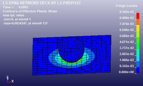
A sample show how to use basic functions to fringe the model with component value. Take "plastic strain" component for an example, the operations of fringing other components are similar to this.
Step 1:
Load a d3plot file in menu of "File->Open->LS_DYNA Binary Plot". Go to Fringe dialog in Post.
Step 2:
Click "Stress" button, the components for stress will be shown in component list.
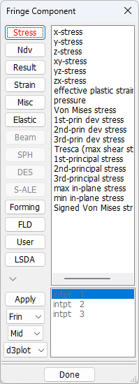
Step 3:
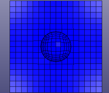
Select the "plastic strain" in the component list. The model will be fringed with the "plastic strain" values, like this,
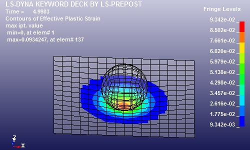
This sample shows how to set limit fringe color map to lower and upper user range.
Step 1:
Follow operations of fringe sample to fringe a model with a kind of component value.
Step 2:
Click "User" radio button, and the "Min" and "Max" text will be enable.
Step 3:
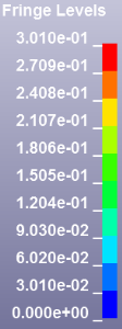
Enter the lower and upper limit value depend on the current fringe range. For example, the range is between 0 and 9.342e-02. You could enter the min value 9.342e-03, which is depend on the fringe range in the right top main window
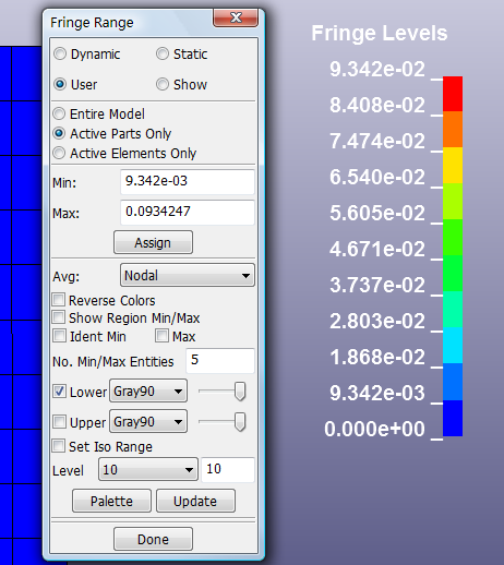
Step 4:
Check the "lower" or "upper" button, click "Update" button. User could modify the color and transparency.
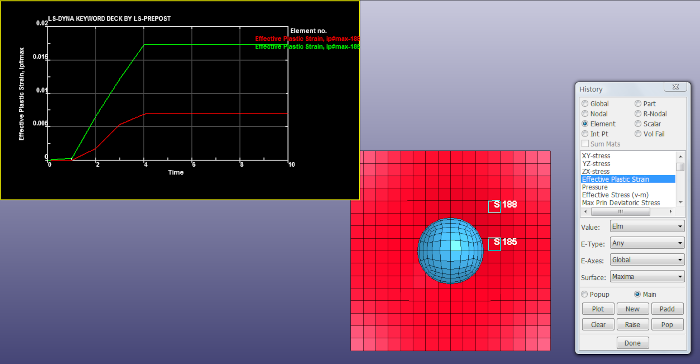
This sample will show how to plot element component history value. The operations of plotting other components value are similar to this sample.
Step 1:
Load a d3plot file in menu of "File->Open->LS_DYNA Binary Plot". Go to History dialog in Post.
Step 2:
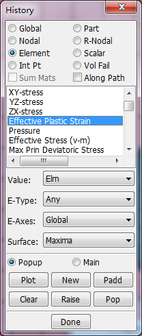
Select "Element" radio button. Then select a component in history component list. Take the component of "Effective Plastic Strain" for example, this item is selected.
Step 3:
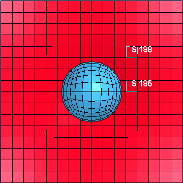
Pick several elements on the model with mouse in main window. The picked elments will be highlight.
Step 4:
Choose the way of plotting xy data with "Popup" or "Main" radio button.
Step 5:
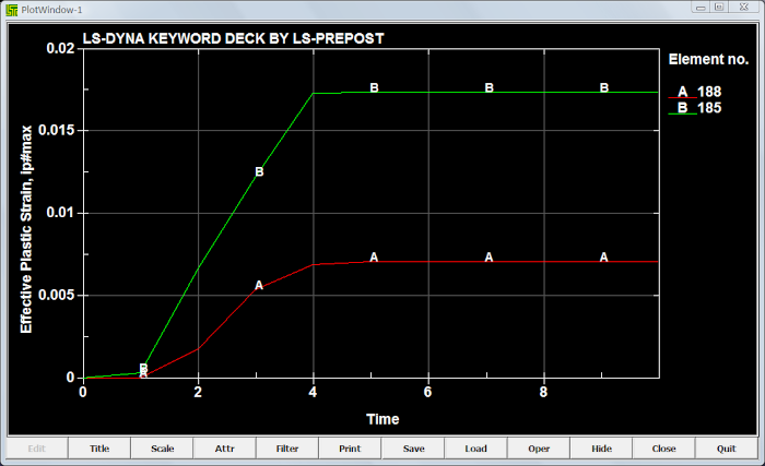
Click "Plot" button to plot time history data in current XY-plot window.
Click "Padd" button to add time history data to current XY-plot window.
Click "New" button to plot time history data in a new XY-plot window.
Step 6:
Step 7:
To operate xy data results in main window. See New XYPlot Frame interface in details.
A sample to setting function.
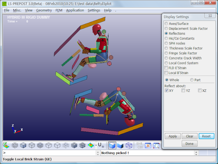
Reflections sample:
Load a d3plot file.
Open Setting->Reflections interface.
Check Whole and XY .
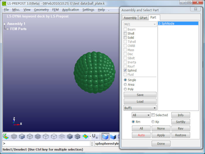
SPH nodes sample:
Load a keyword file.
Create SPH mode with SPH Generation.
Select sphnd with Assembly and Select Part.
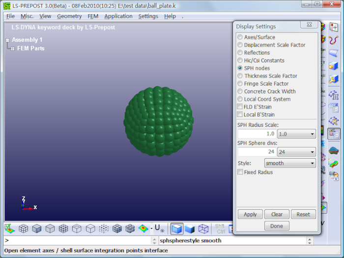
Set SPH Radius Scale: 1.
Set SPH Sphere divs: 24.
Set Style: smooth.
Click Apply.
To give some samples to show how to use reference state, overlay state, fringe difference state and multiple state functions.
Step 1:
To load a d3plot model, click the select radio button, and select one state in the state list. To select the second state like this, the neighbor states shown for compareing with each other clearly.


Step 2:
Check the Ref State to change displacement reference state to on, and enter reference state index number to 2.
The other states displacement will be base on the second state, and the second state will be shown to initial state for displacement. Like this,

Step 1:
Check the overlay state to turn on overlay mode, and enter an overlay state index number to 1. Select overlay color to green and drawing type to mesh.
Step 2:
Select another state in state list. It will be shown like this, the shade sate is the overly state, which is the first state in this model. The green mesh state is another state in the model.
Step 1:
Load a d3plot model, go to state dialog, select one state in the state list. Take the third state for an example.
Step 2:
Go to fringe dialog to show some fringe data. Click the stress button and select the "x-stress" in the list. The x-stress fringe data will be shown in the model, like this,
Step 3:
Go to state dialog, turn on fringe difference mode, and enter the state index number. The fringe data which is the difference between setting fringe defferece state and the selected state in the state list will be shown.
e.g, to set the fringe difference state to 3, select the 3th state in state list. There will be noting difference between them, like this,
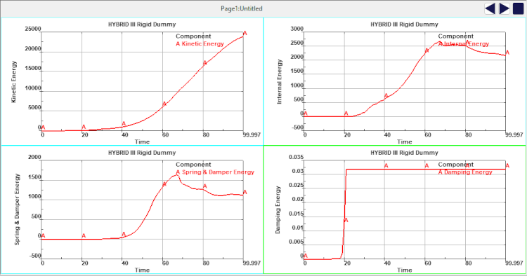
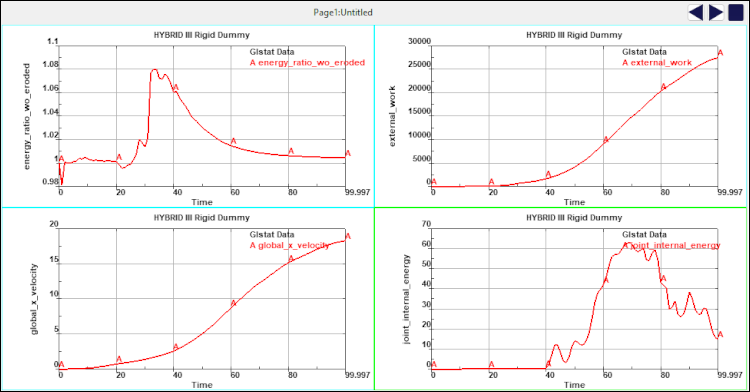
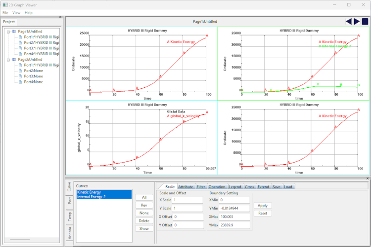
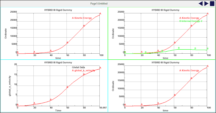
Use the New XYPlot Frame to plot element component history values. The operations of plotting other components value are similar to this sample. After mutiple xy datas have been plotted in the main window, they will be shown in multiple pages, and there are several frames in one page. Operate the New XYPlot Frameand browse mutiple xy data result.
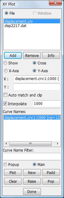
This sample will show user to how to plot curves from XY data pairs file or Microsoft CSV format file.
Step 1:
Click "Add" to open and add a XY data file to the file name list. Then the curves name will be show in the curve names list.
Step 2:
"CurveClip" could be checked to clip curve before plotting, and enter minimum and maximum abscissa point or value, default it's unchecked.
"Interpolate" could be checked to linearly interpolate curves before plotting, and set number of divisons for interpolation, default it's 1000.
User could skip this step, if it's not necessary.
Step 3:
Select a curve in curve names list.
Step 4:
Click "Plot" button to plot XY-Plot data in current XY-Plot window.
Click "Padd" button to add XY-Plot data to current XY-Plot window.
Click "New" button to plot XY-Plot data in a new XY-Plot window.
Step 5:
Step 6:
To operate xy data results in main window. See New XYPlot Frame interface in details.
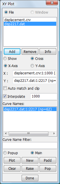
This sample will show user to how to cross curves.
Step 1:
Click "Add" button to open and add XY-Plot data files which you'd like to cross to the filename list.
Step 2:
Click "Cross" radio button to show cross curves interface.
Step 3:
Double click the curve name in curve names list, then it will be shown as abscissa.
Step 4:
Select another file in file list, then curve names list will be updated. Double click the curve name in curve names list, and it'll be show as ordinate.
Step 5:
Click "Plot" button to plot crossing XY-Plot data in current XY-Plot window.
Click "New" button to plot crossing XY-Plot data in a new XY-Plot window.
Step 6:
To operate xy data results in main window. See New XYPlot Frame interface in details.