


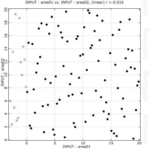
This plot shows a 2D projection of the parameter space of all active, successful designs. Select the 2D projection room using 1st and 2nd dimension selection in the Common Settings pane. A design number label is displayed when a design is selected. You can select multiple designs by pressing Ctrl and clicking on the designs.
You can color or deactivate selected designs in the context menu. The deactivation of designs affects the full recalculation of the statistic data. Design coloring is shown in this plot and in the Cloud plot. Failed designs are plotted into a separate layer (red unfilled circle). After switching from the primary layer to Failed designs, you can select the designs and the design number label is displayed.
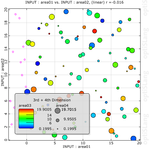
Alternatively, you can visualize another one or two dimensions by color and/or size. Use the Dimension for color and Dimension for size settings in the Common Settings pane. Both settings select a dimension in respect to the design value of this additional dimension.
The context menu options for this plot are:
| Option | Description |
|---|---|
| Deactivate | Deactivate selected designs |
| Activate all | Activate all designs |
| Style | > > : Apply color to selected designs. |
> : Opens the Custom Style dialog box. 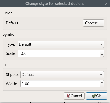 Color Click to select a color. Symbol
Line
|
Settings
| Option | Description |
|---|---|
| Common Settings | |
| Dimension for color | Select an additional dimension to be viewed as colorization of the displayed points. |
| Dimension for size | Select an additional dimension to be viewed as size of the displayed points. |
| Regression analysis | Creates a linear or quadratic regression line of y vs x. |
| Preferences | |
|
The following preference settings are available:
For more details, see Plot Preference Settings. | |
Python Scripting
Creates an Anthill plot using data with data_id.
anthill = Visuals.Anthill(Id("Anthill plot"), data_id )
Add to Postprocessing
Adds Anthill plot in postprocessing to control_container, using the specified relative positioning.
    control_container.add_control (
        anthill,
        True,
        RELATIVE_POSITIONING,
        1/2., 0, 1/2., 1/2.
    )