


This section describes how you can add a list or drop-down list to your interface.
This section discusses the ability to add lists and drop-down
lists to your dialog box. Lists are created with the cx-create-list macro and drop-down lists are created with the cx-create-drop-down-list macro. Both lists and drop-down lists use the same list-items macros
once they are created. List items can be set using the cx-set-list-items macro. List selections can be set
with the cx-set-list-selections macro and
obtained with the cx-show-list-selections macro.
This section explains the arguments used in the various list and drop-down list macros.
(cx-create-list parent label visible-lines multiple-selections
row column)
| Argument | Type | Description |
|---|---|---|
| parent | object | The name of the table that you are adding the list to |
| label | string | The name of the list to be displayed on the GUI |
| visible-lines | symbol/int | The number of lines of text visible before a scroll bar is needed |
| multiple-selections | symbol/Boolean | Allows you to choose between having one item at a time selected or multiple |
| row | symbol/int | When added to a table, signifies the row that the list is added to |
| column | symbol/int | When added to a table, signifies the column that the list is added to |
Note: The visible-lines, multiple-selections, row, and column attributes are optional. If they are not included,
the number of visible lines has a default of ten and multiple-selections
is #f, meaning that you can only select one
list item at a time. Furthermore, if the row or column attributes
are left out then the list will be added to the first row/column of
the parent attribute and overwrite anything that is already in that
spot.
(cx-create-drop-down-list parent label multiple-selections
row column)
| Argument | Type | Description |
|---|---|---|
| parent | object | The name of the table that you are adding the drop-down list to |
| label | string | The name of the drop-down list to be displayed on the GUI |
| row | symbol/int | When added to a table, signifies the row that the drop-down list is added to |
| column | symbol/int | When added to a table, signifies the column that the drop-down list is added to |
Note: The row and column attributes are optional. If not included, the drop-down list will
be added to the first row/column of the parent attribute and overwrite
anything that is already in that spot.
(cx-set-list-items list items)
| Argument | Type | Description |
|---|---|---|
| list | list | The name of the list you are adding items to |
| items | strings | The strings that represent each item to be added to the list |
(cx-set-list-selections list selections)
| Argument | Type | Description |
|---|---|---|
| list | list | The name of the list you are setting the selections of |
| selections | list | The members of the list that you want selected |
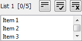
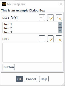
This example shows how the cx-create-list, cx-set-list-items, cx-set-list-selections, and cx-show-list-selections macros work.
Both of the lists are created via cx-create-list statements. The first list only allows for three visible list items
at a time while the second list allows for five to be shown at a time.
This is an example of how to set the size of your list via the visible-lines argument.
Upon opening the dialog box the first list will automatically
load all five list items via a cx-set-list-items line while the second list starts empty. By selecting one or multiple
list items from the first list and then clicking on , the selected list items from list 1 will
be gathered via a cx-show-list-selections statement and added to list 2 via a cx-set-list-items statement. The list items added to list 2 will also automatically be selected via a cx-set-list-selections statement.
The extra button is necessary in this example because setting
up the functionality of the button will
cause it to close the dialog box each time it is clicked. To review
how the in this example works, see Buttons (cx-create-button). This dialog box
does not do anything when the button is
clicked because we have substituted Boolean values for the apply-cb and update-cb arguments,
which would normally be function calls like the button-cb argument is in the cx-create-button line.
For more information on the apply-cb and update-cb functions, see cx-create-panel.
(define (apply-cb) #t)
(define update-cb #f)

(define table)
(define myList1)
(define myList2)

(define (button-cb . args)
  (cx-set-list-items myList2 (cx-show-list-selections myList1))
  (cx-set-list-selections myList2 (cx-show-list-selections myList1))
)

(define my-dialog-box (cx-create-panel "My Dialog Box" apply-cb update-cb))

(set! table (cx-create-table my-dialog-box "This is an example Dialog Box"))

(set! myList1 (cx-create-list table "List 1" 'visible-lines 3 'multiple-selections #t 'row 0))
(cx-set-list-items myList1 (list "Item 1" "Item 2" "Item 3" "Item 4" "Item 5"))

(set! myList2 (cx-create-list table "List 2" 'visible-lines 5 'multiple-selections #t 'row 1))

(cx-create-button table "Button" 'activate-callback button-cb 'row 2)

(cx-show-panel my-dialog-box)
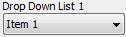
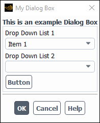
This example shows how the cx-create-drop-down-list, cx-set-list-items, cx-set-list-selections, and cx-show-list-selections macros work.
Since both lists and drop-down lists use the same list data type this example is very similar to the example above. The
major difference with drop-down lists is that they don’t allow
for multiple selections. In the example, both of the drop-down lists
are created via cx-create-drop-down-list statements.
Upon opening the dialog box the first drop-down list will automatically
load all five list items via a cx-set-list-items line while the second drop-down list starts empty. By selecting
one list item from the first drop-down list and then clicking on , the selected list item from Drop
Down List 1 will be gathered via a cx-show-list-selections statement and added to Drop Down List 2 via a cx-set-list-items statement. The
list item added to list 2 will also automatically
be selected via a cx-set-list-selections statement.
The extra button is necessary in this example because setting
up the functionality of the button will
cause it to close the dialog box each time it is clicked. To review
how the in this example works, see Buttons (cx-create-button). This dialog box
does not do anything when the button is
clicked because we have substituted Boolean values for the apply-cb and update-cb arguments,
which would normally be function calls like the button-cb argument is in the cx-create-button line.
For more information on the apply-cb and update-cb functions, see cx-create-panel.
(define (apply-cb) #t)
(define update-cb #f)

(define table)
(define myDropList1)
(define myDropList2)

(define (button-cb . args)
  (cx-set-list-items myDropList2 (cx-show-list-selections myDropList1))
)

(define my-dialog-box (cx-create-panel "My Dialog Box" apply-cb update-cb))

(set! table (cx-create-table my-dialog-box "This is an example Dialog Box"))

(set! myDropList1 (cx-create-drop-down-list table "Drop Down List 1" 'row 0))
(cx-set-list-items myDropList1 (list "Item 1" "Item 2" "Item 3" "Item 4" "Item 5"))

(set! myDropList2 (cx-create-drop-down-list table "Drop Down List 2" 'row 1))

(cx-create-button table "Button" 'activate-callback button-cb 'row 2)

(cx-show-panel my-dialog-box)