


This section describes how you can add a check boxes and radio buttons to your interface.
This section discusses the ability to add check boxes and radio
buttons to your dialog box. Check boxes and radio buttons are normally
grouped in a construct called a button box. The button box allows
check boxes and radio buttons to be stacked on top of each other in
a single spaced format. Button boxes also control whether or not the
button you are adding is a check box or a option button. The difference
between a check box and a option button is that multiple check boxes
in a button box can be selected at the same time. Radio buttons are
mutually exclusive, so only one option button in the button box can
be selected at a time. Button boxes are created with the cx-create-button-box macro. Check boxes and radio buttons
are created with the cx-create-toggle-button macro. The state of a check box or option button can be set with
the cx-set-toggle-button macro and queried
with the cx-show-toggle-button macro.
This section explains the arguments used in the various check box/option button macros
(cx-create-button-box parent label radio-mode)
| Argument | Type | Description |
|---|---|---|
| parent | object | The name of the table that you are adding the button box to |
| label | string | The name of the button box to be displayed on the GUI |
| radio-mode | symbol/Boolean | Allows choosing between check boxes and option buttons |
(cx-create-toggle-button parent label row column)
| Argument | Type | Description |
|---|---|---|
| parent | object | The name of the button box that you are adding the check box/option button to |
| label | string | The name of the check box/option button to be displayed on the GUI |
(cx-set-toggle-button togglebutton value)
| Argument | Type | Description |
|---|---|---|
| togglebutton | object | The variable you used to create the check box/option button |
| value | boolean | The Boolean value that you want to set the check box/option button to |
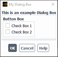
This example shows how the cx-create-button-box, cx-create-toggle-button, cx-set-toggle-button and cx-show-toggle-button macros work.
In the cx-create-button-box line the radio-mode argument is set to #f, which indicates that check boxes are being used, not radio buttons.
Once the two check boxes have been created, the initial value of checkBox1 is set to #f via
the statement (cx-set-toggle-button checkBox1 #f). Next, the value of a random Boolean variable isBool is set to #t via the (set!
isBool #t) statement. After isBool is set to #t, it is next set to the value
of checkBox1 through the use of a cx-show-toggle-button statement.
Finally, the value of checkBox2 is
set to the value of isBool. Since checkBox2 isn’t checked when the dialog box is
opened, we know that the cx-show-toggle-button statement works because it changed the value of isBool to #f. This dialog box does not do anything
when the button is clicked because we have
substituted Boolean values for the apply-cb and update-cb arguments, which would normally
be function calls. For more information on the apply-cb and update-cb functions, see cx-create-panel.
(define (apply-cb) #t)
(define update-cb #f)

(define checkBox1)
(define checkBox2)
(define isBool)

(define my-dialog-box (cx-create-panel "My Dialog Box" apply-cb update-cb))

(define table (cx-create-table my-dialog-box "This is an example Dialog Box"))

(define buttonBox (cx-create-button-box table "Button Box" 'radio-mode #f))

(set! checkBox1 (cx-create-toggle-button buttonBox "Check Box 1"))
(set! checkBox2 (cx-create-toggle-button buttonBox "Check Box 2"))

(cx-set-toggle-button checkBox1 #f)
(set! isBool #t)
(set! isBool (cx-show-toggle-button checkBox1))
(cx-set-toggle-button checkBox2 isBool)

(cx-show-panel my-dialog-box)
To view additional examples of check boxes, see Comprehensive Examples.
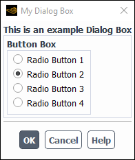
This example shows how the cx-create-button-box, cx-create-toggle-button, and cx-set-toggle-button macros work. In the cx-create-button-box statement the radio-mode argument is set to #t which indicates that
radio buttons are being used, not check boxes. Once all four radio
buttons are created, a cx-set-toggle-button macro is used to set radioButton2 to #t, meaning that this option button will be selected
when the dialog box is opened. Since these are radio buttons and not
check boxes, this is the only button in the button box that can be
selected. If you select any other button, radioButton2 will automatically be deselected.
(define (apply-cb) #t)
(define update-cb #f)

(define radioButton1)
(define radioButton2)
(define radioButton3)
(define radioButton4)

(define my-dialog-box (cx-create-panel "My Dialog Box" apply-cb update-cb))

(define table (cx-create-table my-dialog-box "This is an example Dialog Box"))

(define buttonBox (cx-create-button-box table "Button Box" 'radio-mode #t))

(set! radioButton1 (cx-create-toggle-button buttonBox "Radio Button 1"))
(set! radioButton2 (cx-create-toggle-button buttonBox "Radio Button 2"))
(set! radioButton3 (cx-create-toggle-button buttonBox "Radio Button 3"))
(set! radioButton4 (cx-create-toggle-button buttonBox "Radio Button 4"))

(cx-set-toggle-button radioButton2 #t)

(cx-show-panel my-dialog-box)
To view additional examples of radio buttons, see Comprehensive Examples.