


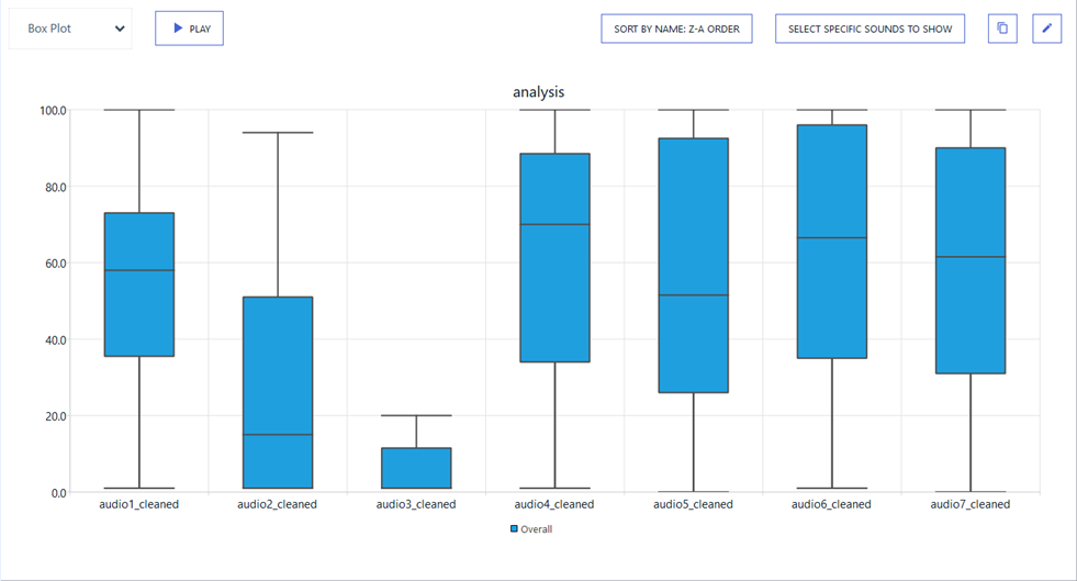
Visualizing Box Plot
The box plot helps to visualize how ratings are distributed around their median.
To Visualize Box Plot:
-
In the Navigation panel, select Analysis & results.

-
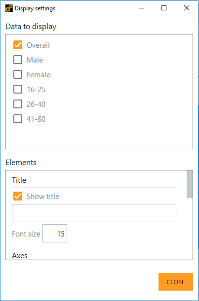
Click
 then, from the Display settings window, select the group data to display in
the chart.
then, from the Display settings window, select the group data to display in
the chart.
-
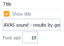
In Elements, enable Show title, give a title to the chart and set the
font size.
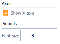
Enable Show X axis and give a title to the x-axis.
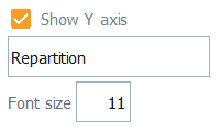
Enable Show Y axis and give a title to the y-axis.
Under Legend, enable Show to display the chart legend.

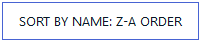
To choose how data are ordered in the chart, click the sorting button:
Sort by value: Ascending
Sort by value: descending
Sort by name: A-Z order
Sort by name: Z-A order
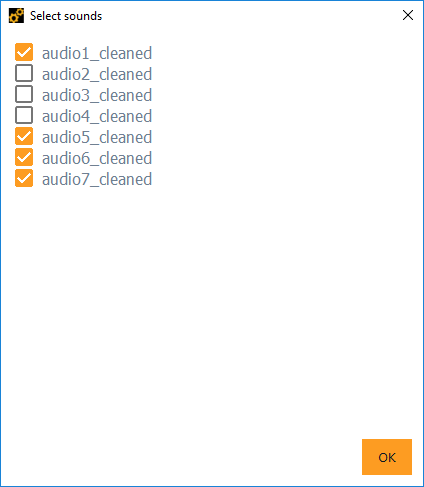
Click Select specific sounds to show then in the Select sounds dialog box tick in the sounds to displayed in the chart.
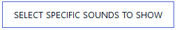
If there a substantial number of sounds in the project, click Select Specific Sounds to Show to select the sounds to display.
The box plot visualization is ready for analysis.