


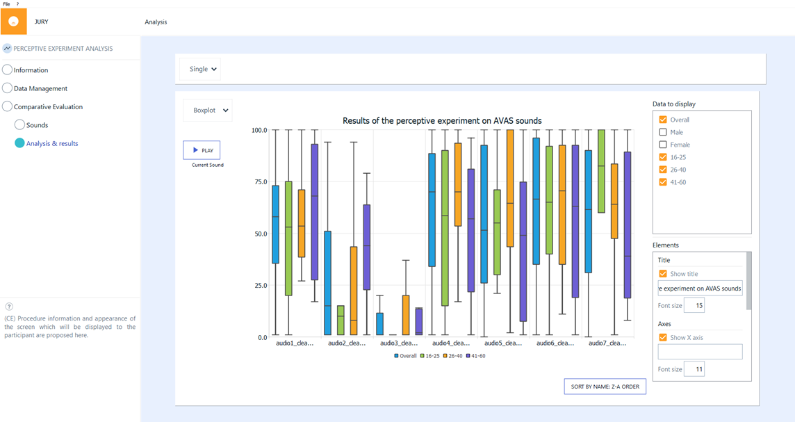
Box Plot
Box plots allow precise representation of the answer data distribution.
In a box plot, the numerical data is divided into four ordered groups of equal size (equal number of answers), separated by 3 quartiles (Q1, Q2, and Q3). A box is drawn between Q1 and Q3. Q3 - Q1 is called the interquartile range (IQR), and therefore contains the most central 50% of the data. The median (Q2) is represented as a horizontal line inside the box. The whiskers (lines outside the box) are represented according to Tukey’s method (1): the whisker ends represent the lowest datum still within 1.5 IQR below Q1, and the highest datum still within 1.5 IQR above Q3. Data outside this whisker range are considered as outliers according to Tukey’s method.
(1) Frigge, Michael; Hoaglin, David C.; Iglewicz, Boris (February 1989). "Some Implementations of the Boxplot". The American Statistician. 43 (1): 50–54. doi:10.2307/2685173. JSTOR 2685173.