


This section gives an overview of the EnSight 2024 R2 user interface. Common terms are described along with a brief summary of their purpose. References to other sections of the documentation are noted for further details.
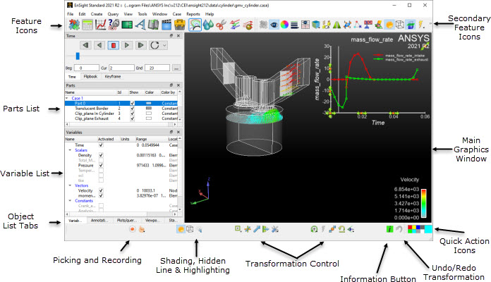
Figure 1.9: EnSight 2024 R2 Startup GUI shows the EnSight user interface along with identification of several of the major user interface elements. While EnSight typically follows the look and feel guidelines for Microsoft Windows, Apple Macintosh, and Linux desktops, it generally has a similar appearance on all of the platforms. Throughout this document images of the interface may come from any of the three platforms; nonetheless, the functionality is common to all three platforms in spite of minor differences from the respective user interface guidelines.
The EnSight user interface is highly user configurable. For example,
which icons and where they're displayed can be configured as can the scrolling lists to the
left of the graphics area. As such, the EnSight user interface may look significantly
different from what is shown in the documentation based on user preference. Running EnSight
with the command line option -no_prefs will revert
EnSight back to its default layout (see Command Line Start-up Options).
Contents
This area shows a graphical representation of the currently loaded datasets' visible geometry. For example, a fluid dynamics dataset might show only boundary surfaces, clips of fluid domains, and particle traces for flow fields but not the entire fluid flow field; whereas FEA datasets might show all visible geometry for a single timestep from a transient simulation.
Mouse Usage
Within this area of the user interface the user may use the computer mouse to interact with the graphics in many ways. When using EnSight as part of an Ansys install, the mouse button controls to manipulate the view follow the conventions prescribed by SpaceClaim, and the desired defaults of Ansys. The method of “primary” mouse operation is that the left mouse button selects items, right mouse button provides a drop down context sensitive menu, and the middle button/scroll wheel (with modifiers) controls the view. In this paradigm, depressing middle mouse scroll where manipulates the view camera orientation (like Legacy EnSight Left mouse button); middle mouse scroll wheel rotation provides zoom control, and Ctrl + middle mouse scroll wheel provides pan. As to make transitioning to this mouse paradigm easier, we have retained the left mouse button to control view orientation (like Legacy EnSight), and zoom with right mouse button as well. When using EnSight as a legacy install while clicking and holding down the left or middle mouse buttons and moving the mouse, the graphics may be transformed. By default, clicking and holding the left button while moving the mouse controls the default transformation, typically rotation. Clicking and holding the middle button while moving the mouse controls translation. EnSight preferences, via the EnSight Preferences Dialog, may be set to indicate how the mouse behaves in the Main Graphics Window, see Set or Modify Preferences for further details.
Selection
Clicking the left mouse button over an object drawn in the Main Graphics Window while not moving the mouse selects the object beneath the mouse. Holding down Ctrl while performing this operation has the affect of adding or removing the object below the mouse from the selection; therefore, multiple objects may be selected with the mouse. By default, the object selected in the Main Graphics Window is highlighted. Additionally, the object is selected or deselected in the appropriate list panel (described below).
Click-N-Go
Selecting an object in the Main Graphics Window activates various hotspots on the object. For example left-clicking an isosurface activates a multi-arrow marker on the isosurface. Clicking and dragging this marker will change the value of the isosurface. Similarly, activating the multi-arrow marker on a clip part allows that marker to be dragged to change the location of the clip part. Annotations can be dragged around the graphics window, resized, and rescaled. In general most objects drawn in the graphics window may be directly manipulated with the mouse. See Click/Touch-n-Go.
Right-Mouse Click
Clicking the right mouse button over an object in the Main Graphics Window will display the message context sensitive menu. The menu's contents depend on the object beneath the mouse pointer. If the mouse is over a clip plane, then a context sensitive menu with options relevant to Parts, and in particular Clip Parts, will be displayed containing applicable and common operations. Whereas if the mouse is over a color legend, common operations applicable to legends are displayed.
Keyboard Interaction
Keystrokes may be used in the graphics window. Delete deletes the currently selected object(s). The P is used by several different picking operations. The function keys (F1 through F12) are used for various graphics transformations. See Rotate, Zoom, Translate, Scale and Enable Stereo Viewing for further details. Additionally, EnSight Macros may be defined to bind user-defined operations to other keys. See Define and Use Macros for details.
Drag-N-Drop
The Main Graphics Window also supports drag and drop from the various List Panels. For example, a variable such as Pressure may be dragged from the Variable List and dropped onto a clip part in the Main Graphics Window. This will color the clip part by the pressure variable. See Drag-n-Drop.
The following topics are included in this section:
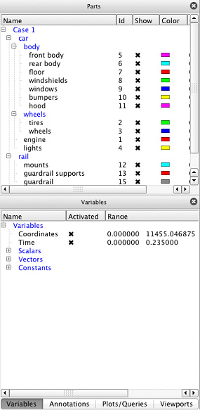
List panels show lists of commonly used EnSight objects such as Parts, Variables, Annotations, Queries, Plotters, Viewports, States and Coordinate Frames. By default List Panels are displayed to the left of the Main Graphics Window; but, because they are a form of docking window, they may be moved to any edge of the main EnSight Window, resized, undocked, or stacked on top of each other. Figure 1.10: Common List Panels shows the default layout of the list panels: the Parts list panel by itself and list panels for Variables, Annotations, Queries/Plots, and Viewports stack atop of each other in a tabbed layout. List Panels of this document fully describes the various List Panels.
Other Panels
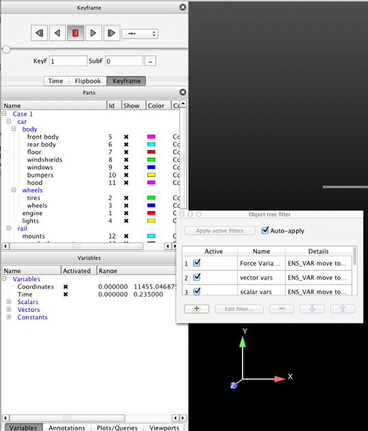
Other User Interface Panels, such as the Time, Flipbook, Keyframe, and various User Defined Tools, are also displayed in the same areas as the List Panels. Similarly as with the List Panels, these panels are also dockable windows and may be moved, resized, undocked, or stacked. Figure 1.11: Abbreviated Parts Listshows an example of this.
By default icons along the top edge of the EnSight user interface are arranged into three clusters: Feature icons, Secondary Feature icons, and Quick Action icons. The Feature icons and Secondary Feature icons are organized into a single Icon Bar with a simple delimiter between them. The Quick Action icons are in their own Icon Bar. Each Icon Bar may be repositioned along any of the edges of the user interface or even undocked. This is done by grabbing and dragging the left dimpled edge of the Icon Bar. All of these icons are fully described in Features.
Feature Icons
The Feature icons represent major functions of EnSight such as Parts operations, Calculator, Plotting, Queries, Viewports, Annotations, Time, Animation, and User Defined Tools. Clicking on one of these icons activates the appropriate user interface elements for that operation which may include displaying the appropriate User Interface or List Panel, displaying the Feature Panel, and displaying the relevant Secondary Feature icons and Quick Action icons.
Secondary Icons
By default Secondary Feature icons are displayed for common Part creation including: Contours, Isosurfaces, Clips, Vector Arrows, and Particle Tracing. Clicking on these displays the appropriate user interface in the Feature Panel.
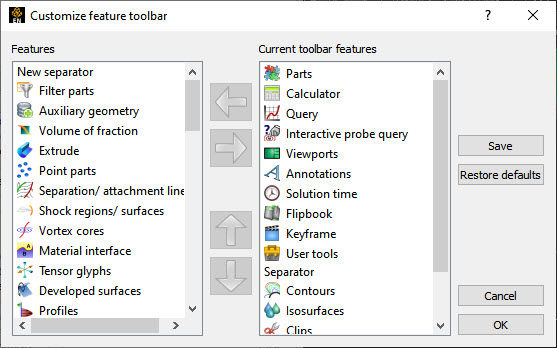
Customize Toolbar
The Customize Feature Toolbar Dialog (see figure below), activated via right-clicking on the Feature icons context sensitive menu, allows you to select which Feature icons to show and in what order. It may be advantageous to customize these icons to show only those that are typically used by you.
Quick Action Icons
The Quick Action icons provide common operations to modify the most recently selected EnSight Object such as a Part or Annotation. Specifically, these icons operate on the what ever is selected in the last updated List Panel. For example, if two plots were last selected, then the Quick Action icons operate on those two plots. If all parts where last selected, then the Quick Action icons operate on all parts.
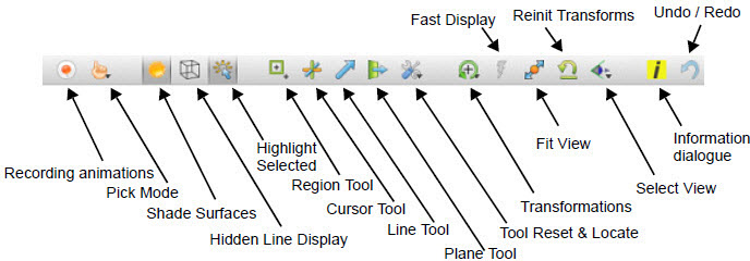
The Icon Bar along the lower edge of the EnSight user interface, shown in the figure below, contains a variety of icons for commonly used operations. They are briefly described here, see Tools Icon Bar for further details.
|
Record animation |
Displays the Save Animation Dialog for recording animations. | |
|
Pick mode |
Submenu to set the type of pick operation performed by the P-key. | |
|
Display shaded surfaces toggle |
Toggles shaded surface rendering. | |
|
Display hidden line overlays toggle |
Toggles hidden line overlays on the geometry. | |
|
Highlight selected parts toggle |
Toggles graphical highlighting of selected part(s). | |
|
Region tool visibility toggle |
Toggles the visibility of the region tool. | |
|
Cursor tool visibility toggle |
Toggles the visibility of the cursor tool. | |
|
Line tool visibility toggle |
Toggles the visibility of the line tool. | |
|
Plane tool visibility toggle |
Toggles the visibility of the plane tool. | |
|
Tool Reset & Locate |
Options to display either the Tool Locations Dialog or the Reset Tools / Viewports Dialog | |
|
Graphics window transformations submenu |
Rotate |
Sets the Selected Transformation operation to rotation. By default the left mouse button is mapped to the Selected Transformation. |
|
Translate |
Sets the Selected Transformation operation to translation. | |
|
Zoom |
Sets the Selected Transformation operation to zoom. | |
|
Rubberband zoom |
Sets the Selected Transformation operation to rubberband zoom. | |
|
Rubberband region |
Sets the Selected Transformation operation to rubberband region. | |
|
Transformation editor |
Displays the transformation Editor. | |
|
Reset... Displays the Reset Tools / Viewports Dialog. | ||
|
Fast display mode toggle |
Toggle for Fast display mode. When on, reduced geometry representations may be used for some or all of the parts to speed interactive transformations. | |
|
Fit view |
Reinitializes the graphics transformations so that all geometry fits well within the Main Graphics Window while preserving the current viewing orientation. | |
|
Reinitialize transforms |
Resets the graphics transformations to initial values. | |
|
Views orientation submenu |
Options to look up or down each of the three axes and an option to display the Views Dialog. | |
|
Info dialog display |
Displays the EnSight Info Dialog. | |
|
Undo / redo last transformation | Undo or Redo the last graphics transformation. | |
The Main Menu Bar appears in the appropriate location for the operating system in use. The options are identical on all platforms. The Main Menu Bar options are described in Main Menu.

The Quick Color Widget appears in the top right location in the EnSight window, see the figure below. The Quick Color Settings widget allows you to store your favorite colors and drag/drop them onto objects (not viewports) that have a color attribute. When any object with a constant color is selected, the large color patch will show that object's color. Drag and drop a color from any of the patches to any single object to color that object by a constant color. Drag a color patch to any other color patch. Right-click the patch to set its color. Currently parts, plotters, queries, and all annotation types will accept a drag/drop color operation from the widget.
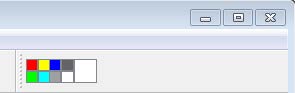
Colors on the Quick Color Settings widget are stored as part of the user's preferences and therefore the colors on the widget are available between EnSight sessions. For more details, see Use Quick Color Settings.
While many common operations can be performed through direct interaction with objects drawn in the Main Graphics Window, Icons, and various List and User Interface Panels, more complex operations are typically found in the Feature Panel (also known as the 'FP'). This figure shows the Feature Panel when used for Isosurface Part Creation.
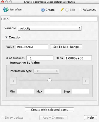
To avoid a proliferation of dialogs, EnSight typically reuses the Feature Panel for many purposes. The Feature Panel will completely reconfigure itself appropriately for the requested operation. The title bar of the Feature Panel will indicate its current functionality. Common to most operations the Feature Panel will also display its functionality in the upper left corner (Isosurfaces in this example).
Simple and Advanced
To simplify EnSight use while still providing a robust feature set, the Feature Panel typically has a Simple and an Advanced view for most operations. Toggling the Advanced check box will display all options relevant to the current operation. The Feature Panel also distinguishes, where appropriate, between Create and Edit mode. Create mode is used for creating new objects such as a new Isosurface Part; whereas Edit mode is used to change attributes associated for an existing object.
Selection and Feature Panel Selection
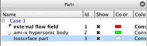
Figure 1.17: Parts List shows the Part List containing three parts. It is important to note three visual metaphors shown. The blue highlighting around the Isosurface part indicates that this part is the currently selected part. The pencil icon to the left of the name ami-x hypersonic body indicates that this part is the Feature Panel selected part. The P icon to the left of the external flow field part indicates that it is a parent part of the currently selected part(s). The concept between selected and Feature Panel selected is important to understand and is common to all List Panels. Selected objects are those that will be affected by operations in the main user interface whereas Feature Panel selected objects are those that will be affected by operations in the Feature Panel. This concept will be further elaborated upon in List Panels.
Click-n-go is a way to grab a handle in the graphics window, using the mouse, and drag it to affect the attribute attached to the handle. There are two methods available, both of which perform the same operation and differ only in how the handles appear. With click-n-go you use the left mouse button and click an object in the graphics window. If that objects has handles they will appear. With touch-n-go the handles will automatically appear for the object found under the mouse cursor (assuming your graphics hardware is capable of the function). With either method, the next step is to grab a handle and modify its value by clicking and dragging the handle.
Click-n-go is always active. Touch-n-go can be turned on/off via Preferences. This is done under Edit → Preferences → View and using the button.
There are no touch-n-go handles on created parts - you must left-click them to see a handle (if it exists for the selected part type). The single handle will appear at the picked location.
The following part types have a click-n-go handle with the function indicated:
| Part Type | Handle Function Tied To |
|---|---|
|
Isosurfaces |
Isosurface value |
|
Clip - XYZ |
X, Y, or Z clip value |
|
Clip - Plane |
Translates the clip plane |
|
Clip - Line |
Translates the clip line |
|
Clip - Cylinder |
The radius |
|
Clip - Cone |
The cone angle |
|
Clip - Sphere |
The radius |
|
Clip - IJK |
I, J, or K value |
|
Particle traces - streamlines |
Translates emitter location |
|
Vector arrows |
Arrow scale factor |
|
Contours |
Number of sub-levels |
|
Elevated Surface |
Scale factor |
|
Profiles |
Scale factor |
Click-n-go and Touch-n-go both show the same handles for the objects shown in the table below:
|
Text Annotation |
 The upper right handle performs a rotate of the text annotation. The other handle performs a translate. It is not necessary to select the translate handle - click/drag anywhere on the object (except the rotate handle) will perform a translate. |
|
Lines Annotation |
 The center handle translates the line annotation. The left/right handles move the left/right end points. It is not necessary to select the translate handle - click/drag anywhere on the object (except the other handles) will perform the translate. |
|
Logo Annotation |
 The upper right handle will scale the logo. The other handle performs translate. It is not necessary to select the translate handle - click/drag anywhere on the object (except the other handles) will perform the translate. |
|
Legend Annotation |
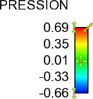 The center handle will translate the legend. The upper right handle will resize. The left top handle will modify the max value for the palette. Likewise, the lower left handle will modify the min value. It is not necessary to select the translate handle - click/drag anywhere on the object (except the other handles) will perform the translate. |
|
Dial Annotation |
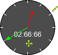 The upper right handle will size the dial while the other handle will translate. It is not necessary to select the translate handle - click/drag anywhere on the object (except the other handles) will perform the translate. |
|
Gauge Annotation |
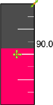 The upper right handle will size the gauge dial while the other handle will translate. It is not necessary to select the translate handle - click/drag anywhere on the object (except the other handles) will perform the translate. |
|
Shapes Annotation |
 The upper right handle will size the shape while the other handle will translate. It is not necessary to select the translate handle - click/drag anywhere on the object (except the other handles) will perform the translate. |
|
Viewports |
 The cross handle will translate the viewport while the corner handles will resize. There are no touch and go handles for this object - you must use click-n-go. Once the click-n-go handles are visible you may click/drag anywhere on the object (except the other handles) to perform a translate. |
|
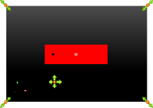
Plotters |
 Upper right corner handle will scale the plotter. The marker on the plotter legend will move the legend. The cross marker (that is not attached to the legend) will translate the plotter. The up/down arrows on the y-axis will scale the top/bottom values of the axis. Similarly, the left/right arrows on the x-axis will scale the left/right values of the axis. It is not necessary to select the translate handle - click/drag anywhere on the object (except the other handles) will perform the translate. |
You can drag (left-click and hold the mouse button down, then move the mouse) an object and drop (release the left mouse button) it onto a target. The target can be in the user interface (always available) or in the graphics window (will work only if your graphics hardware supports the operation). The following drag and drop actions are currently implemented:
Parts
When dropped in a viewport (user interface or graphics window) will make the part visible in the viewport.
When dropped onto a group in the Parts list will make the part belong to the group.
Variables
A constant variable dropped in the graphics window will create an annotation text string with the value of the constant.
When scalars or vector variables are dropped in a viewport the parts with viewport visibility True (regardless of their regular show/hide visibility status) will be colored by the variable.
If you drop a scalar or vector onto a visible part the result will be that the part is colored by the variable. Similarly, if you drop the variable onto a group in the Parts list all the parts that belong to the group will be colored.
Plots and Queries
You can assign a query to a plotter by dropping the query on the plotter
Styles
From the Style manager, you can drag/drop a style onto objects of the right type, that is if you have a style that was saved for a curve you can drop it onto a curve on a plotter.