
Creating a Rectangular Stacked Plot
A rectangular stacked plot is a 2D, x-y graph of results,
with each trace displayed on a separate plot, or with multiple curves grouped in a single stack. The following figure shows one curve per stack.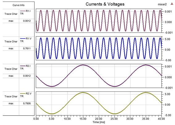
The Stacked tab in the Properties window shows the Curve Grouping Strategy property, as shown below:
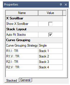
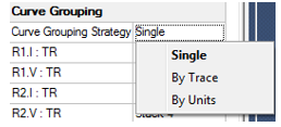
The curves (curve names) and their stack associations (stack names) appear under the Curve Grouping Strategy property in the Stacked tab. The Curve Grouping Strategy property has a drop-down list with three options:
- Single – All curves are ungrouped and each curve is in its own stack.
- By Trace – All curves are grouped by their trace.
- By Units – All curves are grouped by their unit type.
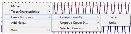
The same options are available when you right-click a plot, as shown below.
Creating a Rectangular Stacked Plot
- Select Twin Builder > Results > Create Standard Report > Rectangular Stacked Plot. The Report dialog box appears.
- In the Context section, make selections
from the following field or fields, depending on the design and solution
type.
- Solution – Lists the available solutions, whether sweeps or adaptive passes.
- Domain – Whether this field appears, and the domains listed depend on the
Solution type and the <type> selected.
- Geometry – For field and radiated field reports, this applies the quantity to a geometry or radiated field setup.
- Under the Trace tab, Y component section, specify the information
to plot along the Y-axis:
- Category – Select the type of information to plot. The category you select provides the default plot name.
- Quantity – Select the value to plot.
- Function – Select the mathematical function of the quantity to plot.
- Value – Displays the currently specified
quantity and function. You can edit this field directly.
Note:
Color shows valid expression.
- Range Function – Click to open the Set Range Function dialog box. This applies currently specified quantity and function.
- On the Trace tab, X (primary sweep) line, specify the quantity
to plot along the X-axis in one of the following ways:
- Select the sweep variable to use from the drop-down list.
- If sweeps are available, click
 to select particular sweeps. The quantity is plotted against the primary
sweep variable listed.
to select particular sweeps. The quantity is plotted against the primary
sweep variable listed.
- On the Families tab, confirm or modify the sweep variables to plot.
- Click New Report.
This creates a new report in Project tree, displays the report with the defined trace, and enables the Add Trace button on the Report dialog box. The default name is based on the report category you selected, (for example, S Parameter Plot n or rE Plot n). You can edit the plot names in the Project tree and the plot header text in the report synchronizes.
The function of the selected quantity is plotted against the swept variable values or quantities you specified on an x-y graph. The plot is listed under Results in the Project tree and the traces appear under the plot. When you select the traces or plots, their properties display in the Properties window. You can edit these properties directly to modify the plot.
- Optionally, add another trace to the plot
by following the procedure above, using Add
Trace rather than New Report.
You can also modify the display type of an existing plot from the Properties dialog box for that plot. Select the Report icon in the Project tree to display the Properties dialog box. Select the Display Type field to display a menu with selections available for that plot.
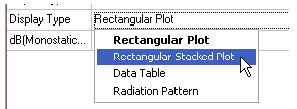
Once you make a selection, the plot display updates for the current selection.
Multiple Curves in a Stack in Cartesian Stacked Plots
Now multiple curves can be grouped together in a single stack. There are two ways in which grouping of curves can be achieved:
- Automatic Grouping
- Manual Grouping
Automatic Grouping
The automatic grouping feature for stacked plots groups the curves generated by a report into stacks based on a similarity metric: trace name or units. This is controlled by the Curve Grouping Strategy property which can also be used to turn grouping off when the single strategy is selected. New curves respect the selected grouping.
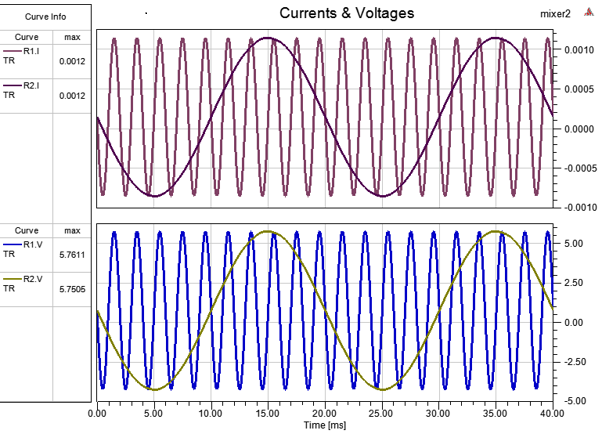
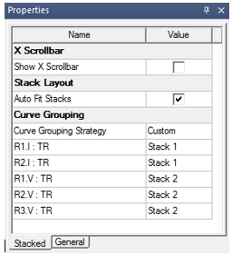
The following image shows the same stacked plot with curves grouped by units; that is, current and voltage curves are grouped together in their own stacks:
Manual Grouping
Manual grouping of curves allows arbitrary grouping of curves. When you manually group curves, the Curve Grouping Strategy property becomes Custom. Each new curve goes into a new stack.
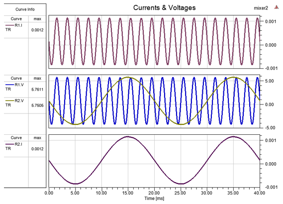
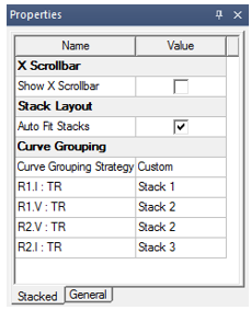
The following image shows an example of manual grouping, where two voltage curves are grouped together while current curves are in their own stacks:
You can perform manual grouping in two ways:
- Through the Stacked tab of the Property window.
- Through the right-click context menu.
Performing manual grouping sets the Curve Grouping Strategy property in Stacked tab in the Properties window as Custom as shown below:
Manual Grouping through the Stacked Property Tab
To perform manual grouping though the Properties window, follow these steps:
- Click in an empty area on the plot.
- In the Properties window, select the Stacked tab.
The Stacked tab shows the curve name and its stack <number> association, as shown in following image:
Each Stack <number> field has a drop-down list as shown in following image:
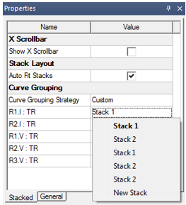
- To change the stack of a curve, choose a different stack in this drop down menu.
The New Stack option is only available when there are multiple curves in the stack, which is the current stack of the curve.
When you choose New Stack, the curve moves to a new stack. This lets you ungroup curves in a stack.
Manual Grouping Through the Context Menu
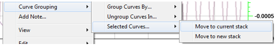
To manually move curves to another stack:
- Select the curves.
- Right-click within the target stack.
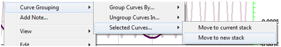
- Select Curve Grouping > Selected Curves > Move to current stack as shown below:
To manually move curves to a new stack:
- Select the curves.
- Right-click within the plot.
- Choose Curve Grouping > Selected Curves > Move to new stack as shown below:
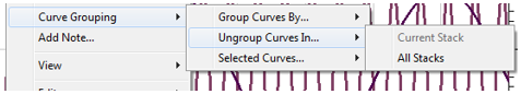
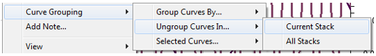
To ungroup all curves in a stack:
- Right-click within the stack.
- Choose Curve Grouping > Ungroup Curves In > Current Stack as shown below.
Legend Optimizations
The legend gets additional layout changes to optimize space usage. When there is single curve per stack, the legend shows the curve names in columns and trace characteristics in rows to optimize use of available vertical space.
If there are multiple curves in any stack, then curve names are shown in rows and trace characteristics are shown in columns. Since automatic grouping tends to increase the number of curves rapidly for the same selected trace characteristics, this keeps the plot area maximized under such growth scenarios.
Y-Markers
If there is a Y-Marker in a stack which has curves, then:
- If all those curves move together to a new stack, the Y-Marker migrates as well.
- If only a subset of the curves move to a new stack, the Y-Marker remains in the stack with the remaining curves.
- If all the curves move to different stacks, the Y-Marker is dropped.
Related Topics
Adding a Characteristic to a Trace
Modifying Background Properties of a Report