


For LS-DYNA analyses, use the Line Chart object to plot a two-dimensional graph in the X and Y directions, for supported input datasets. A dataset is a specified set of two variables, X and Y Axis data, that form the 2D data for the chart.

Go to a section topic:
Supported Data Types
Supported input data for Line Chart objects includes all result-based options available under the Solution object of an LS-DYNA analysis that have data you can represent in a chart, including:
Results (deformation, stress, etc.) and probes.
Result charts, such as waterfall diagrams.
Line Chart objects.
Data from the Solution Information object.
Imported text files (of supported formats).
User-defined datasets created using scripting APIs. See the Working with Line Charts section of the Scripting in Mechanical Guide for examples.
Application
Use the following steps to specify a Line Chart object.
Insert the object by highlighting the object and either selecting the Line Chart option from the Solution Context Tab or right-clicking and selecting > Line Chart.
You can also right-click within the Geometry window and select > Line Chart.
Specify the Source Objects property. Select the entry field of the property and then select a supported object from the Outline pane. Use the [Ctrl] key to select multiple objects. Once complete, click .
To import a dataset, display the Chart Option window by selecting the Chart Options button on the Line Chart context tab or by right-clicking in the chart and selecting the option and then select the Browse option from the Datasets tab. Use the dialog to browse to a directory location and select a desired dataset file.
Note: When importing a file, the application only supports:
Tab separated X-Y Data file format as well as LS-PrePost Data Export format. See the Example File Formats topic below for examples of these formats.
Datasets that have the same x-axis quantities (units).
Once specified, data automatically plots in the Worksheet. Use the features of the Chart Options Window to further define and work with your chart data.
Create additional Line Chart objects as desired.
Chart Options Window
The Chart Options window includes the following tabs. All tabs include the Reset All option. This option enables you to reset your specifications. However, it cannot reset imported datasets, datasets added as a result of operations and filters, or the original color applied to a dataset.
- Datasets Tab
The Datasets tab provides the following options:
Import: Browse to and select a new or additional dataset to include in the line chart. The feature supports importing one dataset at a time.
Name: Change the default name given to the dataset(s).
Type: Select the desired display style of the plotted lines and markers used in the chart. You can change the size, color, and shapes of lines/markers.
- Axes Tab
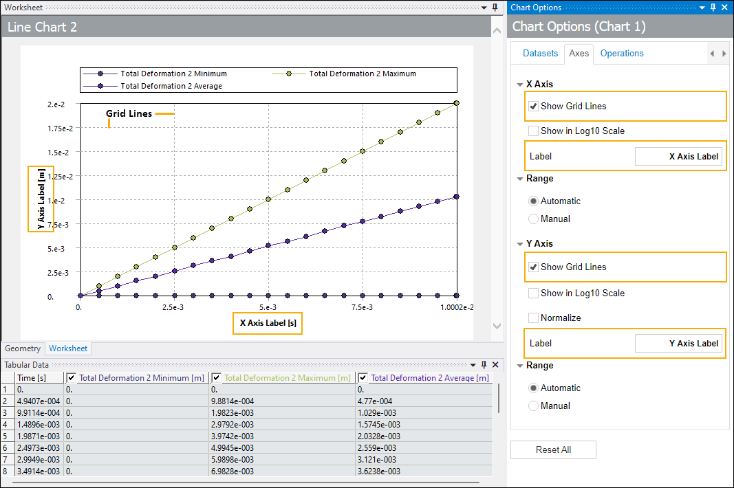
The Axes tab provides the X Axis and Y Axis options. Each option includes a corresponding Range options with the settings Automatic and Manual. Additionally, the Y Axis option includes the selection Normalize. Use these options to:
Display grid lines in the chart.
Display chart data in log10 scale. If a dataset on the chart contains a non-positive value on the chosen axis, the log10 scale cannot be applied.
Normalize the values of all the datasets in the chart with the y-axis ranging from 0 to 1, where these y-values are dimensionless and unitless.
Manually specify the range of the Minimum and/or Maximum values displayed in the chart. For charts containing mixed quantities on the y-axis, enable the Normalize option first to successfully specify the manual Minimum/Maximum limits.
Note:If you select Log10 Scale for either axis and the Manual option to enter values, the Minimum and Maximum entries must be positive values.
If you select Log10 Scale for the Y Axis, the Manual option, and the Normalize option, the Minimum and Maximum entries must be set to between
0and1and the Minimum value must be smaller than the Maximum value.
Edit the labels of either axis displayed on the chart using the Label entry fields. When you create a line chart, the application applies defaults. When you import datasets, they may already include X-Y axis labels. Either way, you can specify a new and unique label as desired.
- Operations Tab
The Operations tab provides the following options:
- Operation
To specify an Operation:
Select the Operation option button and select the desired Operation from the drop-down menu. Options include:
None (default)
Integration
Differentiation
Addition
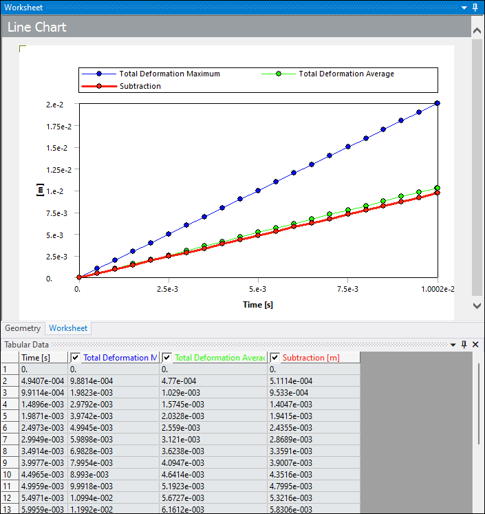
Subtraction (illustrated below)
Multiplication
Division
Scale
Offset
Use the Apply To options to select the desired dataset(s) on which to apply the operation. Options include:
Current Pick [Name of dataset]: Apply the operation to the currently selected dataset. This option is not available for all operation types.
All Datasets: Apply the operation to all of the datasets included in the line chart.
Multi-select: This option provides a drop-down menu you use to select multiple datasets.
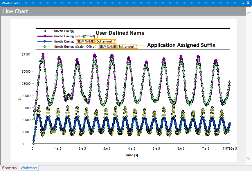
Based on the above selection, use either the Output Dataset Name or Output Dataset Name Suffix field to name your results.
For the Current Pick option, enter a desired name in the Output Dataset Name field or you can use the application assigned default which is the name of the dataset appended with the name of the operation in parentheses.
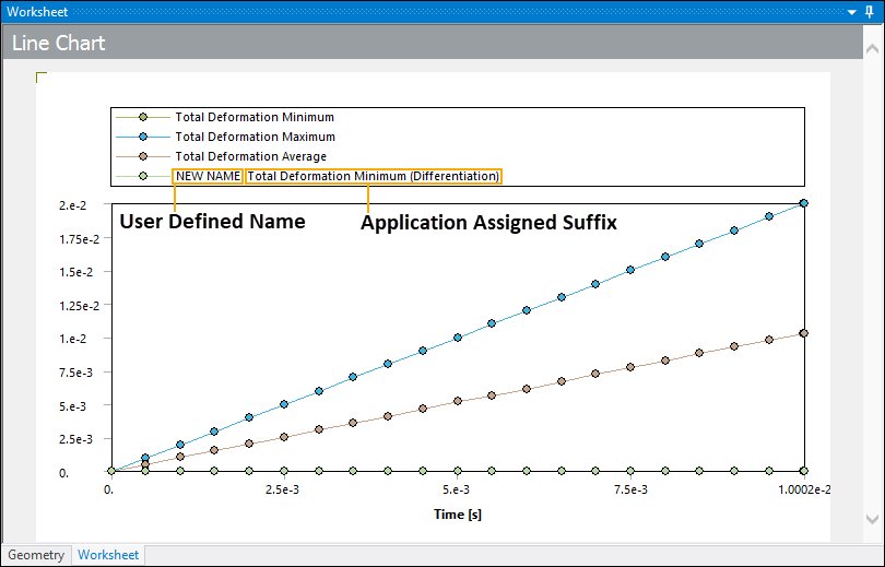
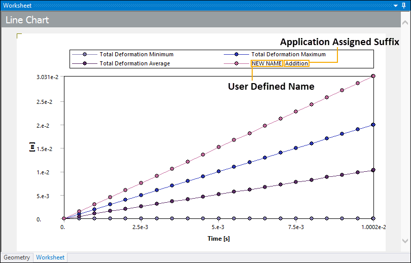
To name the results of operations using the All Datasets or Multi-select options, enter your desired name in the Output Dataset Name Suffix field. The application appends this string to each affected dataset's name. If the operation produces a single output, such as the summation of multiple datasets, the application uses your string as the name of the resulting dataset.
Once you have completed defining the operation, select the Apply button. The application performs the computation on the y-axis for all datasets you have selected in the chart. Each operation uses the intersection of x-axis values of all datasets. There is no interpolation done for any missing y-values.
Important:For the and operations, if all the input datasets are of the same quantity type, internal unit conversions are performed as needed and the resultant dataset is of the same quantity type. If any of the input datasets have different quantity types, the application does not perform internal unit conversions and the resultant dataset will be dimensionless.
For the and operations, if all the input datasets are of the same quantity type, internal unit conversions are performed as needed but the resultant dataset is dimensionless. If any of the input datasets have different quantity types, the application does not perform internal unit conversions and the resultant dataset is dimensionless.
Any internal unit conversions are attempted based on the first input dataset and are applicable in terms of the original units stored for the dataset. Ansys recommends that you interpret the results of the operations carefully. If a resultant dataset is dimensionless, changing the active Unit System does not affect the values of this dimensionless dataset.
Note:Input for the operations can differ. Certain operations require at least one dataset, while others, such as subtraction and division, must have exactly two datasets as input.
Output for the operations may also differ. Certain operations, such as multiplication, require at least two datasets as input, but it returns only a single dataset as a result. Whereas other operations, such as Integration, produce one output for each associated dataset.
Limitation:When using the Division operation, there are instances when it divides by zero (0) and fails to generate a new dataset.
The operation feature does not support atypical datasets and whose x-values are not monotonically increasing/decreasing or that have multiple Y values for a given X value. The application displays an error message if you apply an operation to this type of dataset.
- Filter
Filters are processes that can be used to remove unwanted components from a dataset (or a signal). They are usually used in the field of signal processing. Depending on the type of filter, they can be used to completely or partially suppress values within the dataset or an aspect of the signal. To specify a Filter:
Select the Filter option button.
Select the desired Filter option from the drop-down menu. Options include:
None (default): Select any of the following options to be able to apply a Filter to a dataset.
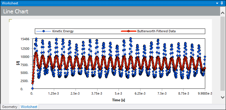
Butterworth: Apply a Butterworth filter to create and plot a new dataset as illustrated below
Butterworth LSPP: Apply a Butterworth LSPP filter to create and plot a new dataset. This is similar to the Butterworth filter provided by LS-PrePost.
SAE: Apply a SAE filter to create and plot a new dataset.
When you specify a Filter type option, the Cutoff Frequency (Hz) property also displays. Use this property to define a cutoff frequency value for the applied filter. The default setting is 0.1.
Use the Apply To options to select the desired dataset(s) on which to apply the filter. Options include:
Current Pick [Name of dataset] (default): Apply the operation to the currently selected dataset.
All Datasets: Apply the operation to all of the datasets included in the line chart.
Multi-select: This option provides a drop-down menu you use to select multiple datasets.
Based on the above selection, use either the Output Dataset Name or Output Dataset Name Suffix field to name your results.
For the Current Pick option, enter a new name in the Output Dataset Name field or you can use the application assigned default which is the name of the dataset appended with the name of the filter in parentheses.
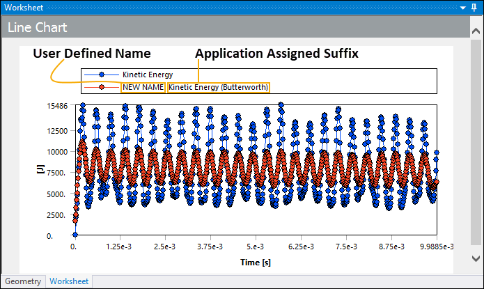
To name the results of a filter using the All Datasets or Multi-select options, enter your desired string in the Output Dataset Name Suffix field. The application appends this string to each affected dataset's name.
Once you have completed defining the filter, select the Apply button.
Context Menu Options
When you specify a Line Chart object, the application displays a graph of the plotted data in the Worksheet. Once you select a dataset, the graph includes the following context (right-click) menu options:

Format Chart: This option opens the Chart Options pane.
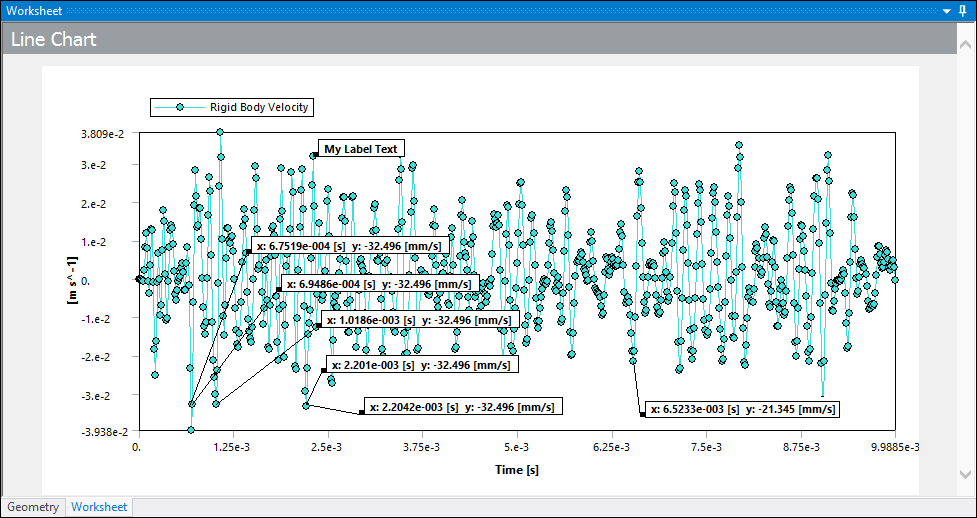
Add Label: Create a label showing the X-Y coordinate of a point selected on the plotted line of a dataset. You can drag and drop labels anywhere within the chart. Once inserted, right clicking a label presents the context menu option Delete Label in order to remove labels. Also note that if you drag a label outside of the chart, it returns to its original location.
Delete Dataset: Delete a selected dataset. Any labels attached to the dataset will also be deleted.
Hide Dataset: Hide a selected dataset and any attached labels. When you hide a dataset, the context menu then includes the option . Select this option to redisplay any hidden datasets and labels as applicable.
Label Example
Tabular Data Options
Once you plot data, the Tabular Data window populates with result values. Each column displayed in the window is associated with a dataset. The first column of the window always displays the quantity of the X axis, which depends upon the datasets you currently have displayed.
For Line Charts, the Tabular Data window operates in much the same way it does for other data types (/), however, for Line Charts, the context (right-click) menu options, illustrated below, are specific to datasets. The options to hide and/or show datasets perform the same action as selecting/clearing the check box in the column title. The option displays any hidden columns/datasets and then hides all currently displayed columns/datasets. You can manually change the width of the columns and reset them using the context menu option .

To make data comparison easy and efficient, the column headings of the Tabular Data window, the data plots in the chart, and the legend displayed in the chart, all have the same color-coding. The column heading for each dataset also displays the associated unit system. Unit system changes are automatically reflected in the Tabular Data window and the chart. As illustrated below, the X axis of the chart in the Worksheet also displays the unit quantity name (Time) as well as the unit system (s), however, the Y axis only displays the associated unit system (J). Be sure to review the Unit System Limitations topic below.

In addition, if multiple datasets do not include overlapping values for the X axis, the cells in the table are left blank.

Use the Precision for Distinct Rows preference (Options > Results > Line Chart Tabular Data) to change the number of significant digits used to consider the distinct X axis values. Each distinct value for the X axis represents a row in the table. If you specify a smaller value for this preference, you could see multiple rows (values) merged into one (row). Increasing the setting for this preference better ensures that each X axis value is displayed in the data table. The default setting is . The supported range is -.
Use the global Number of Significant Digits preference to change the number of significant digits used for displaying the values in the Tabular Data window. The Number of Significant Digits preference is available in Workbench from the Tools > Options > Appearance dialog or when you open Mechanical independently, from the Options > Common Settings > User Interface category.
Tip:
Note: The Precision for Distinct Rows preference affects how multiple X axis values are merged in the table, while the global Number of Significant Digits preference affects how many digits are displayed for the value in each cell of the data table.
If there is a mismatch of y-quantities, such as force and displacement, the y-axis is considered dimensionless and unitless and the chart leaves this information blank (as illustrated below).

Unit System Limitations
The Line Chart feature currently has limitations for how it displays certain units of measure. For example, the Line Chart feature:
Only supports the Joules (J) unit of measure for energy. If you specify the units to be milli (mJ) or micro (µJ), the application automatically converts and displays these values in Joules. All other units of measure are properly converted as needed.
Uses the letter "u" for micro instead of the Greek letter mu (µ).
The application uses the notation (^-) instead of a division symbol (/) to represent negative powers in units. For example, instead of "m/s," the chart displays "m s^-1."
Uses Slug values instead of PSI values.
Examples File Formats
Tab Separated X-Y Data Format
Time	Force
s	N
0 0	0.01 3.17E+05
0.02	7.04E+06
...	...
LS-PrePost Data Export Format
Curveplot

Time
butterworth
Glstat Data
int-0  #pts=463
* Minval=     0.0000000000e+00 at time=         0.0000000000
* Maxval=     1.7000000000e+08 at time=         0.0011100000
    0.0000000000e+00    0.0000000000e+00
    5.9800000599e-05    0.0000000000e+00
    1.2599999900e-04    7.0400000000e+06
…          …
endcurve