


Animation view properties are activated by clicking the background in the view as shown in the figure below.
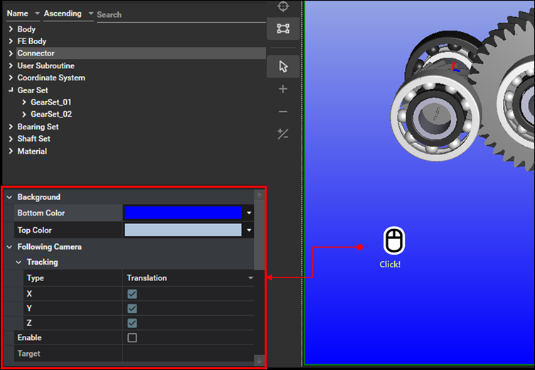
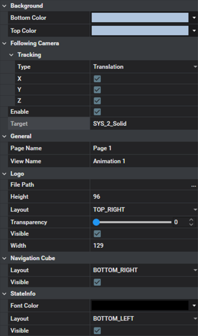
Animation view properties are used to modify the colors of the background, visibility, camera settings, and logo settings as shown in the figure and table below. The common parameters are explained in the main window Property Panel.
Figure 3.25: Animation View Property Details
| Category | Contents | Description |
| Background | Bottom Color | Use to set the bottom color of the animation view. See the Color Tablet for information on how to set the color. |
| Top Color | Use to set the top color of the animation view. See the Color Tablet for information on how to set the color. | |
| Camera | Tracking | Category for the following camera settings. |
| Type |
Use to select one of the following behaviors: | |
|
: The camera will follow a target body in translational directions. In this case, however, the camera's orientation is not aligned with the target body. X, Y, Z : Select the directional components to follow. When you clear an option, the camera will not follow that direction. | ||
|
: The orientation of the camera will align with that of the target. In this case, the camera will follow the target body in all selected translational directions. X, Y, Z : Select the directional components to follow. When you clear an option, the camera will not follow that direction. | ||
| Enable | Use to activate the following camera. If this option is selected, the viewpoint will follow the position and orientation of the target body during animation. | |
| Target | Use to set a target body for the camera. The position and orientation of camera will follow those of the target body. | |
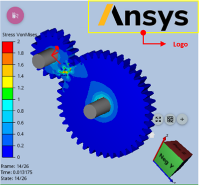
| Logo | Visible |
Use to display the logo as shown in the figure below.
|
| Height | Use to set the height of the logo. | |
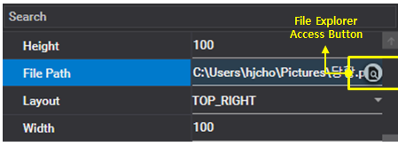
| File Path |
Use to set the image file for the logo. When the mouse is hovering on the right end of input field, the access button for file explorer will be activated as shown in the figure below.
| |
| Layout |
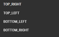
Use to set the location of logo. You can select one of four predefined positions as shown in the figure below.
| |
| Width | Use to set the width of the logo. | |
| Opacity | Use to set the opacity by dragging the slider. Decreasing the value increases the transparency of the logo. | |
| Navigation Cube | Visible | Use to enable the navigation cube. |
| State Info | Visible | Use to enable the frame information. |
| Layout |
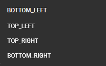
Use to set the location of frame information. You can select one of four predefined positions as shown in the figure below.
|
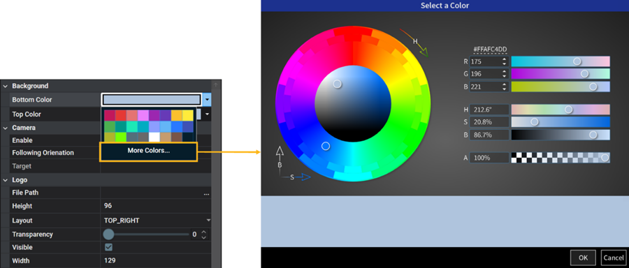
The color for the background, contour, and character can be set in the color tablet as shown in the figure and table below. When the color input field is clicked, the color tablet is activated.
Figure 3.27: Color Tablet
| Contents | Description |
| Standard Color | Use to pick one of the standard colors. |
| More Colors | Use to pick a color from the color palette window. You can select a color generated using various methods, such as RGB and HSB. |