


For LS-DYNA analyses, use the Line Chart object to plot a two-dimensional graph in the X and Y directions, for supported input data.
Go to a section topic:
Supported Data Types
Supported input data for Line Chart objects includes all result-based options available under the Solution object of an LS-DYNA analysis that have data that you can represent in chart. Including:
Results (deformation, stress, etc.) and probes.
Result charts, such as waterfall diagrams.
Line Chart objects.
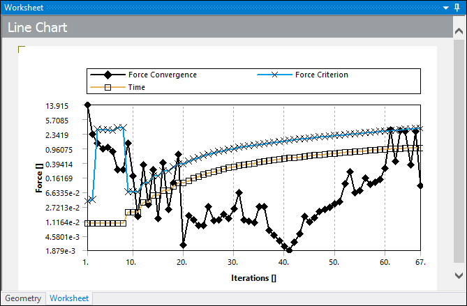
Data from the Solution Information object.
Imported text files (of supported formats).
User-defined datasets created using scripting APIs.
Application
Use the following steps to specify a Line Chart object.
Insert the object by highlighting the object and either selecting the Line Chart option from the Solution Context Tab or right-clicking and selecting > Line Chart.
You can also right-click within the Geometry window and select > Line Chart.
Specify the Source Type property. Options include and .
Based on your Source Type property selection, use one of the following properties to specify your data:
Source Objects: Manually select an object or multiple objects, using the [Ctrl], from the Outline pane. Once you specify object(s) for this property, selecting the entry field highlights the associated objects in the Outline.
: Select the property's field to display an option to open a dialog. Use the dialog to browse to a directory location and select a desired dataset file.
Note: When importing a file, the application supports tab separated X-Y Data file format as well as LS-PrePost Data Export format. See the Example File Formats topic below for examples of these formats.
Object data automatically plots in the Worksheet pane once you complete the above selections. If you have specified only one dataset, the following additional properties display:
- Operation Type
Property options include:
(default): Reset any previous operations and redisplay the plot of the original dataset.
: Generate and plot a new dataset based on the integral operation.
: Generate and plot a new dataset based on the differentiation operation.
- Filter Type
Property options include:
(default): Reset any previous filters and redisplay the plot of the original dataset.
: Apply a Butterworth filter to create and plot a new dataset.
: Apply a SAE filter to create and plot a new dataset.
When you specify a Filter Type, the following additional properties display:
Cutoff Frequency: Define a cutoff frequency value for the applied filter.
Cutoff Frequency Limit: A read-only property that displays the cutoff frequency limit for the current dataset. This limit indicates the maximum value for the cutoff frequency that can still supports filtering. This value helps you fine tune your Cutoff Frequency property entry.
Note: You cannot use the options of the Operation Type property and the Filter Type property in combination. Specifying an Operation Type automatically causes the Filter Type property to be set to , and vice versa. In addition, these properties require that Beta Options are turned off.
You can use the Display Original property to display the original curve as well as the plot you have creating using an operation or filter. Options include (default) and .
Create additional Line Chart objects as desired.
Tabular Data Options
Once you plot data, the Tabular Data window populates with result values. Each column displayed in the window is associated with a dataset. The first column of the window always displays the quantity of the X axis, which depends upon the datasets you currently have displayed.
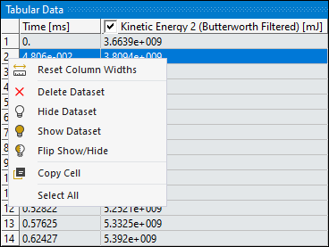
For Line Charts, the Tabular Data window operates in much the same way it does for other data types (/), however, for Line Charts, the context (right-click) menu options, illustrated below, are specific to datasets. The options to hide and/or show datasets perform the same action as selecting/clearing the check box in the column title. The option displays any hidden columns/datasets and then hides all currently displayed columns/datasets. You can manually change the width of the columns and reset them using the context menu option .
To make data comparison easy and efficient, the column headings of the Tabular Data window, the data plots in the chart, and the legend displayed in the chart, all have the same color-coding. The column heading for each dataset also displays the associated unit system. Unit system changes are automatically reflected in the Tabular Data window and the chart. As illustrated below, the X axis of the chart in the Worksheet also displays the unit quantity name (Time) as well as the unit system (ms), however, the Y axis only displays the associated unit system (mJ). Be sure to review the Unit System Limitations topic below.
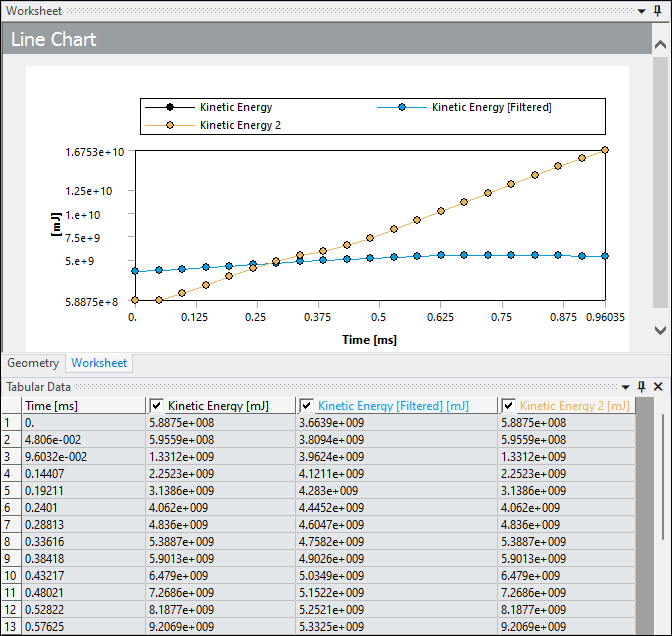
When working with multiple datasets that have different quantities along the X-axis, the heading of the first column (representing the X-axis) displays an "X."
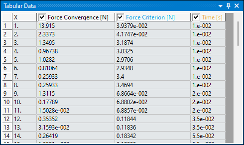
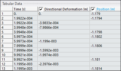
In addition, if multiple datasets do not include overlapping values for the X axis, the cells in the table are left blank.
Use the Precision for Distinct Rows preference (Options > Results > Line Chart Tabular Data) to change the number of significant digits used to consider the distinct X axis values. Each distinct value for the X axis represents a row in the table. If you specify a smaller value for this preference, you could see multiple rows (values) merged into one (row). Increasing the setting for this preference better ensures that each X axis value is displayed in the data table. The default setting is . The supported range is -.
Use the global Number of Significant Digits preference to change the number of significant digits used for displaying the values in the Tabular Data window. The Number of Significant Digits preference is available in Workbench from the Tools > Options > Appearance dialog or when you open Mechanical independently, from the Options > Common Settings > User Interface category.
Tip:
Note: The Precision for Distinct Rows preference affects how multiple X axis values are merged in the table, while the global Number of Significant Digits preference affects how many digits are displayed for the value in each cell of the data table.
If there is a mismatch for the units of measure between datasets, the chart displays blank brackets ([]) along the axes.
Unit System Limitations
The Line Chart feature currently has limitations for how it displays certain units of measure. For example, the Line Chart feature displays:
Joules (J) instead of pico Joules (pJ).
The letter "u" for micro instead of the Greek letter mu (µ).
"dyne cm^-2" instead of "dyne/cm2."
Slug values instead of PSI values.
Examples File Formats
Tab Separated X-Y Data Format
Time	Force Reaction
s	N
0 0	0.01 3.17E+05
0.02	7.04E+06
...	...
LS-PrePost Data Export Format
Curveplot

Time
butterworth
Glstat Data
int-0  #pts=463
* Minval=     0.0000000000e+00 at time=         0.0000000000
* Maxval=     1.7000000000e+08 at time=         0.0011100000
    0.0000000000e+00    0.0000000000e+00
    5.9800000599e-05    0.0000000000e+00
    1.2599999900e-04    7.0400000000e+06
…          …
endcurve