


Overview

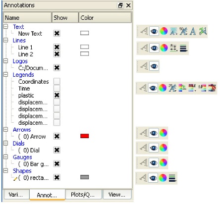
Annotations are provided to augment/mark up 3D/4D information contained in the graphics window. Some examples of this are, current simulation time, changing value of the volume or the area of an object, a variable's color legend, company logo, text, arrows showing point(s) of interest, backdrop shapes, actual experimental video footage, etc. Annotations can be selected in the graphics window by left click and multiple items can be selected by holding the control key down while left clicking. Selection is also available via the annotation list panel. Upon selection of an annotation the Quick Action Icon Bar shows attributes that can be edited. Right-click selection in both areas provide a menu of options for editing, creating, and access to the full Feature Panel.
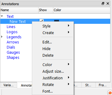
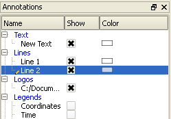
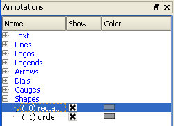
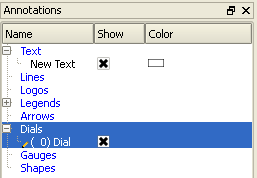
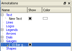
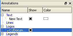
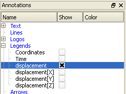
The annotation panel gives a user modifiable view of the annotation items that can be created and already exist. The toggles, in the Show column, turn visibility on/off, whereas the other column items are display only. Selection is accomplished via right and left mouse buttons. Multiple disjoint items can be selected by holding Ctrl as the mouse is clicked and multiple sequential items by holding Shift. Double-click displays the Feature Panel. Any item currently in edit mode will display a pencil icon near it.
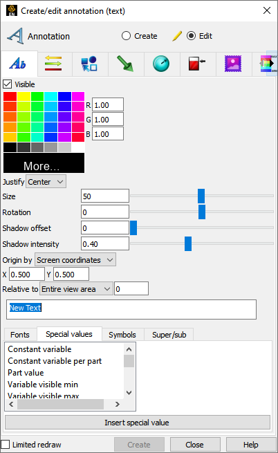
The annotation icon opens the annotation Feature Panel with the last tab selected displayed. Text annotation can contain a mixture of a user's descriptive text along with special values that access information from the current dataset. These annotations can be positioned to a 2D or 3D location and tied to a specific viewport.

Edit specific lines by double clicking or right-click on item.
|
Create |
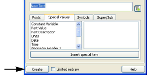
Clicking the button creates a text string called New Text that displays in the text edit area of this dialog, in the annotations panel, and in the graphics window. This text can then be modified simply by typing in the text edit, changing any of the attributes, or by manipulation in the graphics window.
 |
|
|
Special Values |
Lists a number of different special strings that can be inserted into the annotation currently being edited. These include information contained in results data or from other dialogs. |
|
|
Constant Variable |
inserts the value of the constant variable selected and displays it in the selected format. |
|
|
Constant Variable per Part |
Inserts the value of the constant variable selected for the part selected and displays it in the selected format. |
|
|
Date |
inserts the Day of Week, Month, Date, Time, Year. |
|
|
Geometry Header |
inserts either the first or second header lines of the Case Gold geometry file. User defined readers populate these values at their own discretion. |
|
|
Measured Header |
inserts the header line of the measured results file. |
|
|
Variable Header |
inserts the header line of the selected variable data file. |
|
|
Part Value |
inserts the value used to create the Isosurface or Clip Plane Part. Works for Isosurface Parts, or some (XYZ, IJK, RTZ, plane aligned with axis, or attached to a spline) Clip Plane Parts. |
|
|
Part Description |
inserts the description of the Part selected in a Parts list which pops up within the Text Annotation Creation dialog. |
|
|
Units |
inserts the units description for a specified variable if provided by data reader. |
|
|
Version |
inserts the EnSight version number. |
|
|
Fonts |
Allows selection of TrueType fonts and styles for your text.
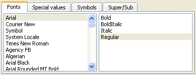 See Manipulate Fonts for additional information on working with fonts. |
|
|
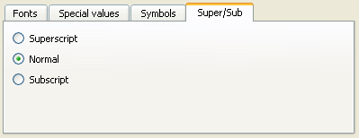
Super/Sub |
These toggles can be used to do superscripting and subscripting in your text string. They place codes in the string (<no> for normal, <up> for superscript, and <dn> for subscript) to delineate the desired mode.
 |
|
|
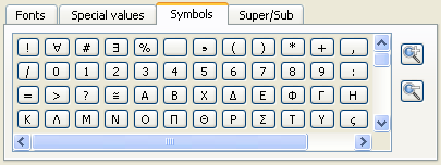
Symbols |
Allows selection of special symbols to be inserted into your text.
 |
|
|
Visible |
Toggles text visibility ON/OFF. |
|
|
RGB |
Color of text. |
|
|
Justify |
Pulldown for left, right, or center justification. |
|
|
Size |
Field and slider for text size. |
|
|
Rotation/Degrees |
Field and slider for rotation in degrees (-360 to 360). |
|
|
Shadow offset |
Field and slider for an offset for a drop shadow. |
|
|
Shadow intensity |
Field and slider for shadow intensity, where 0 is black and 1 is white. |
|
|
Origin by |
Screen coordinates |
Indicates to locate the annotation in normalized screen space |
|
3D coordinates |
Indicates to locate the annotation in world coordinates and therefore a X, Y, Z position must be specified. |
|
|
Relative to |
If Origin is by 3D coordinates, this specifies which reference frame the X, Y, Z position is in reference to. |
|
|
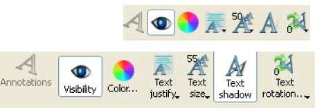
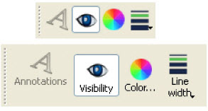
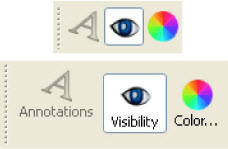
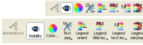
Quick Action Icons for Text |
When a text annotation is selected, the following Quick Action Icons are available in the tool ribbon: With and without icon:
 |
|
|
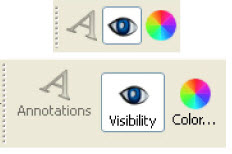
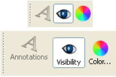
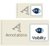
Visibility |
Turn visibility of selected text ON or OFF |
|
|
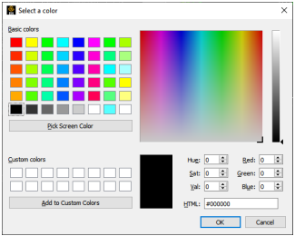
Color... |
Control color of selected text in color dialog that comes up.
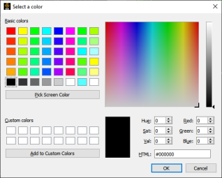 Note: It is also possible to make constant variables dynamically colored according to over/between/under value rules. See Constant Variable Color Override. |
|
|
Text justify |
Set left, center, or right justification of selected text.
 |
|
|
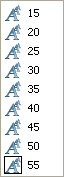
Text size |
Select common sizes for selected text.
 |
|
|
Text shadow |
Turn drop shadow ON or OFF for selected text. |
|
|
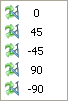
Text rotation... |
Select common rotations for selected text.
 |
|
Any constant (or per part constant) can override it's color in an annotation text string or table by applying color rules on the constant variable. To do this right click on the constant in the Variables object list.
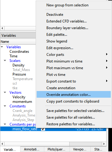
Select to expose the following dialog which allows one to specify a color override for a constant variable if it is below, between, or above the user supplied values.
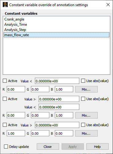
Constant variables - Choose the variable to be edited.
- When turned on will apply the rule to the variable.
Value - The value limit for the rule.
- If checked will use the absolute value for the variable in the comparison against the Value given.
RGB - The color to use if the variable passes the test.
- When toggled on will delay the application of the rules until the user select .
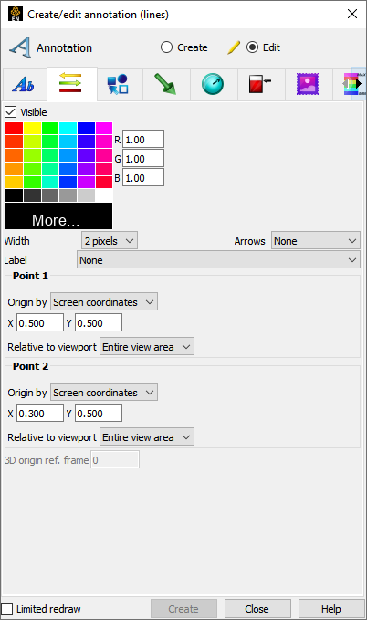
The annotation create/edit icon opens the annotation Feature Panel with the last tab selected displayed. Line annotations can include arrows and can be attached to locations in 2D and/or 3D space. For example one endpoint attached to a 2D text annotation and the other to a location in 3D space.
Edit specific lines by double clicking or right-click on item
|
Create |
Clicking the button creates a line annotation that displays in the annotations panel and in the graphics window. This line can then be modified simply by changing any of the attributes or by manipulation in the graphics window. |
|
|
Visible |
Toggles line visibility ON/OFF. |
|
|
RGB |
Color of line. |
|
|
Width |
Controls the line width in pixels |
|
|
Arrows |
Allows placement of arrow on line |
|
|
Label |
A text annotation can be used to label the line annotation. The text is aligned with the line orientation. |
|
|
Point 1, 2 |
||
|
Origin by |
Screen coordinates |
Indicates to locate the annotation in normalized screen space |
|
3D coordinates |
Indicates to locate the annotation in world coordinates and therefore a X, Y, Z position must be specified. |
|
|
Relative to |
If Origin is by 3D coordinates, this specifies which reference frame the X, Y, Z position is in reference to. |
|
|
3D origin ref. frame |
If either of the end point origins are in 3D coordinates then the reference frame is specified here. |
|
|
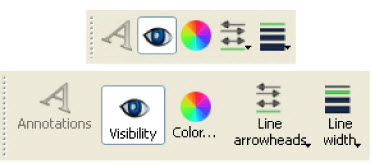
Quick Action Icons for Lines |
When a line annotation is selected, the following Quick Action Icons are available in the tool ribbon: With and without icon labels:
 |
|
|
Visibility |
Turn visibility of selected line ON or OFF |
|
|
Color... |
Control color of selected line in color dialog that comes up.
 |
|
|
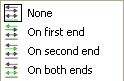
Line arrowheads |
Set arrowhead situation of selected line.
 |
|
|
Line width |
Select common widths for selected line.
 |
|
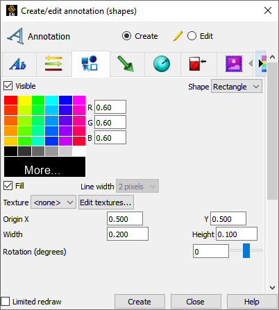
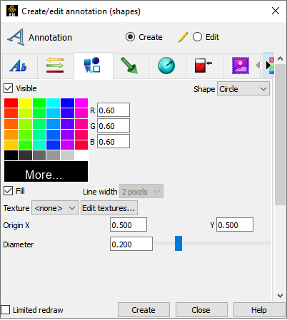
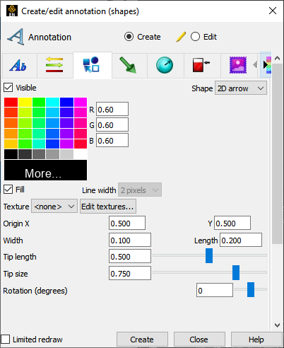
The annotation create/edit icon opens the annotation Feature Panel with the last tab selected displayed. Shapes are often used as background for other annotations, to point to other annotation information, and used as a panel to display actual experiment footage.
Edit specific shapes by double clicking or right-click on item.
|
Create |
Clicking the button creates a shape annotation of the type selected in the Shape option menu. The new shape displays in the annotations panel and in the graphics window. This shape can then be modified simply by changing any of the attributes or by manipulation in the graphics window. |
|
|
Attributes common to all shapes |
||
|
Visible |
Toggles shape visibility ON/OFF. |
|
|
Shape |
Allows selection of the type of 2D shape that will be created when the button is selected. |
|
|
RGB |
Color of shape. |
|
|
Fill |
Toggles whether shape will be filled or just an outline. |
|
|
Line width |
Controls the outline width in pixels |
|
|
Origin XY |
Fields for setting the center of rectangles or spheres, or tip of arrows in normalized coordinates - range 0 to 1. |
|
|
Texture |
Allows specifying a texture to apply to the rectangle. Textures can be video and this method allows actual video to be placed in the scene. |
|
|
Edit textures... |
Click to display the texture dialog which allows adding more textures and modification of texture attributes. |
|
|
Attributes specific to Rectangles |
||
|
Width/Height |
Fields for setting the width and height of a rectangle shape in normalized coordinates - range 0 to 1. |
|
|
Rotation (degrees) |
Field and slider for rotation in degrees - range -360 to 360. |
|
|
Attributes specific to 2D arrows |
||
|
Width/Length |
Fields for setting the width and length of a shape in normalized coordinates - range 0 to 1. |
|
|
Tip: Length/Size |
Fields and sliders for setting the arrow tip length and size. |
|
|
Rotation (degrees) |
Field and slider for rotation in degrees - range -360 to 360. |
|
|
Attributes specific to Circles |
||
|
Diameter |
Field and slider for setting the diameter of a circle shape in normalized coordinates - range 0 to 1. |
|
|
Quick Action Icons for Shapes |
When a shape annotation is selected, the following Quick Action Icons are available in the tool ribbon: With and without icon labels:
 |
|
|
Visibility |
Turn visibility of selected shape ON or OFF |
|
|
Color... |
Control color of selected shape in color dialog that comes up.
 |
|
|
Line width |
Select common line widths for selected shape.
 |
|
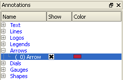
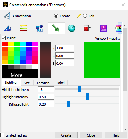
The annotation create/edit icon opens the annotation Feature Panel with the last tab selected displayed. 3D arrows can be used to label areas of interest by attaching their origin to an XYZ location, a probe query, a force, or a moment. The origin can be used to locate specific nodes or elements interactively by snapping it to either of these. Snapping the origin will not cause the annotation to follow the node or element however. To follow the node or element, first create a probe query by node or element and then tie the 3D arrow to the probe query.

Edit 3D arrows by double clicking or right-click on item.
|
Create |
Clicking the button creates a 3D arrow annotation. The new 3D arrow displays in the annotations panel and in the graphics window. This 3D arrow can then be modified simply by changing any of the attributes or by manipulation in the graphics window. |
|
|
Visible |
Toggles arrow visibility ON/OFF. |
|
|
Viewport visibility |
Toggles the visibility of the 3D arrow(s) in the viewport. Clicking on the viewport toggles the visibility. Green indicates visible. |
|
|
RGB |
Color of Line |
|
|
Lighting Tab |
||
|
Highlight Shininess |
Shininess factor. You can think of the shininess factor in terms of how smooth the surface is. The larger the shininess factor, the smoother the object. A value of 0 corresponds to a dull finish and larger values correspond to a more shiny finish. To change, use the slider. |
|
|
Highlight Intensity |
Highlight intensity (the amount of white light contained in the color of the arrow which is reflected back to the observer). Highlighting gives the arrow a more realistic appearance and reveals the shine of the surface. To change, use the slider. Will have no effect if Highlight Shininess parameter is zero. |
|
|
Diffused Light |
Diffusion (minimum brightness or amount of light that the arrow reflects). (Some applications refer to this as ambient light.) The arrow will reflect no light if value is 0.0. If value is 1.0, no lighting effects will be imposed and the arrow will reflect all light and be shown at full color intensity at every point. To change, use the slider. |
|
|
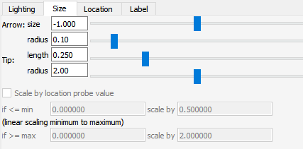
Size Tab |
 |
|
|
Arrow |
size Set the length of the arrow in global units. |
|
|
radius Set the radius of the arrow as a percentage of the size. |
||
|
Tip |
length Set the length of the arrow tip as a percentage of the arrow size. |
|
|
radius Set the radius of the arrow tip as a percentage of the arrow size. |
||
|
Scale by location probe/force/moment value |
(depends on which location method is used) |
|
|
low value if below this value, scale by low scale factor |
||
|
low value scale factor the scale factor to use if below the low value |
||
|
high value if above this value, scale by high scale factor |
||
|
high value scale factor the scale factor to use if above the high value |
||
|
Location Tab |
 |
|
|
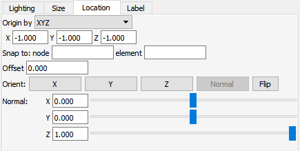
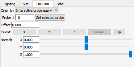
Origin by |
Interactive probe query Location set via the probe query capability |
|
|
XYZ Location set by x,y,z coordinates |
||
|
One or more forces Location set by external force vector glyph |
||
|
One or more moments Location set by external moment vector glyph |
||
|
If by Interactive probe query |
 |
|
|
Probe # |
The probe to use. |
|
|
Offset |
This field specifies the distance away from the Arrow Location to display the arrow(s). A positive value moves the arrow(s) in the opposite direction that the arrow is pointing along the arrow axis. |
|
|
Orient: |
X, Y, Z Orients the arrow direction parallel to the X, Y, or Z axis, respectively. |
|
|
Normal Orients the arrow normal to a surface. This is only available if the Arrow Location has been picked on a 2D surface (see below). |
||
|
Flip Flips the arrow 180 degrees. |
||
|
Normal X, Y, Z |
Rotates the arrow axis about the X, Y, or Z axis. |
|
|
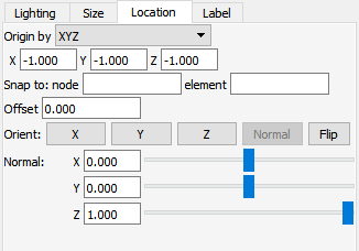
If by XYZ |
 |
|
|
X, Y, Z |
X,Y,Z - location of the arrow tip. |
|
|
Snap to |
node
Enter the Node ID and press Enter and the arrow tip will be located at the coordinates of this Node. This field will set the Arrow Location X, Y, and Z values and is not used subsequently. That is, the arrow location is specified by the X, Y, and Z location and cannot be tied to a particular node number as the node changes location due to transient data, etc. |
|
|
element Enter the Element ID and press Enter and the arrow tip will be located at the centroid coordinates of this Element. This field will set the Arrow Location X, Y, and Z values and is not used subsequently. That is, the arrow location is specified by the X, Y, and Z location and cannot be tied to a particular node number as the node changes location due to transient data, etc. |
||
|
Offset |
This field specifies the distance away from the Arrow Location to display the arrow(s). A positive value moves the arrow(s) in the opposite direction that the arrow is pointing along the arrow axis. |
|
|
Orient: |
X, Y, Z Orients the arrow direction parallel to the X, Y, or Z axis, respectively. |
|
|
Normal Orients the arrow normal to a surface. This is only available if the Arrow Location has been picked on a 2D surface (see below). |
||
|
Flip Flips the arrow 180 degrees. |
||
|
Normal X, Y, Z |
Rotates the arrow axis about the X, Y, or Z axis. |
|
|
If by one or more forces |
||
|
Offset |
This field specifies the distance away from the Arrow Location to display the arrow(s). A positive value moves the arrow(s) in the opposite direction that the arrow is pointing along the arrow axis. |
|
|
Selection list |
Description of loaded force vector glyphs from which to choose. |
|
|
If by one or more moments |
||
|
Offset |
This field specifies the distance away from the Arrow Location to display the arrow(s). A positive value moves the arrow(s) in the opposite direction that the arrow is pointing along the arrow axis. |
|
|
Selection list |
Description of loaded moment vector glyphs from which to choose. |
|
|
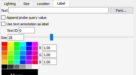
Label Tab |
 |
|
|
Text |
Enter the label to be displayed on the 3D arrow. Field is not used if the Use text annotation as label toggle is on. |
|
|
Font |
Pick the font for the label text. |
|
|
Append probe query value |
If the Origin (Location tab) of the 3D arrow is set to Interactive probe query the probe value can be appended onto the label. |
|
|
Use text annotation as label |
A text annotation can be used as the 3D label. Specify the Text ID number in the field. |
|
|
Size |
Size of the font used as the label |
|
|
RGB |
Color for the label. |
|
|
Picking the arrow location is accomplished using the pick icon below the graphics screen. Once your pick method is chosen, move the cursor to the location you wish to pick and enter the P key. |
||
|
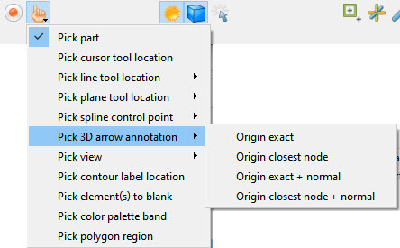 |
||
|
Origin exact |
Locate arrow tip at cursor |
|
|
Origin closest node |
Snap arrow tip to closest node to cursor |
|
|
Origin exact + normal |
Locate arrow tip at cursor & normal to surface |
|
|
Origin closest node + normal |
Snap arrow tip to closest node to cursor & normal to surface |
|
|
Quick Action Icons for 3D Arrows |
When a 3D arrow annotation is selected, the following Quick Action Icons are available in the tool ribbon: With and without icon labels:
 |
|
|
Visibility |
Turn visibility of selected arrow ON or OFF |
|
|
Color... |
Control color of selected arrow in color dialog that comes up.
|
|
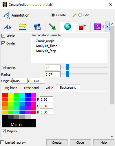
The annotation create/edit icon opens the annotation Feature Panel with the last tab selected displayed. Dials can be used to show the current value of a constant variable in a chosen range. In order to use this feature, you must have one or more constant variables.

Edit specific dials by double clicking or right-click on item.
|
Create |
Clicking the button creates a dial annotation using the constant variable selected. The dial displays in the annotations panel and in the graphics window. This dial can then be modified simply by changing any of the attributes or by manipulation in the graphics window. |
|
|
Visible |
Toggles dial visibility ON/OFF. |
|
|
Use constant variable |
List of available constant variables. |
|
|
Border |
Toggles border for the dial ON/OFF. |
|
|
Tick marks |
Field and slider to control the number of tick marks around the dial. |
|
|
Radius |
Field and slider to control the radius of the dial. |
|
|
Origin |
Location of center of the dial in normalized X and Y coordinates. |
|
|
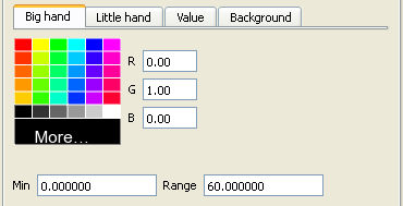
Big hand Tab |
 |
|
|
RGB |
Color of the big hand on the dial. |
|
|
Min |
Min value of the big hand on the dial. |
|
|
Range |
Range for the big hand on the dial. |
|
|
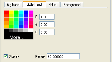
Little hand Tab |
 |
|
|
RGB |
Color of the little hand on the dial. |
|
|
Display |
Toggle controlling whether to show the little hand or not. |
|
|
Range |
Range for the little hand on the dial. |
|
|
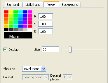
Value Tab |
 |
|
|
RGB |
Color of the value label in the dial. |
|
|
Display |
Toggle controlling whether to show the value label or not. |
|
|
Size |
Field and slider for size of the value label. |
|
|
Show as |
Controls whether the value label is the actual value or the number of revolutions. |
|
|
Format |
Controls the format of the displayed value label. |
|
|
Decimal places |
Controls the number of decimal places of the displayed value label. |
|
|
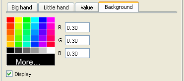
Background Tab |
 |
|
|
RGB |
Color of the dial's background. |
|
|
Display |
Toggle controlling whether to have a background in the dial or not. |
|
|
Quick Action Icons for Dials |
When a dial annotation is selected, the following Quick Action Icons are available in the tool ribbon: With and without icon labels:
 |
|
|
Visibility |
Turn visibility of selected dial ON or OFF |
|
|
Color... |
Control color of selected dial in color dialog that comes up.
|
|
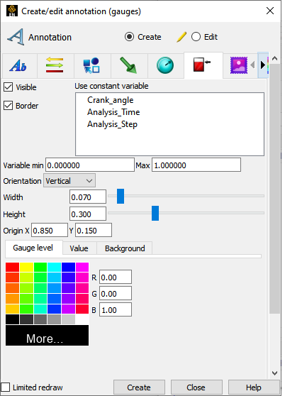
The annotation create/edit icon opens the annotation Feature Panel with the last tab selected displayed. Gauges can be used to show the current value of a constant variable in a chosen range. In order to use this feature, you must have one or more constant variables.

Edit specific gauges by double clicking or right-click on item.
|
Create |
Clicking the button creates a gauge annotation using the constant variable selected. The gauge displays in the annotations panel and in the graphics window. This gauge can then be modified simply by changing any of the attributes or by manipulation in the graphics window. |
|
|
Visible |
Toggles gauge visibility ON/OFF. |
|
|
Use constant variable |
List of available constant variables. |
|
|
Border |
Toggles border for the gauge ON/OFF. |
|
|
Variable Min/Max |
Fields for setting the min and max for the variable. |
|
|
Orientation |
Pulldown for setting the gauge to be vertical or horizontal. |
|
|
Width/Height |
Fields and sliders to control the size of the gauge. |
|
|
Origin |
Location of the bottom left corner of the gauge in normalized X and Y coordinates. |
|
|
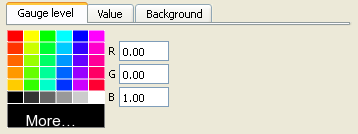
Gauge level Tab |
 |
|
|
RGB |
Color of the fluid in the gauge. |
|
|
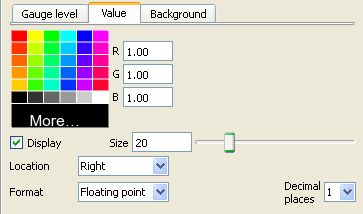
Value Tab |
 |
|
|
RGB |
Color of the value label on the gauge. |
|
|
Display |
Toggle controlling whether to show the value label or not. |
|
|
Size |
Field and slider for size of the value label. |
|
|
Location |
Controls whether the value label is to the left, right, or in the center of the gauge. |
|
|
Format |
Controls the format of the displayed value label. (floating point or exponential) |
|
|
Decimal places |
Controls the number of decimal places of the displayed value label. |
|
|
Background Tab |
 |
|
|
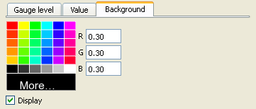
RGB |
Color of the gauge's background. |
|
|
Display |
Toggle controlling whether to have a background in the gauge or not. |
|
|
Quick Action Icons for Gauges |
When a gauge annotation is selected, the following Quick Action Icons are available in the tool ribbon: With and without icon labels:
 |
|
|
Visibility |
Turn visibility of selected dial ON or OFF |
|
|
Color... |
Control color of selected dial in color dialog that comes up.
|
|
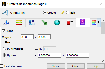
The annotation create/edit icon opens the annotation Feature Panel with the last tab selected displayed.

Edit specific logos by double clicking or right-click on item.
|
Create |
Clicking the button opens a dialog to load a new logo. The new logo displays in the annotations panel and in the graphics window. This logo can then be modified simply by changing any of the attributes or by manipulation in the graphics window. |
|
|
Visible |
Toggles logo visibility ON/OFF. |
|
|
Origin |
Location of the bottom left corner of the logo in normalized X and Y coordinates. |
|
|
Size |
By normalized width |
Changes the normalized width (value between 0.0 and 1.0) which auto computes the height according to the aspect ratio of the graphics window. This results in a logo that will automatically scale (change size) relative to the size and aspect ratio of the graphics window. |
|
By scale |
X and Y scaling of the logo pixels. This default setting results in the logo remaining a constant size when re-sizing the graphics window. |
|
|
Quick Action Icons for Logos |
When a logo annotation is selected, the following Quick Action Icons are available in the tool ribbon: With and without icon labels:
 |
|
|
Visibility |
Turn visibility of selected logo ON or OFF |
|
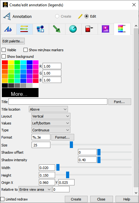
The annotation create/edit icon opens the annotation Feature Panel with the last tab selected displayed.

Edit specific legends by double clicking or right-click on item.
|
Create |
Legends exist automatically for any variable that has been activated, therefore they cannot be created via this dialog. |
|
|
Edit Palettes |
Brings up the Palette Editor and allows you to edit palette attributes. |
|
|
Visible |
Toggles Legend Visibility ON/OFF |
|
|
Show min/max markers |
Toggles min/max markers on the right side of the legend color bar. These are the min/max for the current time step. |
|
|
RGB |
Color of the legend text. |
|
|
Title |
Field for entering text for the legend title. |
|
|
Font |
Brings up dialog for selecting font for legend title. |
|
|
Title location |
Location of the Title: Above, Below or None |
|
|
Layout |
Layout of the Legend Bar: Vertical or Horizontal. |
|
|
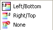
Values |
Location of the legend values: Left/Bottom, Right/Top, or None. |
|
|
Type |
Color distribution: Continuous or Discrete. |
|
|
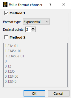
Format |
Value format field, or use Format dialog:
 |
|
|
Size |
Choose a Font Size |
|
|
Width |
Legend width normalized. |
|
|
Height |
Legend height normalized. |
|
|
Origin |
Normalized X and Y coordinates of lower left of legend. |
|
|
Relative to |
Ties the location values relative to the entire graphics window or a specific viewport. |
|
|
Quick Action Icons for Legends |
When a legend annotation is selected, the following Quick Action Icons are available in the tool ribbon: With and without icon labels:
 |
|
|
Visibility |
Turn visibility of selected legend ON or OFF |
|
|
Color... |
Control color of selected legend in color dialog that comes up.
|
|
|
Text size |
Select common sizes for labels in selected legend.
 |
|
|
Legend orient |
Toggle between vertical and horizontal orientation for selected legend. |
|
|
Legend title loc |
Select location of title for selected legend.
 |
|
|
Legend text loc |
Select location of value labels for selected legend.
 |
|
|
Legend min/max |
Toggle presence of min and max values for selected legend. |
|