


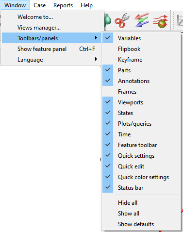
By default, the EnSight user interface shows several panels on the left side of the main graphics area. These panels show the list of objects that EnSight knows about. Panels may be displayed or hidden via the Window → Toolbar/List tab visibility menu as shown in Figure 3.1: Window → Toolbar/List Tab Visibility. By default list panels are visible for Parts, Variables, Annotations, Plots/Queries, and Viewports. A Frame list panel is also available and activated via the menu option. Each of these list panels are described in the following sections.
All of the list panels share common features and operate in a similar manner. List panels show objects of a particular type, such as Parts, and list each object one per line. Some list panels may also show objects arranged in a group hierarchy. For example, Parts and Variables may be organized into user-defined groups (see Figure 3.2: Part List). Other lists do not support grouping, such as Frames.
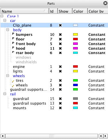
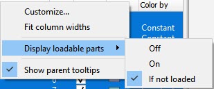
List panels can show a user selectable set of columns. Each column corresponds to a particular object attribute. For example, the Part list panel by default shows columns for Name, Id, Show, Color, and Color by. These correspond to the associated Part attributes. Column headers may be clicked to change the sort order of the list. A second click reverses the sort order for that column. The edge between columns may be dragged to resize columns. Alternatively, right-clicking on a list panel's column header will display a context sensitive menu (see Figure 3.3: Parts) with an option Fit column widths that will resize all columns to an appropriate size.
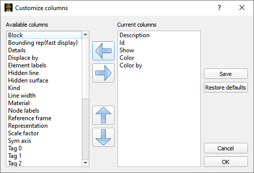
Which panel columns and their order are chosen from the same context sensitive menu. Selecting the Customize... option displays a dialog (see Figure 3.4: Customize) for choosing which columns are displayed and in what order. The dialog shows available column attributes in the left list and displayed columns in the right list. The left and right arrows move column attributes between the lists. The up and down arrows are used to reorder the attributes in the right list. Clicking the button dismisses the dialog and resets the list panel's columns to the new set of column attributes. Clicking the button dismisses the dialog with no changes. Clicking the button operates the same as the button and additionally saves the changes for future EnSight sessions. The button will reset a list panel's attribute columns back to the application defaults.
The Display loadable parts menu has three options: it can be set to Off, On and If not loaded (default). Recall model parts in EnSight are original parts found in the dataset (that is, not created by EnSight). And, in EnSight, model parts can be either loaded or not loaded. Loaded model parts show up in regular text, not grayed out. If this is On, then loadable parts show up as an additional list of parts whose name is grayed out. If you have loaded all model parts, then you'll have a list of these bolded part names with the downside of having a an additional same, list of grayed out part names. If this list is Off and you haven't loaded all model parts in EnSight then you'll have a bolded list of the loaded parts and the non loaded parts will be invisible, and essentially not loadable. Finally the default option, only shows the loadable parts that haven't yet been loaded.
List panels support drag and drop interaction. In panels that support grouping, objects may be dragged from one group into another group. Variables support drag and drop to the Part panel; this interaction causes a part to be colored by the variable dropped onto it. Variables may also be dragged and dropped into the main graphics window to color a part or all parts. These interactions are further described in later sections.
Objects within a panel support two forms of selection: selection and Feature Panel-selection. A blue background indicates which object or objects are selected (see Figure 3.2: Part List). Selecting objects in a list panel operates very similarly to making selections in a Microsoft Windows Explorer window or a Macintosh Finder window. Objects are selected by clicking once on the object. Clicking on a different object selects that object and deselects the former selection. Clicking while holding down Ctrl toggles selection. Clicking while holding down Shift extends a selection. Clicking while holding down the Ctrl performs a disjoint selection. Lastly, clicking on an empty line of a list panel deselects all objects.
Selected objects may be deleted by pressing Del. A confirmation dialog will appear to confirm the deletion.
An object or objects are made Feature Panel selected by either double-clicking them or by choosing the context sensitive menu option Edit... The Feature Panel, or Feature Editor Dialog, is used to perform or complicated interactions on objects. It is described in detail in Transformation Control. Feature Panel selected objects are indicated by a little pencil icon drawn to the left of an object's name as shown in Figure 3.2: Part List. It is important to distinguish between normal selection and Feature Panel selection. The Feature Editor Dialog operates on objects that are Feature Panel selected, those with the pencil icon next to their name; whereas, the rest of the EnSight user interface operates on objects that are normally selected.
List panels have a context sensitive menu that is displayed by right-clicking an object or the background of a list panel. The contents of this pop-up menu depend upon the particular list panel and what is selected. Typically, the pop-up menu contains options for Edit..., Delete, and grouping (if the list panel supports grouping). As previously mentioned, Edit... will make the current selection the Feature Panel selection for that list panel and then display the Feature Editor Dialog if it is not already displayed. Delete will simply delete the selected object(s). If grouping is supported for the particular list panel, then options for creating, deleting, and renaming groups will be available. The specific context sensitive menus for each list panel type will be described in the following sections.
List panels are a form of dockable panel. Dockable panels can be dragged and placed elsewhere on the main user interface or even dragged off of the user interface to make the panel a standalone window. Clicking a panel's button in the upper right corner of the panel will hide the panel. Dragging and dropping a panel onto another panel will stack the panels together therefore making a tabbed group with one tab per panel; this interaction is commenced by dragging on a panel's header. Additionally, dragging a panel's edge will resize the panel or panel group. These interactions allow the user to reorganize the user interface into a more desirable configuration based on user preference.
Because list panels are a form of dockable panel, you may also see them stacked with non-list panels such as the panels for Time, Flipbooks, and Keyframes. Furthermore, User Defined Tools may also have a user interface that utilizes a dockable panel.