Creating scatter plots
On the Scatter plot page, you can examine relationships between two numeric variables in the records in your search results.
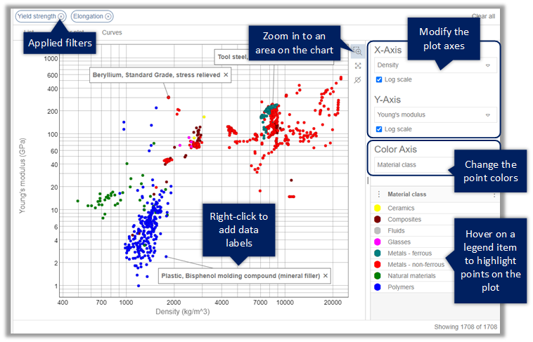
- To select different properties for the plot axes, select from the X-Axis and Y-Axis lists. When all the data is positive, you may be able to choose a logarithmic or linear axis scale.
- To change the property used to determine the bubble colors, select it in the Color Axis list.
- To add a data label, right-click a point or bubble and choose Add data label, then drag the label to the position you want. To remove a label, click the cross on the label. To remove all labels from the plot, click Remove all labels.
- Double-click a bubble to view the datasheet for that record.
- Optional:
Right-click for additional record actions:
- Show datasheet - open the record datasheet.
- Add to Favorites list - add the selected record to a personal Favorites List.
- Compare records - compare the selected records.
- Export material cards - export data from the selected records as material cards for use in CAD, CAE, or PLM applications.
Example: