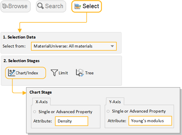
Exercise 6: Create a bubble chart
Add attributes to both axes to create a bubble chart.
-
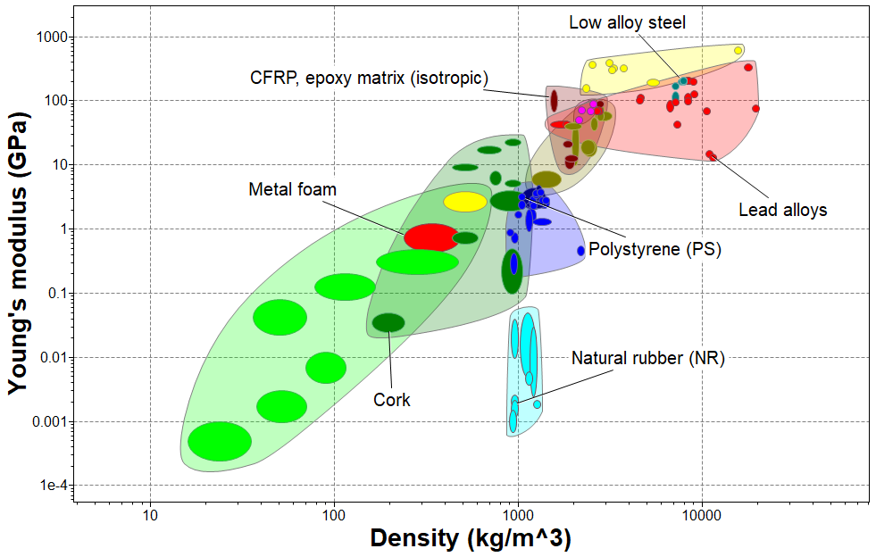
Make a bubble chart plotting Young’s modulus (E)
against Density (ρ)
-
Under Selection Stages, click
 Chart/Index.
-
Leave the Axis Settings as default values to
create a log-log plot.
-
Under Selection Stages, click
-
Display family envelopes
-
Click
 Show Family
Envelopes to look at how data for a given family of
materials cluster together.
Show Family
Envelopes to look at how data for a given family of
materials cluster together.
-
Click
-
Label records on the chart
- Hover the cursor over the record bubble to see the record name, and then label some records (click over a record and drag).
- Try adding labels from the Results list: right-click a record in the list, and select Label on the shortcut menu, then drag the label where you want it on the chart.
-
If the new label isn’t visible at the current zoom, click
 Autoscale to display the
whole chart again.
Autoscale to display the
whole chart again.