


The table item can be displayed as a physical table as text with optional
column sorting or as an interactive plot. The value of the plot
property controls the specific
type of display that is generated.
Table View
A table data item displayed as a table might look like this:
Tables have optional row and column headers that are presented as bold-face
labels along the top and left sides of the table. Each table has an optional
title that is displayed, centered, over the top of the table. Columns support
sorting. Clicking individual columns sorts the rows according to the order of
the values in that column. Values in the table can be strings or floating point
numbers. The format property sets the default formatting for the entire table or for
individual columns. A table value can be interpreted as a time value (the number
of seconds since 1970-01-01T00.00:00.00000). In conjunction with the
date_XY formatting option, these can be displayed in proper
date/time formats.
Line Plot View
The table can be displayed as a line plot.
In line plot mode, rows in the table are mapped to lines in the line plot. A
specific row or the column labels can be used as the common X axis for the data
in each row. Not a Number (NaN) values in the row are not included in any plots
(they are simply skipped). Line colors, widths, styles, thicknesses and symbols
can all be controlled using properties. A line plot with symbols but with the
line_style property
of none results in a scatter plot.
3D Scatter Plot View
The table example can be displayed as a 3D scatter plot if the
xaxis, yaxis, and zaxis properties are
specified. If the plot property is set to
line, the table is displayed as:
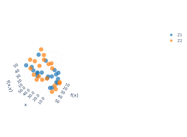
The default 3D scatter plot mode is lines+markers, which includes
the dot points and the connection lines between the dots. To show the dots
without lines, change the line_style property to
none. Line colors, widths, thicknesses, and symbols can
also be controlled with properties.
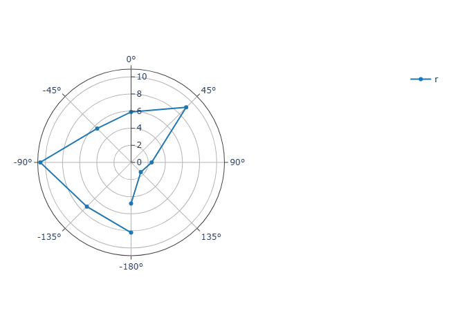
Polar Plot View
The table can be displayed as a polar plot. A polar plot is a plot type that visualizes the data points in a polar coordinate system.
One common variation of a polar plot is a radar chart. The data position is determined by:
Radius (r): The distance from the center of the polar plot, defined by the
yaxisproperty.Theta (Θ): The direction of the point, measured in numeric degrees or categorical data, defined by the
xaxisproperty.
Note:
Scatter polar is the only available polar plot type currently.
The theta (Θ) value is defined by the data type of the
xaxisvalues:If the
xaxisvalues have a negative numeric value, the labels are a list of symmetrical values from -180° to 180°.If the
xaxisvalues are all positive values, the labels are from 0° to 360°.If the
xaxisvalues are categorical values, allxaxisvalues are used to label.
Bar Graph View
The table can be displayed as a bar graph.
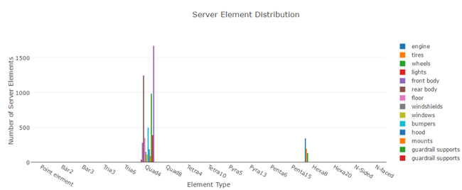
In bar plot mode, rows in the table are mapped to sets of bars in the bar
plot. A specific row or the column labels can be used as the common X axis for
the data in each row. Not a Number (NaN) values in the row are not included in
any plots (they are simply skipped). Bar plots map the line_color
property to the color of each bar
set.
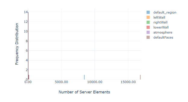
Histogram View
The table example can be displayed as a histogram plot categorized by its Y labels in two scenarios:
Render large table as histogram
By default, Ansys Dynamic Reporting displays any data table as histogram if the table columns count is greater than the rendering threshold. The initial threshold is 50 columns, but can be modified.
Specify the display option
You can also specify the plot property as a histogram.
Pie Chart View
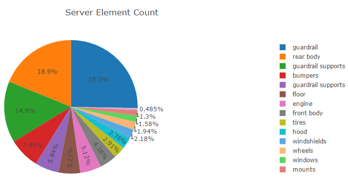
In pie chart mode, each row is displayed as a separate pie graph with a common
legend. The colors of the pie wedges can be set using the
line_color property.
The row label and the specific wedge value can be seen when you hover over an
individual wedge.
Heatmap View
A 2D array of values can be displayed graphically as blocks colored by a palette. The following is an example table of values.
| 0.00291 | 0.01306 | 0.02153 | 0.01306 | 0.00291 |
| 0.01306 | 0.05854 | 0.09653 | 0.05854 | 0.01306 |
| 0.02153 | 0.09653 | nan | 0.09653 | 0.02153 |
| 0.01306 | 0.05854 | 0.09653 | 0.05854 | 0.01306 |
| 0.00291 | 0.01306 | 0.02153 | 0.01306 | 0.00291 |
If the plot property is set to heatmap, the table is displayed
as:
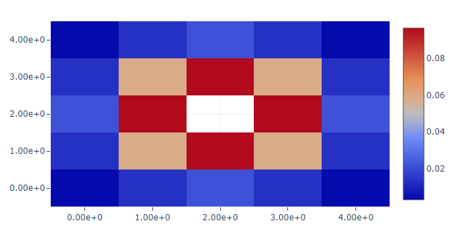
The Not a Number (NaN) value is interpreted as a missing value. Grid lines can
be added to the display using the show_border property. The
format, palette, palette_reverse,
palette_show and palette_range properties are all
supported.
3D Surface View
A 3D surface view is a variation of a heatmap view as both types of plots
share the same data structure. The difference is that the 3D surface view
displays in 3D space, allowing interactions like rotating to view different
perspectives. For example, the following table of values (using the same data
from the heatmap example) is displayed as the following image when the
plot property is set to 3d surface.
| 0.00291 | 0.01306 | 0.02153 | 0.01306 | 0.00291 |
| 0.01306 | 0.05854 | 0.09653 | 0.05854 | 0.01306 |
| 0.02153 | 0.09653 | nan | 0.09653 | 0.02153 |
| 0.01306 | 0.05854 | 0.09653 | 0.05854 | 0.01306 |
| 0.00291 | 0.01306 | 0.02153 | 0.01306 | 0.00291 |
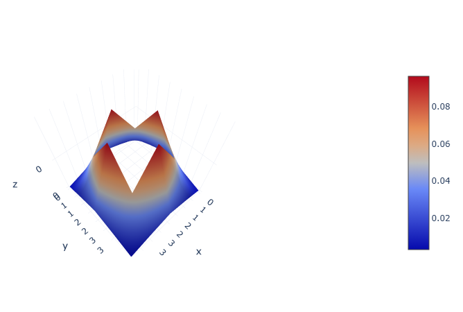
The Not a Number (NaN) value is interpreted as a missing value. Currently, the
supported properties are format, palette,
palette_reverse, palette_show, and
palette_range.
Parallel Coordinates Plot View
In a parallel coordinates plot, each row in the table is considered an observation. Each column in the table is a different observation. The following is an example table of five observations. Each observation consists of three values (width, height and value).
| Width | Height | Value |
|---|---|---|
| 54.2 | 12.3 | 1.45e5 |
| 72.3 | 9.3 | 4.34e5 |
| 45.4 | 10.8 | 8.45e4 |
| 67.4 | 12.2 | 2.56e5 |
| 44.8 | 13.5 | 9.87e4 |
If the plot property is set to parallel, the table is displayed
as:
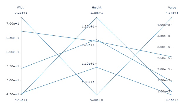
One axis for each of the columns in the table with one line for each row in
the table. The minimum and maximum values for each column can be set using the
column_minimum and column_maximum properties. The
format and line_color properties are also used in
parallel coordinates plots.
Sankey Diagram View
A sankey diagram is a nodal flow diagram. It draws a plot of linked nodes, where each link has a specific weight or value. Links are directional, in that the flow from node A to node B is displayed separately from the flow from node B to A, and they can have different weights. Weights must be non-zero, positive floating point numbers.
The nodal network is represented as a table. The rows and columns are the nodes. Rows are the sources and columns are the targets. The value in the table is the weight of the link from the source to the target. Weights that are less than or equal to 0.0 are non-existent links and are not included in the diagram.
Note: Labels for the nodes are assumed to be the same for the sources and targets. The column labels are used as the node labels, any supplied row labels are ignored.
The following is an example graph with six nodes: A, B, C, D, E, F. Nodes A and B feed C and D while nodes C and D feed E and F with the following weights:
| Source | Target | Weight |
|---|---|---|
| A | C | 8 |
| B | D | 4 |
| A | D | 2 |
| C | E | 8 |
| D | E | 5 |
| D | F | 1 |
That graph is represented using this table (which is passed to Ansys Dynamic Reporting):
| A | B | C | D | E | F | |
| A | 0 | 0 | 8 | 2 | 0 | 0 |
| B | 0 | 0 | 0 | 4 | 0 | 0 |
| C | 0 | 0 | 0 | 0 | 8 | 0 |
| D | 0 | 0 | 0 | 0 | 5 | 1 |
| E | 0 | 0 | 0 | 0 | 0 | 0 |
| F | 0 | 0 | 0 | 0 | 0 | 0 |
If the plot property is set to sankey, the table is displayed
as:
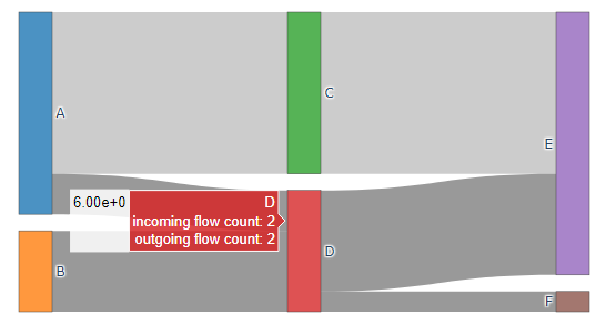
The format property is also used in sankey plots.