


Overview
The default EnSight configuration shows one view of your model in the main Graphics Window. This initial viewport, which covers the Graphics Window cannot be removed and is always used to clear (erase) the Graphics Window prior to a redraw. You can create up to fifteen additional viewports that will overlay the Graphics Window. These viewports can be interactively resized and relocated within the Graphics Window using the mouse and the visibility of each Part can be controlled on a per viewport basis. Transformations, and Z-clip location settings can also be made independently in each viewport.
When in viewport mode, you are always modifying the viewports selected in the Graphics Window. Selected viewports are outlined in the selection color, while unselected objects are outlined in a white color.
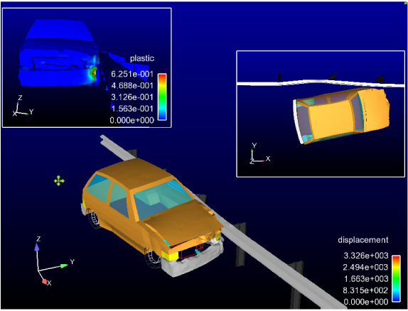
Multiple viewports are helpful in showing the same object from multiple views, showing different axes in each viewport, showing the same parts with different attributes, etc. Max number of viewports is 16.
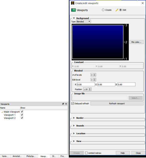
You can get at the viewport attributes via the Quick Action Icons or through the Feature Panel. Clicking once on the Viewports icon opens the Feature Panel for Viewports. This editor is used to both create and edit viewports. Plots can be selected in the graphics window by left click, and multiple items can be selected by holding the control key down while left clicking. Selection is also available via the Viewports list panel. Upon selection of a viewport, the Quick Action Icon Bar shows attributes that can be edited. Right-click selection in both areas provide a menu of options for editing, creating, and access to the full Feature Panel.
The Viewports panel gives a user modifiable view of the viewports that already exist. The toggles, in the Show column, turn visibility on/off. Selection is accomplished via right and left mouse buttons. Multiple disjoint items can be selected by holding Ctrl as the mouse is clicked and multiple sequential items by holding Shift. Double-click displays the Feature Panel. Any item currently in edit mode will display a pencil icon near it.
Note: The Ansys 2025 R1 watermark in the top right corner of the viewport is by default visible in interactive viewport of EnSight. This watermark is never exported to image or animation files. However, you can now also turn off this watermark from the interactive session of EnSight by toggling OFF the Watermark option under → .
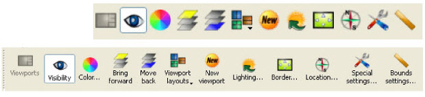
When a viewport is selected, the following Quick Action Icons become available.
With or without icon labels:
|
Visibility Icon |
Sets the visibility of the selected viewport(s). |
||
|
Color... Icon |
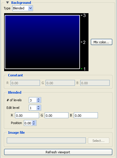
Opens the background area of the Feature Panel for the specification of the color you wish to assign to the background of the selected viewports.
 |
||
|
Type |
Opens a pulldown menu for the specification of the type of background you wish to assign to a viewport. |
||
|
Blended |
In the Blended area, allows you to specify a background comprised of 2 to 5 blended colors. |
||
|
# of Levels |
This field specifies the number of levels (from 2 to 5) at which a color will be specified. The default is 2. |
||
|
Edit Level |
This field specifies which of the levels you wish to edit. You may select the desired level using the stepper buttons, by entering a value in the field, or interactively by clicking on its number on the right side of the Viewport Color window. |
||
|
Position |
This field specifies the vertical position of the edit level as a fraction (from 0 to 1) of the vertical height of the Viewport Color window, where 0.0 is at the bottom and 1.0 is at the top. You may adjust a level to the desired position using the stepper buttons, by entering a value in the field, or interactively by selecting and dragging a level's number on the right side of the Viewport Color window. The position of any level can not be below the position of the next lower level. |
||
|
Constant |
In the Constant area, allows you to specify a constant color using the RGB fields or the Color Selector dialog which is accessed by clicking the button. |
||
|
Image |
In the Image file area, allows you to choose an image as a background for your viewport. |
||
|
Inherit |
Causes the viewport to display the same background color attributes as the main Graphics Window. Only applicable for created viewports, not the main Graphics Window. |
||
|
|
Opens the Color Selector dialog. |
||
|
Refresh Viewport |
Will redraw the selected viewport(s) with the defined viewport background settings. |
||
|
Bring forward Icon |
Clicking this button moves the selected viewport(s) forward in the Graphics Window to occlude any viewports which it (they) may overlap. |
||
|
Move back Icon |
Clicking this button moves the selected viewport(s) back in the Graphics Window to be occluded by any viewports which may overlap it (them). |
||
|
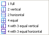
Viewport Layouts Icon |
This icon opens a pulldown menu of icons which indicate standard viewport layouts.
 |
||
|
New Viewport Icon |
Clicking this button creates a new Viewport within (and on top of) the main Graphics Window. The location and size of the viewport can be modified interactively in the Graphics Window by
|
||
|
Selected viewport(s) lighting... Icon |
Opens the Light Source Editor dialog, where you can modify light sources and their attributes. This is not a viewport specific operation - but this way of getting to it has been retained for now. You can also get there from the main menu View → Lighting. |
||
|
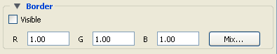
Border... Icon |
Opens the Border attributes area of the Feature Panel, for the specification of a constant color for the border of the selected viewports.
 |
||
|
Visible Toggle |
Toggles on/off visibility of a viewport's border in the other five Modes. The border of each viewport will always be visible in VPort Mode. |
||
|
RGB |
These fields specify the RGB values for the color you wish to assign. |
||
|
|
Opens the Color Selector dialog. See Variable Selection and Activation. |
||
|
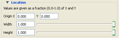
Location... Icon |
Opens the Location area of the Feature Panel for the specification of the desired location in the main Graphics Window for the selected viewports. This dialog provides a more precise alternative to moving and resizing the viewports interactively.
 |
||
|
Origin X Y |
These fields specify the location for the X and Y coordinates of the selected viewport's origin (lower left corner) in the main Graphics Window. Values range from 0.0 to 1.0. |
||
|
Width, Height |
These fields specify the width and height of a selected viewport in X and Y coordinates from the viewport's origin. Values range from 0.0 to 1.0. |
||
|
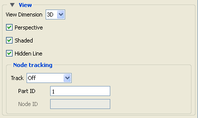
Special settings... Icon |
Opens the View area in the Feature Panel for the specification of whether the global settings for Perspective versus Orthographic display, hidden surface display, and hidden line display will apply in the selected viewport(s). In addition, a viewport can be designated as 2D, in which case only planar 2D parts can be displayed in the viewport.
Note: Once you designate a viewport as a 2D viewport, all 3D parts are no longer visible in that viewport. To see the 3D parts in that viewport again, you will need to make the viewport 3D, select the 3D parts in the Parts list, and make them visible again using the visibility per viewport icon.
 |
||
|
Track |
In the Node tracking area, will do a global translate of the geometry to track the motion with respect to one of the following: |
||
|
Node number |
Enter the node id in the Node ID field |
||
|
Part Centroid |
The geometric centroid of the part is used for tracking |
||
|
Part xmin |
The minimum x coordinate of the part is used for tracking |
||
|
Part xmax |
The maximum x coordinate of the part is used for tracking |
||
|
Part ymin |
The minimum y coordinate of the part is used for tracking |
||
|
Part ymax |
The maximum y coordinate of the part is used for tracking |
||
|
Part zmin |
The minimum z coordinate of the part is used for tracking |
||
|
Part zmax |
The maximum z coordinate of the part is used for tracking |
||
|
Part ID |
ID number of Part used for camera tracking. |
||
|
Node ID |
Node ID for the Part ID used for tracking if Node number is selected in Track pulldown. |
||
|
Bounds settings... Icon |
Opens the Bounds area of the Feature Panel for the specification of part bounding box gradation and labeling.
 |
||
|
General Tab |
Change the dialog to reflect overall extent grid attributes. |
||
|
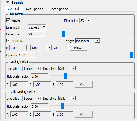
All Axes Section |
Contains parameters that affect attributes of all axes of the bounding extent. |
||
|
Visible Toggle |
Toggles on/off visibility of the viewport 2D/3D extent axes. |
||
|
Dimension |
Opens a menu for the specification of the desired dimension (2D or 3D) of the bounding extent axis. Default is 3D. 2D is only available for 2D viewports and 3D viewports in orthographic mode. |
||
|
Line Width |
Opens a menu for the specification of the desired line width (1 - 4 pixels) of the bounding extent axis. Default is 2. |
||
|
Label Size |
Sets the axis label size. |
||
|
RGB |
These fields specify the RGB values for the color you wish to assign. |
||
|
|
Opens the Color Selector dialog. See |
||
|
Opacity |
Specifies the degree of opaqueness for the axes of the bounding extent. This value may be adjusted by typing in a value from 0.0 to 1.0 in the field or by using the slider bar whose current value is reflected in the field. A value of 0. or 1. will render the axes completely transparent or completely opaque, respectively. |
||
|
Auto Size Toggle |
Will resize the bounds to reflect the coordinate range of the scene when toggled On. For example, Auto Size Toggle will adjust for newly created/modified parts as well as part visibility. |
||
|
Length |
Opens a menu for the specification of the desired type of length gradation on the axes of the bounding extent. |
||
|
As Specified |
Divides the gradations evenly along the length of the axis. (default) |
||
|
Rounded |
Tries to set the bounds size such that the labels are nicely formatted. Will use the min/max specified and the number of labels to resize the bounds to achieve the formatted labels. |
||
|
Grids/ticks |
Controls the specification of the gradation and grids for the bounding bounds display. |
||
|
Line Width |
Sets the line width for the grid/tick marks on the axis or faces of the bounds display |
||
|
Line Style |
Sets the line style for the grid/tick marks on the axis of faces of the bounds display. |
||
|
Tick Scale Factor |
A normalized factor that scales the length of the Grid marks (Ticks) |
||
|
RGB |
These fields specify the RGB values for the color you wish to assign. |
||
|
|
Opens the Color Selector dialog. See . |
||
|
Sub grids/ticks |
Controls the specification of the sub gradation and grids for the bounding bounds display. |
||
|
Line Width |
Sets the line width for the sub grid/tick marks on the axis or faces of the bounds display |
||
|
Line Style |
Sets the line style for the sub grid/tick marks on the axis of faces of the bounds display. |
||
|
Tick Scale Factor |
A normalized factor that scales the length of the Sub Grid marks (Ticks) |
||
|
RGB |
These fields specify the RGB values for the color you wish to assign. |
||
|
|
Opens the Color Selector dialog. See |
||
|
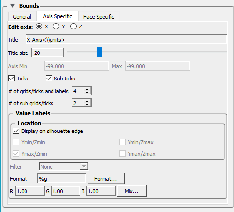
Axis Specific Tab |
Change the dialog to reflect XY or Z-Axis extent attributes (see below)
 |
||
|
Bounds |
This controls the look of the bounding box in the viewport (see it using → ) |
||
|
X-, Y-, Z-Axis |
These toggles choose the axis. |
||
|
Title |
The title that will be displayed along the axis. If blank there will be no title for this axis. |
||
|
Title size |
The size of the title chosen. |
||
|
Axis min/max |
These set the min/max extent for the axis being edited. They will be grayed out if the General tab setting of Auto axis is toggled on. The axis min/max is set to exactly the values specified if the General tab option for Length is set to As Specified. If Length is set to Rounded the min/max values are used as the basis to compute round numbers. |
||
|
Ticks |
Toggles on/off the axis tick marks. |
||
|
Sub ticks |
Toggles on/off the axis sub tick marks. |
||
|
# of grids/ticks and labels |
Set the number of axis tick marks, face grid lines, and labels along the axis. If the General tab setting for Length is set to Rounded this number will be used only as a basis for determining the number used. |
||
|
# of sub grids/ticks |
Set the number of axis sub tick marks and face sub grid lines. |
||
|
Value Labels |
Controls location, precision, coloration of numbers along axes. |
||
|
Location |
Control location of numerical values. |
||
|
Display on silhouette edge |
Default ON) automatically put labels on edge of bounding box. If this toggle is OFF then any or all of the four toggles below allow for manual placement of the numbers along the axes. |
||
|
Xmin/Zmin |
Place numbers along axes at the location indicated. |
||
|
Xmax/Zmin |
Place numbers along axes at the location indicated. |
||
|
Xmin/Zmax |
Place numbers along axes at the location indicated. |
||
|
Xmax/Zmax |
Place numbers along axes at the location indicated. |
||
|
Filter |
Front face only, Back face only, None (default). . |
||
|
Format |
This field specifies the format used to display the labels
on the selected axis. Any C language |
||
|
Format... |
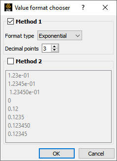
Opens the Value Format Chooser to set the format.
 |
||
|
Method 1 |
|||
|
Format type Specify floating point, or exponential |
|||
|
Decimal points Specify the number of decimal points |
|||
|
Method 2 |
|||
|
Format Selection List List of pre-defined formats. |
|||
|
RGB |
These fields specify the RGB values for the color you wish to use for the labels. |
||
|
Mix... |
Opens the Color Selector dialog. |
||
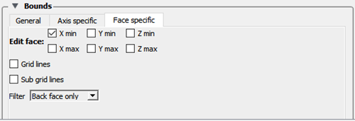
| Face Specific tab |
|
||
| Face specific | Control display of Grid / Sub grid on which face(s). | ||
| Edit Face | Select which face to edit. More than one can be selected. | ||
| X Min |
Face to show Grid / Sub grid |
||
| X Max |
Face to show Grid / Sub grid |
||
| Y Min |
Face to show Grid / Sub grid |
||
| Y Max |
Face to show Grid / Sub grid |
||
| Z Min |
Face to show Grid / Sub grid |
||
| Z Max |
Face to show Grid / Sub grid |
||
| Grid lines |
Show grid lines on the checked face |
||
| Sub grid lines |
Show grid lines on the checked face |
||
| Filter |
Filter Front face only, Back face only, None |
||
| Global Axis |
Controls the location and visibility of the global axis system display as well as the labels to be shown on the axis. |
||
|
Visible Toggle |
Toggles on/off the global axis in the viewport. |
||
|
Location |
The X and Y location for the global axis display. These are normalized coordinates in the viewport, i.e., 0,0 is located in the lower left corner of the viewport and 1,1 is the upper right corner. |
||
|
Labels |
The labels to be shown on the X, Y, and Z axis of the global axis display. |
||