


The panel layout is similar to the column layout, except that it draws a more formal boundary around its children that can be styled in different ways. It also allows you to specify a link to the item display page instead of including the HTML for an item inline.
Configuration Options
There are two options specific to this layout:
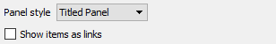
The panel styles are:
Titled Panel
Callout Panel
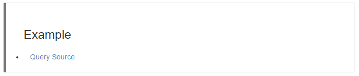
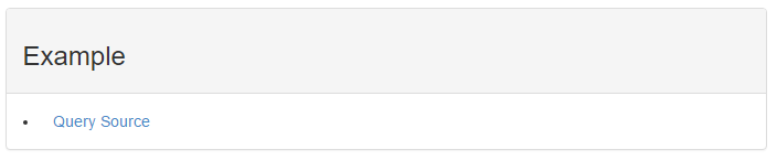
Note: In these examples, the Show items as links option has
been selected and the custom HTML header has been set to
<h3>Example</h3>.
The other callout panels differ in the color of the bar on the left side of the callout. The Error case is red, the Warning case is orange-yellow, the Success case is green, and the Info case is blue.
The Show items as links option places a URL link in the report that can be used to display the actual data item content instead of placing the content inline.
Properties
| Property | Description |
|---|---|
items_as_links |
Controls how individual items are displayed. Values are:
|
panel_template_toggle |
Adds or hides an interactive icon in the rendered HTML that provides hide/show capabilities to the panel. Values are:
|