Customizing a Grid

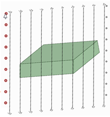
To customize the grid:

  1. Select the grid by clicking on a grid label or end point.
  2. Drag the handles to expand or shrink the grid dynamically.
  3. Modify the following values in the Modular grid section of the Properties panel:
    • Color: The color of the grid, labels, and the legend axis.

    • Font: The font and text height used for grid labels. Type the complete name for a font, followed by a comma and the font height in units (mm, in, etc.). You can also click the ... button and select a font and a size in points. The size will be converted to the current units.

    • Grid interval: The distance between grid lines.

    • Horizontal text location: Show labels for the bottom of grid lines, the top of grid lines, both, or neither.

    • Intervals per grid line: The number of rows between each grid line.

    • Show balloons around grid labels: Show circles around grid labels.

    • Show baselines only: Select True to only show the baselines. The default is False which shows all grid lines.

    • Show origin: Show the legend axis on the lower left corner of the view.

    • Show when at least one direction is parallel to the sheet: Select True to automatically display the grid if the X, Y, or Z axis in the view is parallel to the drawing sheet. Select False if you want to hide the grid in this case.

    • Vertical text location: Show labels for the left end of grid lines, the right end of grid lines, both, or neither.

    • Axis labels: Override X, Y, or Z with your own labels.

    • Negative and positive prefixes: A prefix shown before the distance on a grid label.

    • Negative, positive, and zero suffixes: A suffix shown after the distance on a grid label.

Note: Modular grid properties are based on the sheet defaults and are not inherited by child views.