


Analysis View Reference
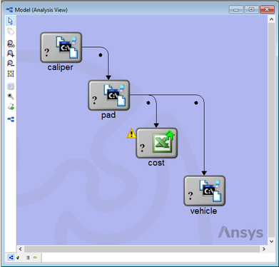
The Analysis View provides a high-level schematic of the workflow's data flow. Each Analysis Component in a workflow is represented by an icon in the Analysis View window. Components can be moved within the view by dragging them with the mouse. Whenever two components are linked together, an arrow extends from one component to the other, showing the direction of data flow. This representation provides a high-level view of the workflow and provides feedback on components as they execute.
Analysis View Toolbar
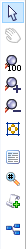
 Selection Tool - Used to
select and move components.
Selection Tool - Used to
select and move components. Hand Tool - Used to pan the
Analysis View.
Hand Tool - Used to pan the
Analysis View. Zoom 1:1 Tool - Zooms the
view to 100%.
Zoom 1:1 Tool - Zooms the
view to 100%. Zoom In Tool - Zooms the
view in.
Zoom In Tool - Zooms the
view in. Zoom Out Tool - Zooms the
view out.
Zoom Out Tool - Zooms the
view out. Zoom to Model Tool -
Zooms the workflow to fit the Analysis View window.
Zoom to Model Tool -
Zooms the workflow to fit the Analysis View window. Text Tool - Used to add text
annotation to the Analysis View.
Text Tool - Used to add text
annotation to the Analysis View.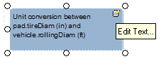
A text tool allows you to enter text on the Analysis View. The text tool can be linked to a component and can be dragged around and positioned. Click the Edit Text button to edit the text.
 Data Monitor Tool -
Used to insert a Data Monitor into the Analysis View.
Data Monitor Tool -
Used to insert a Data Monitor into the Analysis View.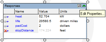
A data monitor allows you to drag variables from the Component Tree into the Analysis View. The values of the variables will update as the workflow runs. The data monitor can be linked to a ocmponent and can be dragged around and positioned. Click the Edit Properties button to edit the data monitor's name and other properties.
 Macro Tool - Used to add
macro buttons to the Analysis View.
Macro Tool - Used to add
macro buttons to the Analysis View. Data Scheduler Assembly
Tool - Used to add an Assembly to the Analysis View.
Data Scheduler Assembly
Tool - Used to add an Assembly to the Analysis View.
Component States
 Valid - The analysis
component's inputs and outputs are all up-to-date.
Valid - The analysis
component's inputs and outputs are all up-to-date. Invalid - Some or all of
the analysis component's inputs have changed.
Invalid - Some or all of
the analysis component's inputs have changed. Running - The component
is currently executing. If the component supports Progress Monitoring,
a stop watch will be displayed on the Component. Pressing this button
will launch the Component
Progress Monitor.
Running - The component
is currently executing. If the component supports Progress Monitoring,
a stop watch will be displayed on the Component. Pressing this button
will launch the Component
Progress Monitor. Failed - Execution of this
component has failed for some reason.
Failed - Execution of this
component has failed for some reason. Ignored - This component
has been disabled and will be ignored in the workflow. Right-click the
component and select "Component Enabled" to re-enable the
component.
Ignored - This component
has been disabled and will be ignored in the workflow. Right-click the
component and select "Component Enabled" to re-enable the
component. Not Loaded - An error
occurred in loading this component, the error was ignored, and the
component was loaded anyway. This component will not run properly
unless it is reconnected after the original error is
rectified.
Not Loaded - An error
occurred in loading this component, the error was ignored, and the
component was loaded anyway. This component will not run properly
unless it is reconnected after the original error is
rectified.
Component Types
- Analysis Component - A
standard component.
 Driver Component - A
component that introduces a feedback loop into the Model.
Driver Component - A
component that introduces a feedback loop into the Model. Script Component - A
component written using a scripting language.
Script Component - A
component written using a scripting language. Geometry Component - A
component that has geometry.
Geometry Component - A
component that has geometry. Assembly Component - A
component that holds other components. Double-click the icon to view
its contents.
Assembly Component - A
component that holds other components. Double-click the icon to view
its contents.
Component Tooltip
Component
 icon -
hover over the
icon on the component to display the tooltip for the component. This
tooltip lists all defined metadata for the component.
icon -
hover over the
icon on the component to display the tooltip for the component. This
tooltip lists all defined metadata for the component.
Mouse Controls
- Zoom - zoom in and out by by dragging the mouse up or down while holding the middle mouse button. For 2-button mice, hold down both buttons. If the middle button is a scroll wheel, scrolling up and down will zoom in and out.
- Pan - pan the view by dragging the mouse while holding down the right mouse button.