Use X-Y charts to examine the relationship between two Attributes for a set of records.
You create an X-Y chart by selecting the records of interest and then either specifying
the Attributes you want to plot, or by selecting a report template that specifies the
information to be plotted. Report templates are managed by your Granta MI Data
Administrator.
-
Click Reports on the toolbar.
The Record List shows the currently-selected records.
-
Add or delete records from the list, as required, then click X-Y
Chart.
-
If templates have been configured for your database, you can select one from the Report
Template list and then click Plot Chart.
-
If no templates are available, or if you just want to define your own chart, select the
X- and Y-axis Attributes and range settings. Auto-scale will scale the chart to
automatically show all the selected records.
- Optional:
Add a Chart Title, if desired.
-
Click Plot Chart.
- Click View The Data to view the underlying chart data in a table.
Click a bubble to bring the corresponding record to the top of the legend.
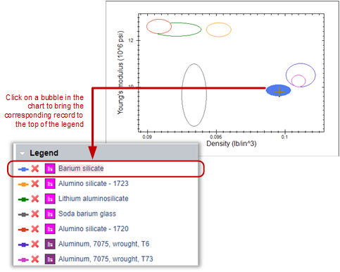
To see which bubble a
particularly interesting record corresponds to, click the colored line in the legend: in
the chart, the corresponding bubble is highlighted.
- Click Modify Chart in the toolbar at the top of the page to
return to the Chart Properties page and modify the chart axis settings.


