
Adding Radio Buttons to a Component Dialog Box
Radio buttons are control elements that provide a set of mutually exclusive choices. In the Component Dialog Wizard, you can create radio buttons for two purposes: for enabling and disabling other control elements, and for entering the value of a non-conservative input node. Following is an example of a set of radio buttons as it appears in the Component Dialog Wizard.

To create a set of radio buttons for enabling and disabling other control elements within a component dialog box:
- Select Controls > RadioButton
from the Component Dialog Wizard
menu bar.
- You can also click Add Radio Button on the Standard toolbar.
- Click the component dialog box to place the radio button.
- Drag the radio button to its desired location in the component dialog box.
- Resize the radio button to its desired height and width.
- Repeat steps 1 through 4 for the remaining radio buttons in the set.
- Select Layout > Set
Tab Order from the Component
Dialog Wizard menu bar.
- You can also click Set Tab Order on the Layout toolbar.
- Note the tab order number of each newly placed radio button in the group.
-
Right-click the radio button with the lowest tab order number. The Properties dialog box appears.
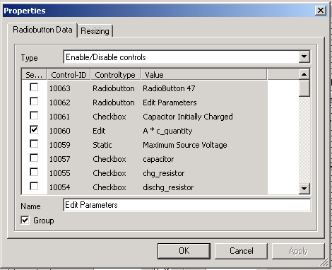
- Click the Radiobutton Data tab.
- Select Type > Enable/Disable controls.
- Select a check box in the Select column for each control element you want to enable when the radio button is selected. If you want no controls to be enabled, select no boxes in this column.
- Type a name to accompany the radio button in the Name field.
- Select the Group check box.
- Repeat steps 1 through 12 for each remaining radio button in the set, but do not select the Group check box for any of these buttons. Only the radio button with the lowest tab order number in the set should have its Group box selected.
To create a set of radio buttons for entering the value of a non-conservative input node:
- Select Controls > RadioButton
from the Component Dialog Wizard
menu bar.
- You can also click Add Radio Button on the Standard toolbar.
- Click in the component dialog box to place the radio button.
- Drag the radio button to its desired location in the component dialog box.
- Resize the radio button to its desired height and width.
- Repeat steps 1 through 4 for the remainder of the radio buttons in the set.
- Select Layout > Set Tab Order on the Component Dialog Wizard menu bar, or click Set Tab Order on the Layout toolbar.
- Note the tab order number of each newly placed radio button in the group.
- Right-click the radio button with the
lowest tab order number.
The Properties
dialog box opens.
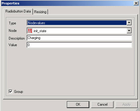
- Select Type > Nodevalues.
- Select the name of the non-conservative input node to be controlled by the set of radio buttons from the Node list.
- Select a name for the radio button and type it into the Description field.
- Select the value for the chosen non-conservative input node when the radio button is selected and type it into the Value field.
- Select the Group check box.
- Repeat steps 1 through 12 for each remaining radio button in the set, but do not select the Group check box for any of these buttons. Only the radio button with the lowest tab order number in the set should have its Group box selected.