
Creating 3D Rectangular Bar Plots
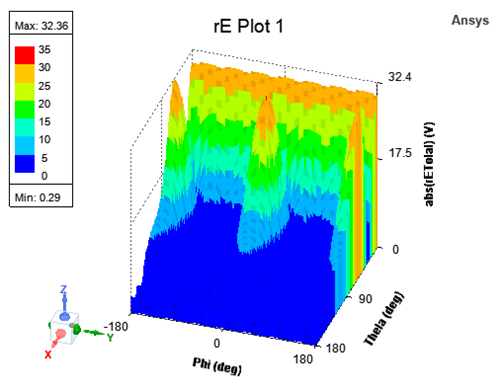
This is a 3D, xyz graph of results as rectangular bars.
Working with a 3D Rectangular Plot
You can Rotate, Zoom, and Pan a plot. When you rotate, the Cartesian grid responds so that the curve always remains in front and the grids behind.
Clicking on a plot entity selects it, highlighting the selected entity in bold.
Double-clicking anywhere in the plot brings up the Properties dialog box.
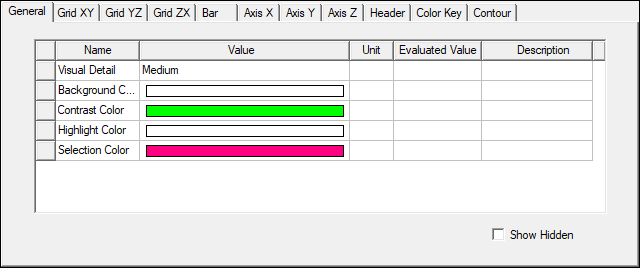
The properties tabs for a 3D Rectangular Bar plot are
- General: For general plot properties such as Visual Detail level and background color
- Grid [XY|YZ|ZX]: Properties related to the three grids
- Bar: Properties related to rectangular bars.
- Axis [X|Y|Z]: Properties related to the three axes
- Header: Properties related to plot Header/Title.
- ColorKey: Properties related to ColorKey, including borders, background, Min and Max, as well as number format and precision.
- Contour: Properties related to contouring of all surfaces
Selecting a property also displays its properties in the Property window. You can edit the properties to customize the appearance of the plot. See Controlling Visual Detail in a 3D Rectangular Bar Plot.
Creating a 3D Rectangular Bar Plot
- On the Results
menu (under the Maxwell menu or right-click Results in the Project Manager), click Create <type>
Report, and select 3D Rectangular Bar plot from the report type menu, or select the Results tab of the ribbon, and select the 3D Rectangular Bar icon for the Report type you want to create.
The Report dialog box appears.
- In the Context section make selections from the
following field or fields, depending on the design and solution type.
- Solution field with a drop-down selection list. This lists the available solutions, whether sweeps or adaptive passes.
- Geometry field with a drop-down selection list. For field and radiated field reports, this applies the quantity to a geometry or radiated field setup.
- Under the Trace tab Z Component area, specify the information
to plot along the z axis:
- In the Category list, click the type of information to plot. The category you select provides the default plot name.
- In the Quantity list, click the value to plot.
- In the Function list, click the mathematical function of the quantity to plot.
- The Value field displays the currently
specified Quantity and Function. You can edit this field directly.
Note: Color indicates a valid expression.
- Range Function button -- opens the Set Range Function dialog box. This applies currently specified Quantity and Function.
- On the Trace tab Y (Secondary sweep) lines, specify the
information to plot along the y-axis in one of the following ways:
- Select the sweep variable to use from the drop-down list.
- If sweeps are available, you can select the browse button to display a dialog that lets you select particular values. The quantity will be plotted against the primary sweep variable listed.
- On the Trace tab X (Primary sweep) lines, specify the
information to plot along the x-axis in one of the following ways:
- Select the sweep variable to use from the drop-down list.
- If sweeps are available, you can select the browse button to display a dialog that lets you select particular values. The quantity will be plotted against the primary sweep variable listed.
- Click New Report.
This creates a new report in Project tree, displays the report with the defined trace, and enables Add Trace on the Report dialog box. The default name is based on the Report Category you selected, (for example, S Parameter Plot n or rE Plot n). You can edit the plot names in the project tree and the plot header text in the report synchronizes.
The function of the selected quantity or quantities will be plotted against the values you specified on an x-y-z graph. The plot is listed under Results in the Project Manager. When you select the traces or plots, axis or grid labels, plot header, color key, or variable labels, their properties are displayed in the Properties window. The properties for each plot element can be edited directly to modify the plot content and appearance. See Modifying the Background Properties of a Report.
- Optionally, add another trace to the plot by following the procedure above, using Add Trace rather than New Report.
3D Rectangular Bar Customization
Selecting a bar in the plot shows the customizable attributes of bars in a 3D Rectangular Bar plot.
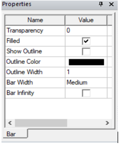
The customizable attributes of the bars in a 3D Rectangular Bar plot include
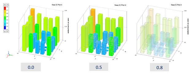
- Transparency
- Filled
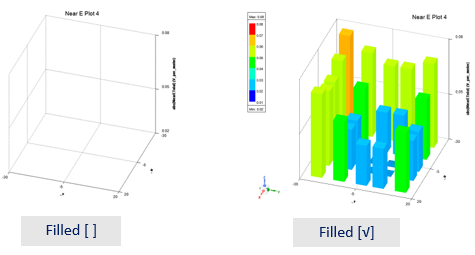
- Show Outline
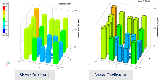
- Outline Color (customizable, see plot above)
- Outline Width (customizable, see plot above)
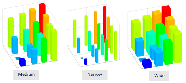
- Bar Width, controls the thickness of the bar. Medium (default), Wide and Narrow are the width that equals to ½, ¾ and ¼ of the min spacing between adjacent points respectively.
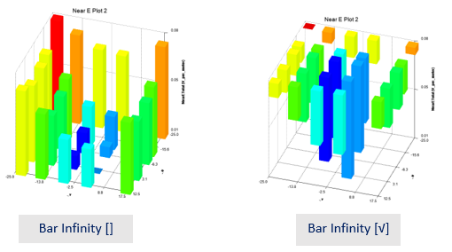
- Bar Infinity represents the third coordinate (z) using the bottom of the bar.
Controlling Visual Detail in a 3D Rectangular Bar Plot
If a particular plot seems busy with information, you can edit plot properties, such as Axis and Grid Attributes for discrete levels of visual detail to improve readability. Double-click anywhere on a plot to display the Properties dialog box. The Visual Detail property on the General tab also provides control suited to different screen and plot sizes.
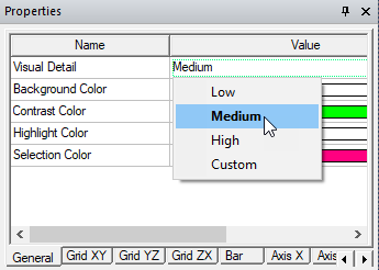
The Visual Detail menu has four options: Low, Medium (the default), High, and Custom. If you select any Visual Detail, the 3D plot is rendered according to the selected Visual Detail level and the properties reflect the values chosen for the selected visual detail level. From this predefined visual detail level, if you modify any properties, Visual Detail is automatically set to Custom (or to another predefined visual detail level if the edits happen to match the settings for that level).
You can also manually set Visual Detail to Custom. In such a case, Custom will inherit property values corresponding to the previous level. This ensures that you can customize settings starting from a baseline provided by the preconfigured Low, Medium or High Visual Detail levels.
3D Rectangular Plot with Medium Visual Detail
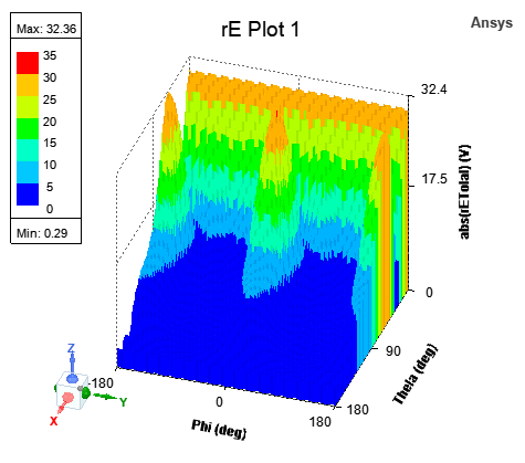
On creation, a 3D Rectangular Plot has Visual Detail set to Medium and looks and feels as shown above. Specifically, under Medium Visual Detail level, a 3D Rectangular Plot has 3 ticks per axis (X, Y, Z axis) which will show min, max and middle value. This setting also shows axes labels.
3D Rectangular Bar Plot with Low Visual Detail

With Visual Detail set to Low, a 3D Rectangular Plot shows axes with 2 ticks corresponding to min and max values. It also shows axes labels and grid borders.
3D Rectangular Bar Plot with High Visual Detail
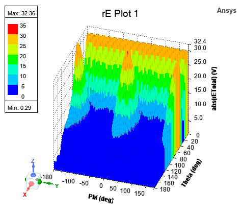
With Visual Detail set to High, a 3D Rectangular Plot shows all Cartesian axes and grids together with all ticks and axes labels.
Axis Properties: Ticks Specification and Num. Ticks
Ticks Specification is available on Axis properties, as shown below:
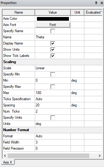
Ticks Specification is a menu with possible values as Auto, Spacing, and Num. Ticks, with Auto being the default value. If Ticks Specification is Auto, then a spacing value is automatically calculated and used to calculate and display the tick labels. Spacing shows the calculated value, and Num. Ticks shows the number of ticks based on this spacing value, as shown below:
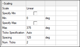
You can edit the Spacing field when Ticks Specification is set to Spacing; otherwise, it is read only.
You can edit the Num. Ticks field when Ticks Specification is Num. Ticks; otherwise, it is read only.
Valid Num. Ticks are between 0 and 100, including 0 and 100. If you enter an invalid value, an error message is shown. If you enter a spacing value that results in number of ticks greater than 100, then an appropriate value is shown.
- If Num. Ticks is 0, then no ticks are shown on the axis.
- If Num. Ticks is 1, then only the max value tick is shown on the axis.
- If Num. Ticks is 2, then only the min and max value ticks are shown on the axis.
- If Num. Ticks is greater than 2, then evenly spaced ticks (including min and max) are shown on the axis.